Steinmann Kraft is a next-generation company in the medical equipment market. It supplies and implements high-tech solutions for clinics, helping doctors work with greater precision and efficiency.
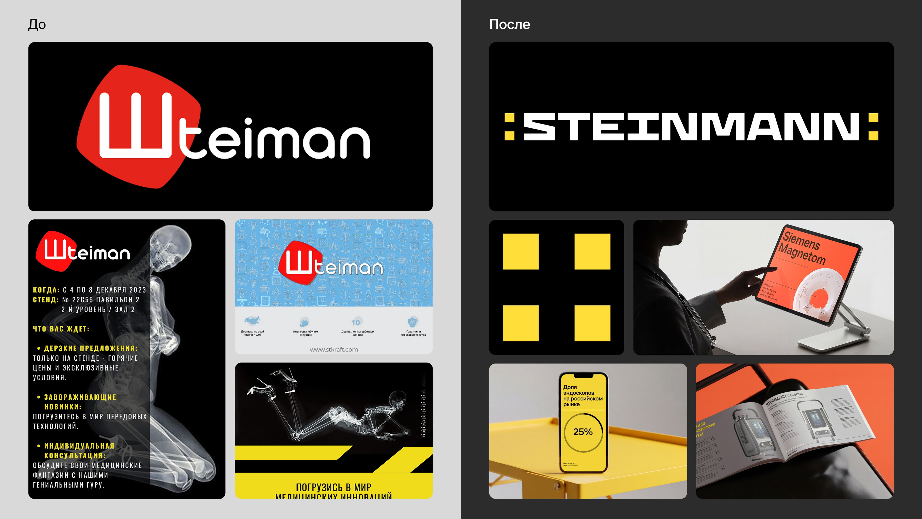
Before the project, the company faced a systemic problem: despite its high level of expertise, the brand was perceived as just one of many distributors. Marketing was fragmented, relied on offline channels and word of mouth, and communication failed to build a consistent image or help the brand stand out — at exhibitions or in digital.
As a result, the brand: did not convey leadership and innovation; created no emotional reason to choose it; and did not reflect the company's real level of expertise.
The project's key task was to redefine the brand's role: to shift from being an equipment supplier to becoming a strategic partner and market driver, and to turn marketing into a systematic growth tool.
Insight
In the medical equipment market, clients don't choose a supplier — they choose a partner who takes responsibility for the result.
What matters to them is an expert who understands the problem, offers a comprehensive solution, and helps grow the business rather than simply supplying equipment.
Meanwhile, most market players keep competing on range and price, without addressing brand perception or building systematic communication.
Visual System
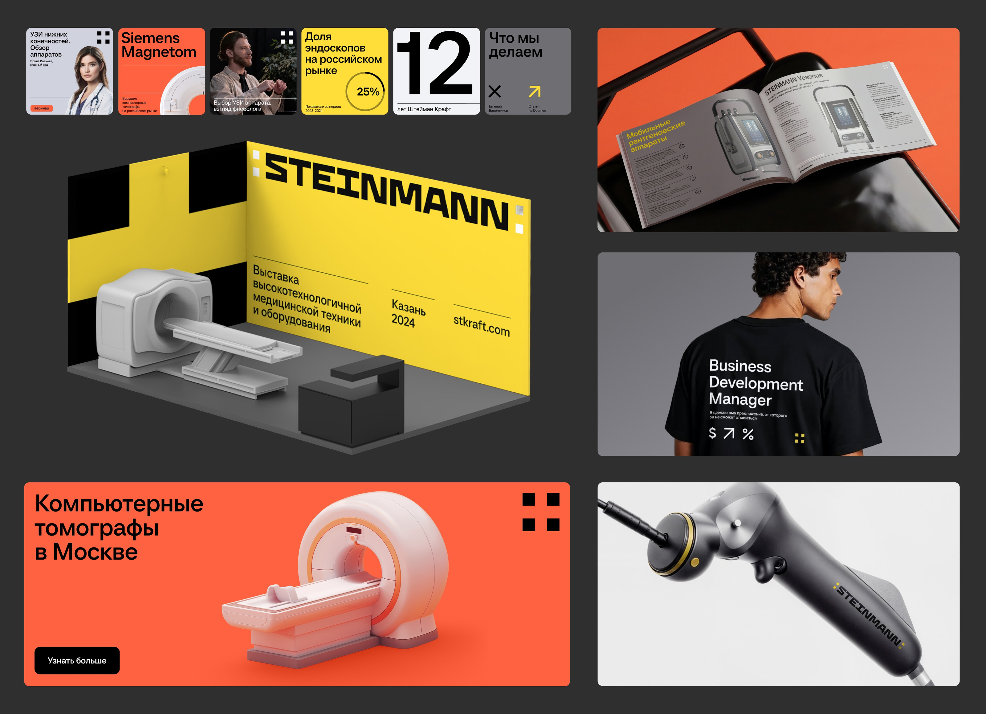
The identity is built as a system at the intersection of two principles — editorial expressiveness and engineering precision.
Bold typography, expressive composition and vivid color accents on one hand; a modular grid, strict hierarchy and clear construction rules on the other. This lets the brand stand out from the industry while staying consistent across every application. The system was designed to be flexible from the outset — able to work in different modes, from image-driven visuals to functional materials, while remaining cohesive.
Logo
The mark is formed from four elements converging toward the center. It references the principle of focus — a key concept in diagnostics and medical technology. At the same time, the mark reflects the synergy between participants in the medical process and the company's comprehensive approach.
Rollout
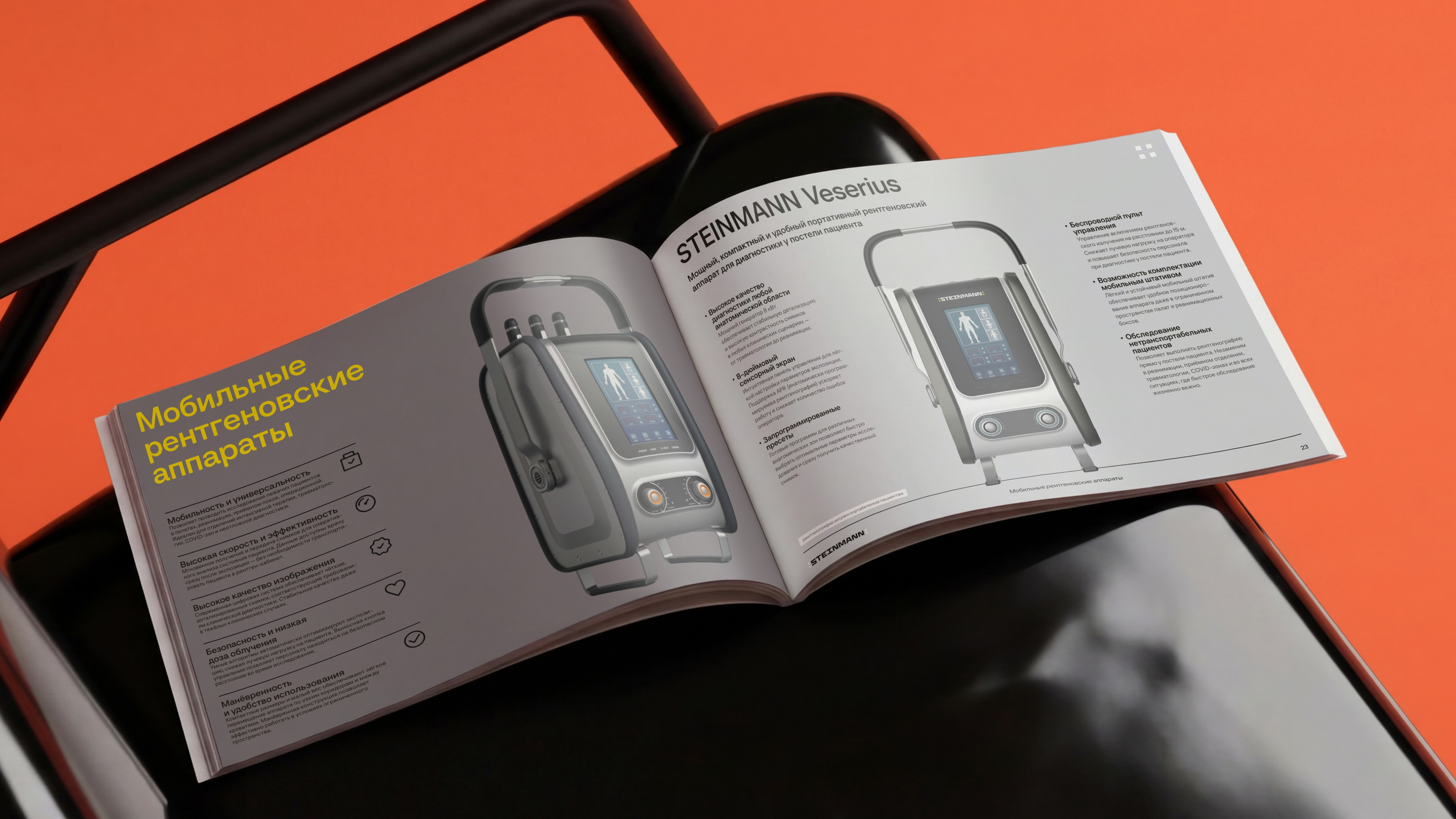
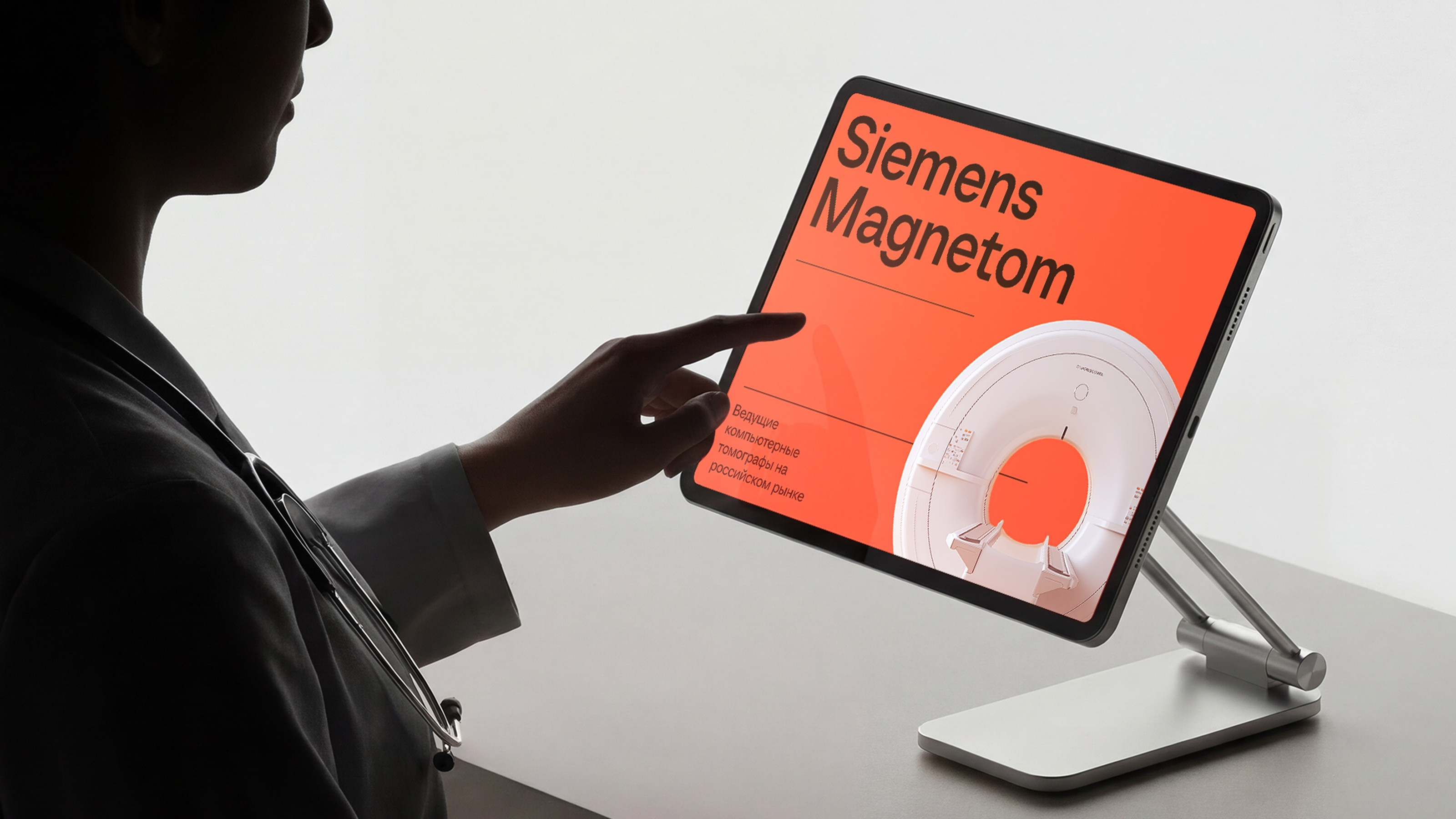
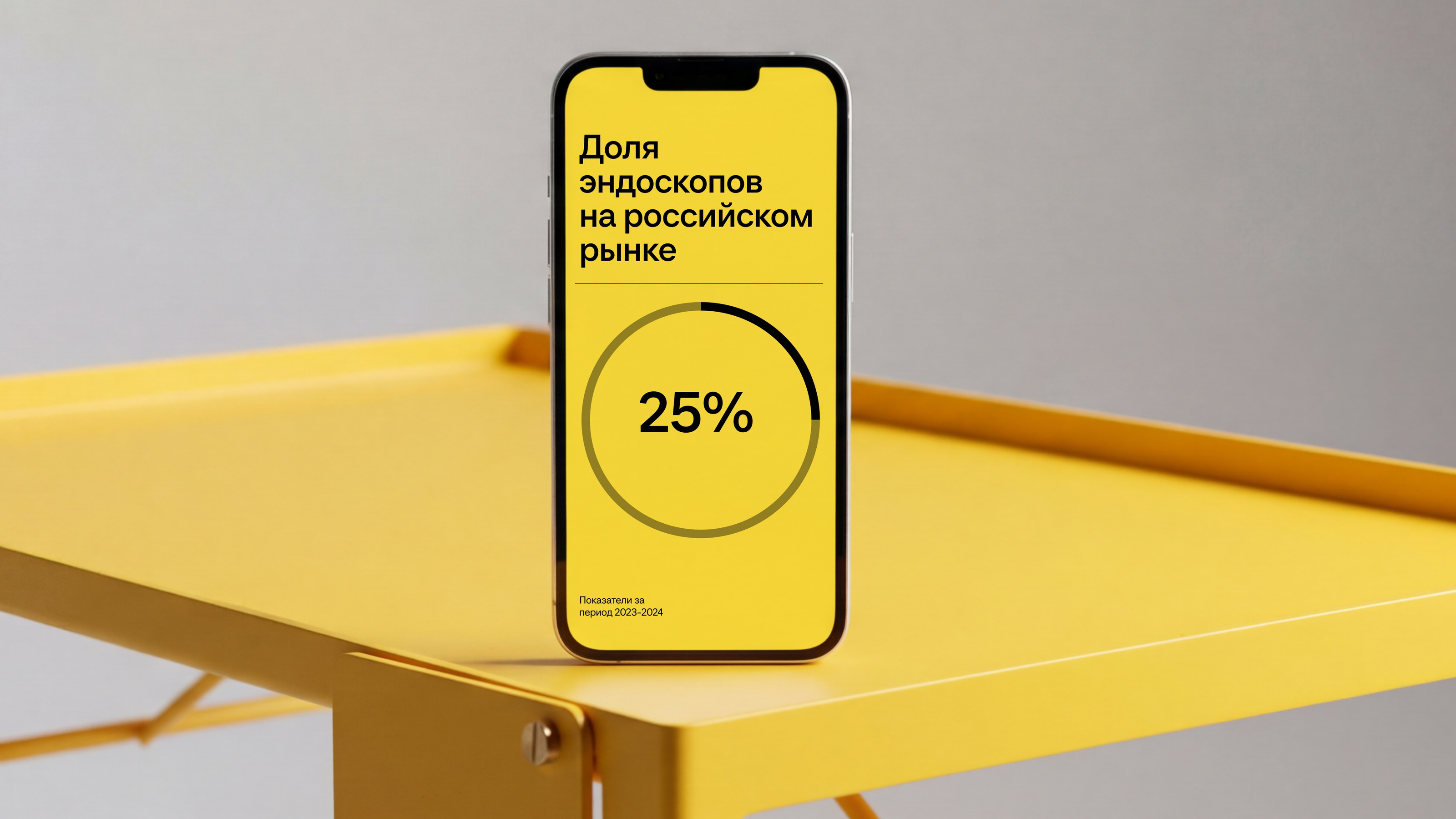
The identity was rolled out as a single system across all key brand touchpoints: digital channels and the website, business presentations, product catalogs, exhibition stands, merchandise and print materials, medical equipment branding, and vehicles.
The system covers both image-building and applied formats — from business cards to comprehensive presentation materials.
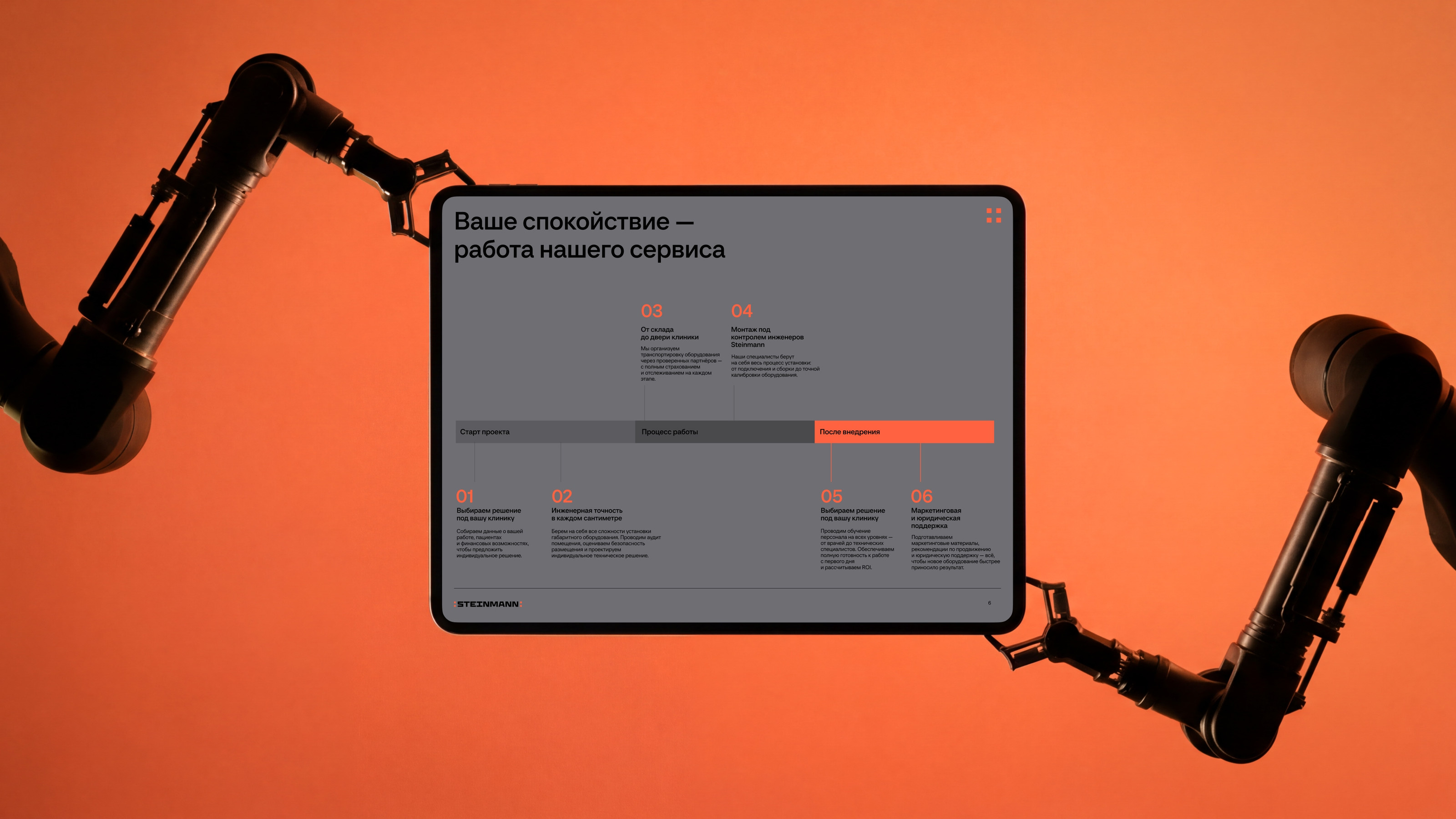
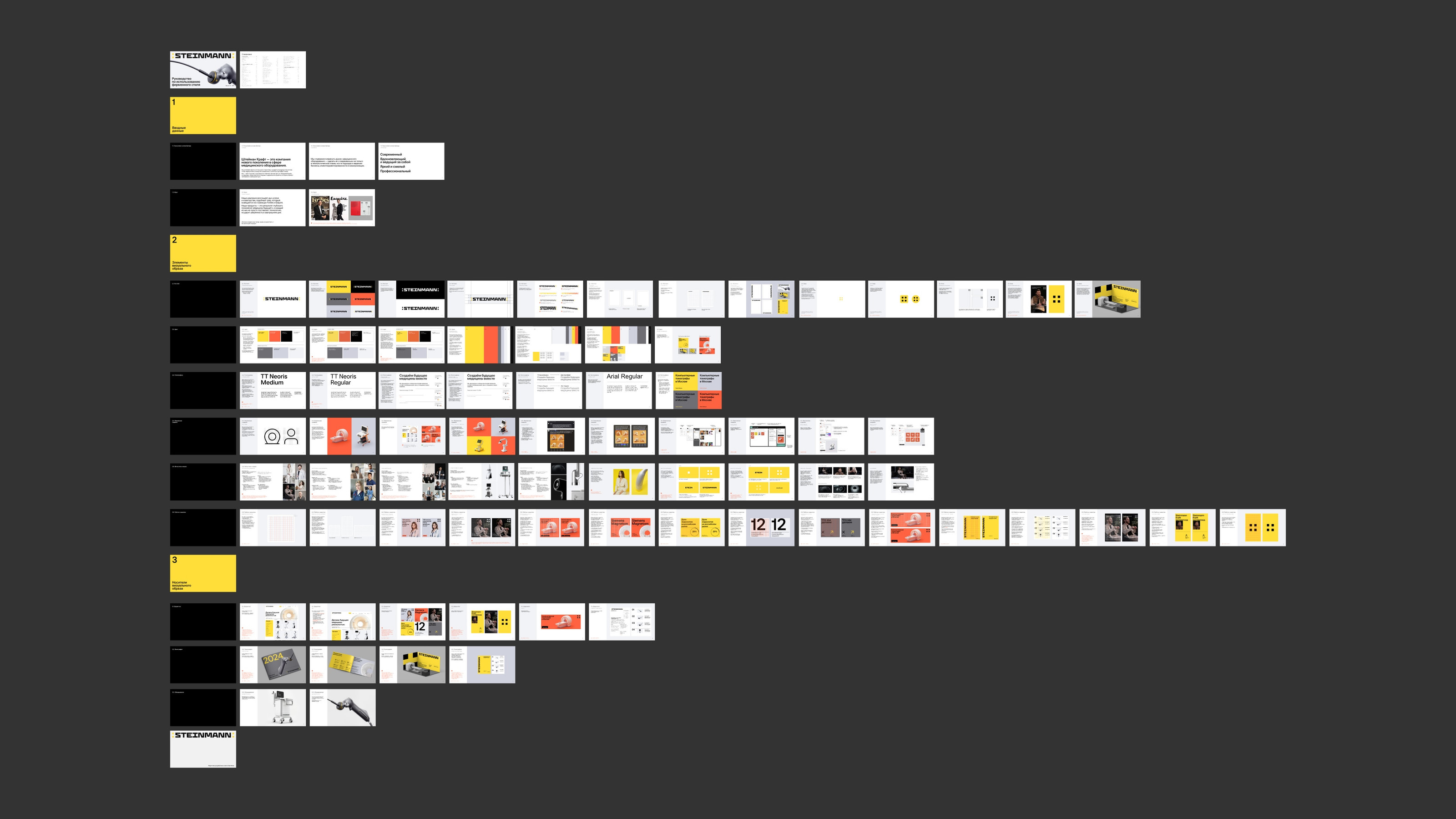
To ensure consistency, a detailed guideline was developed, covering rules for working with the identity, layout and composition principles, animation and video, and usage examples. This made it possible to scale the brand without losing quality and to develop communication in a controlled way.
pages in the brand guideline
Want a systematic identity like this for your own brand?
The project fundamentally changed the role and perception of Steinmann Kraft: from an "equipment supplier" to a strategic partner, from a technical brand to a carrier of expertise and leadership, from fragmented communication to a systematic marketing tool.
The company gained more than just a visual style — it gained a tool for growing its marketing, strengthening trust, and reaching a new level of communication with the market.
Client Feedback
Shamil Abbyasov, CEO, Steinmann:
Working with Nimax turned out to be more than a redesign for us — it was a rethinking of the brand's role. Before the project, we were perceived as just one of many medical equipment suppliers, and our expertise wasn't fully coming through. The team accurately identified this gap and proposed a solution that changed our whole approach to communication.
Let's break down your challenge and offer a solution — just like we did for Steinmann Kraft.
Project Team
Senior Strategist — Sergey Chulkov
Brand Strategist — Aksinya Kupina
Art Directors — Nika Troptseva, Pasha Konyukov
Brand Designers — Nikita Komarov, Nina Chistilina
Producer — Angelina Saribekyan
PR and Case Study — Anait Sarkisian