В уже далёком 2021 году мы отрисовали большой сет иконок для цифровых продуктов и сервисов Райффайзен Банка. Тогда наша задача совместно с дизайн командой заказчика была синхронизировать визуальный язык иконок с фирменной типографикой банка — нейтральным гуманистическим гротеском. Мы буквально «сняли мерки» со шрифта и перенесли его логику в графемы: те же пропорции, та же пластика линий, та же функциональная сдержанность.
Но время идёт, и вместе с ним меняется визуал и бренды. После редизайна у банка появился новый фирменный шрифт Tomato Grotesk и перед нами была поставлена масштабная задача:
- переработать и обновить более 600 иконок;
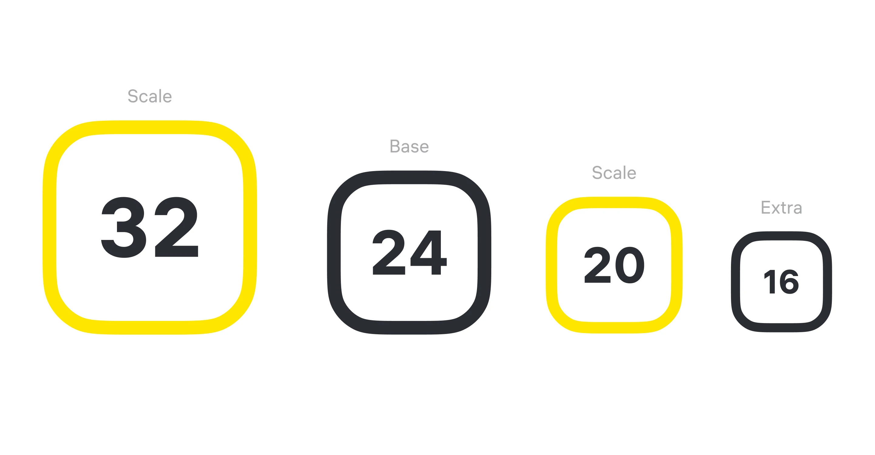
- адаптировать их под несколько типоразмеров: 32, 24, 20 и 16 px;
- пересобрать часть метафор;
- добавить новые сущности, отражающие современные банковские функции — от оплаты по QR-коду до AR-очков и других цифровых сценариев, которых раньше не существовало.
Back in 2021, we created a large icon set for Raiffeisen Bank's digital products and services. At that time, our goal, in collaboration with the client's design team, was to align the visual language of the icons with the bank's corporate typeface—a neutral, humanist sans-serif. We essentially took the font's "measurements" and applied its logic to the iconography: the same proportions, the same fluidity of line, the same functional restraint.
But times change, and with them, visual identities evolve. Following a brand refresh, the bank introduced a new custom typeface, Tomato Grotesk. This led to a large-scale new project:
· To redesign and update over 600 icons.
· To adapt them for multiple standard sizes: 32, 24, 20, and 16 px.
· To rethink and rebuild a number of the visual metaphors.
· To add new icons representing modern banking features — from QR code payments to AR glasses and other digital scenarios that didn't exist before.
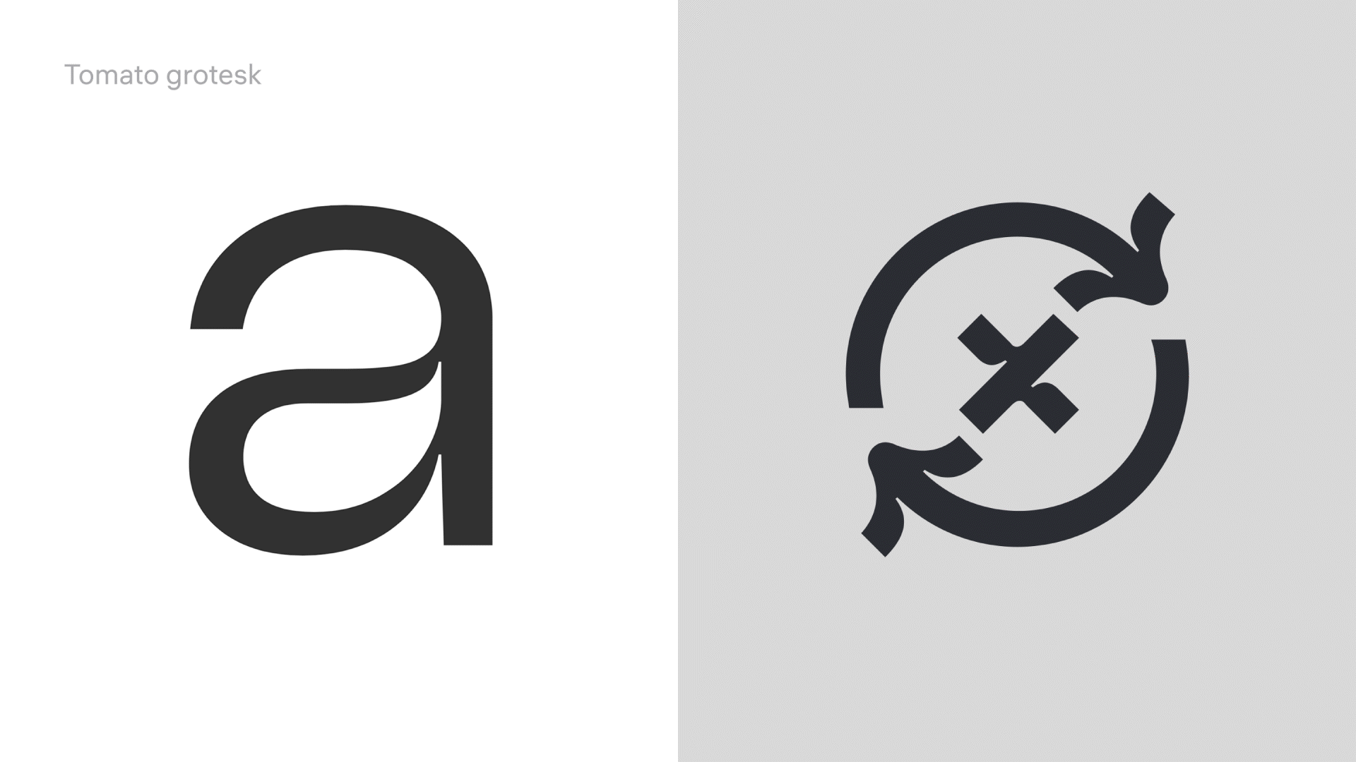
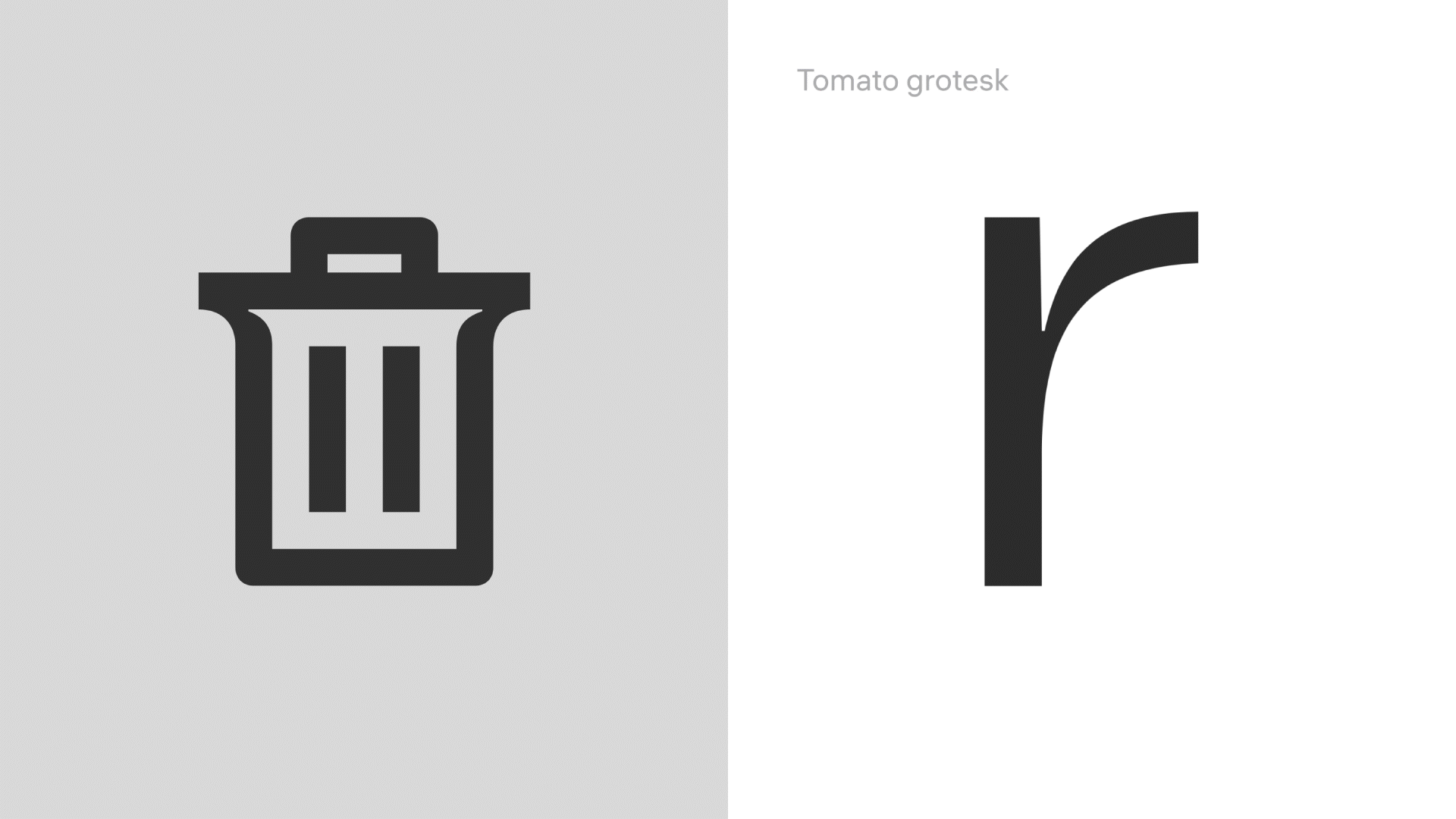
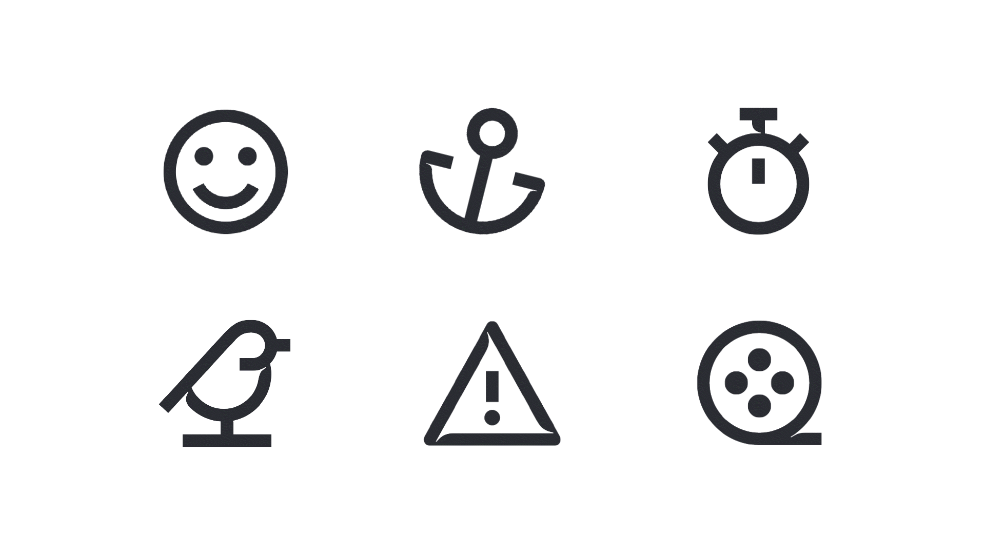
Tomato Grotesk это уже не нейтральный инструмент, а характерный гротеск с ярко выраженными «чернильными ловушками» (ink traps), которые в цифровой среде работают не как техническая необходимость, а как элемент стиля и харизмы. Важно было не просто «перерисовать» сет, а создать иконочный эквивалент шрифта. Так, словно это альтернативный набор знаков внутри самой системы Tomato Grotesk. Мы внимательно изучили характер шрифта: логику углов, напряжение форм, работу внутренних выемок. И перенесли эту энергетику в пиктограммы. Линии стали чуть более выразительными, формы — смелее, силуэты — живее. При этом мы сохранили строгость — это по-прежнему инструменты для банковского интерфейса, где важны ясность и доверие.
Tomato Grotesk is no longer a neutral tool; it's a distinctive grotesque with prominent ink traps. In a digital environment, these aren't a technical necessity but a defining element of style and character. Our key task wasn't simply to "redraw" the set, but to create an icon system that felt like the visual equivalent of the font. As if they were an alternate character set within the Tomato Grotesk family itself. We carefully studied the font's personality: the logic of its angles, the tension in its forms, the function of its interior cuts. We then translated that energy into the pictograms. The lines became slightly more expressive, the forms bolder, the silhouettes livelier. Yet, we maintained a sense of discipline—these are still tools for a banking interface, where clarity and trust are paramount.
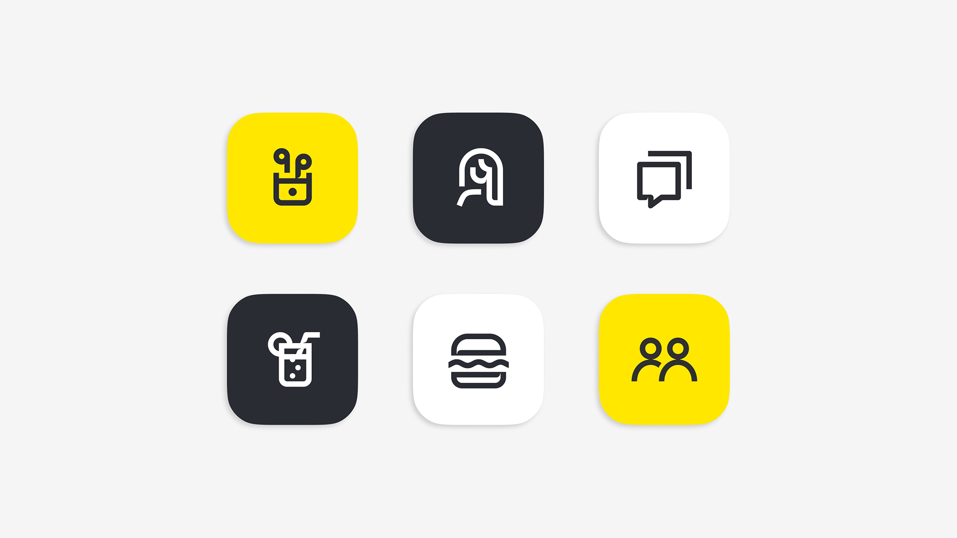
Отдельный пласт работы — метафоры. Современные мобильные банки постоянно расширяют функциональность, и иконки должны быть одновременно уникальными и интуитивно понятными. Мы искали баланс между свежестью образа и мгновенной считываемостью. В итоге получился сет, который стал заметно бодрее и харизматичнее предыдущего, но при этом не потерял серьёзности. Это профессиональная система, в которой появилась эмоция и характер. Сегодня делимся этим проектом с гордостью — как примером того, как фирменная типографика может стать основой иконочного языка.
The metaphors themselves were a significant area of focus. Modern mobile banks are constantly expanding their functionality, and the icons need to be both distinctive and instantly understandable. We sought a balance between a fresh concept and immediate legibility. The result is a set that feels noticeably more dynamic and has more personality than its predecessor, without losing any of its professional seriousness. It's a functional system that now has emotion and character. We're proud to share this project today—as an example of how a brand's typography can become the very foundation of its iconographic language.