Overview
When it comes to medical equipment, every detail must be carefully calculated. This is exactly what we tried to achieve when working with GMT, a medical equipment trading company. For them, we developed a unique visual identity and revamped their online store for the best customer experience.
Logo
The logo, made up of the company name in a classy font and two nice, friendly-looking ellipses, helped build a visual bridge between medical technologies and customer trust. Complete with the lowercase letters and brand colors, this logo is a perfect embodiment of the brand concept, communicating proximity to customers.
Colors
We created a unique color palette that represents reliability and innovations and emphasizes the importance of customer care. This set of colors gives the brand a distinctive, compelling look that reflects its values and positioning.
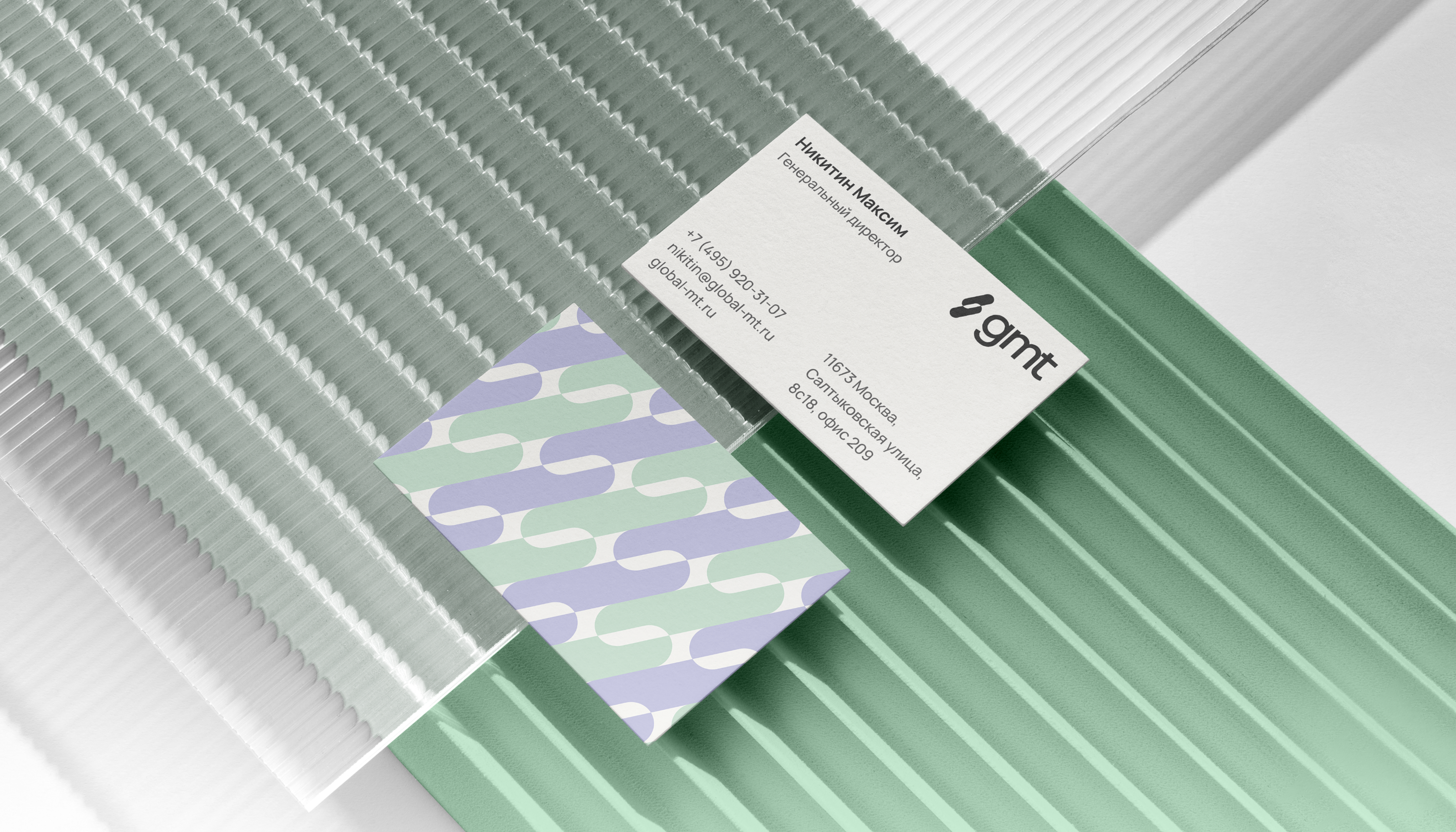
Pattern
The signature pattern on business cards is more than just a stylish touch—it is actually part of a color-coding scheme where every department is assigned its special color. Emerald stands for Accounting, lilac for Marketing, while the CEO’s business card has several colors harmonizing together—a visual metaphor for his active involvement in all the domains.
Website prototypes
Reliability and convenience are a must in the medical field. This is why our two main goals when updating the GMT website were creating a visually appealing design and working on SEO optimization for increased search visibility. To that end, we ran an in-depth analysis of the old website to identify its technical shortcomings and developed some prototypes to fix those issues. The resulting set of documents and prototypes was featured in an informative presentation. This allowed the company to fully assess the recommendations.
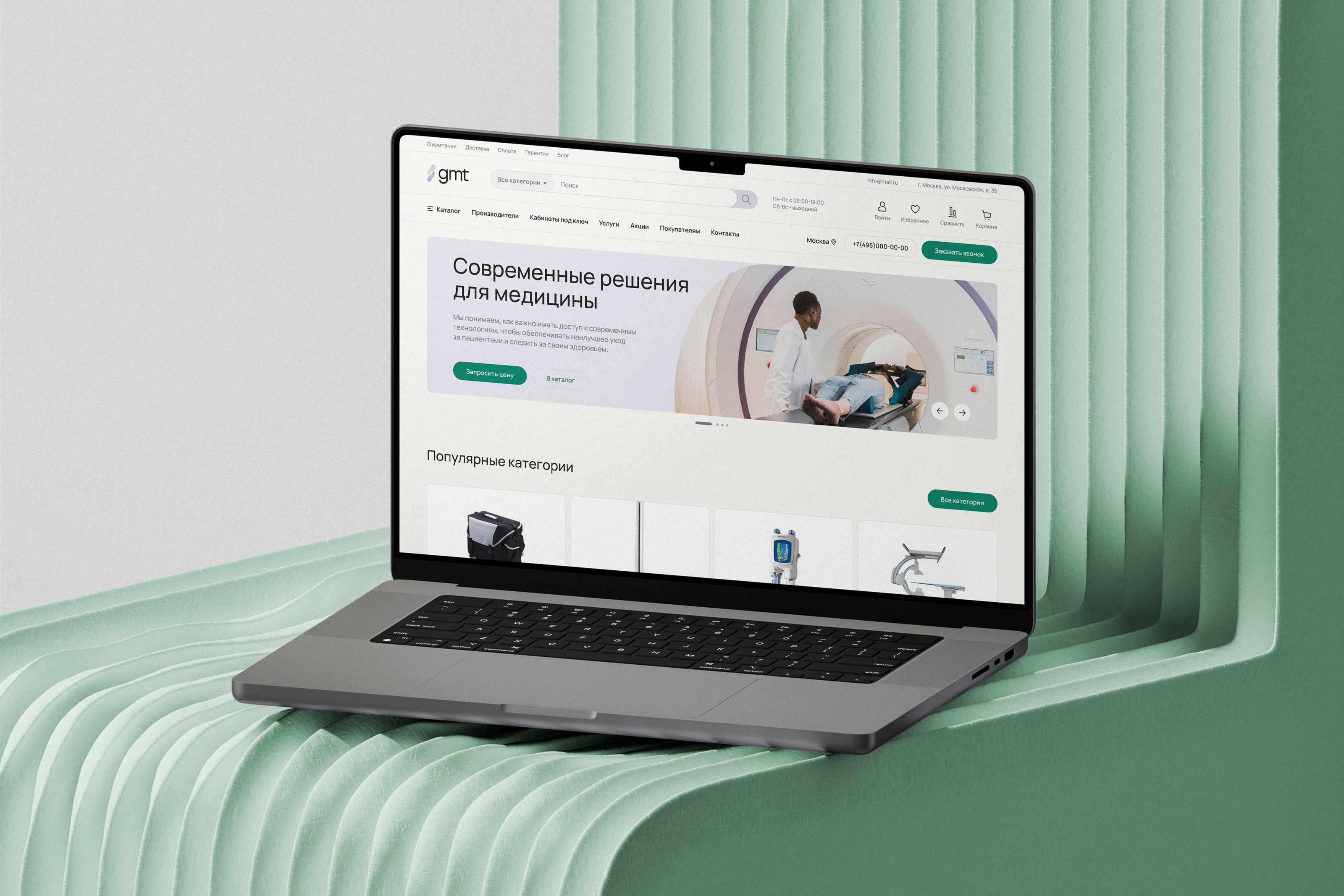
Home page
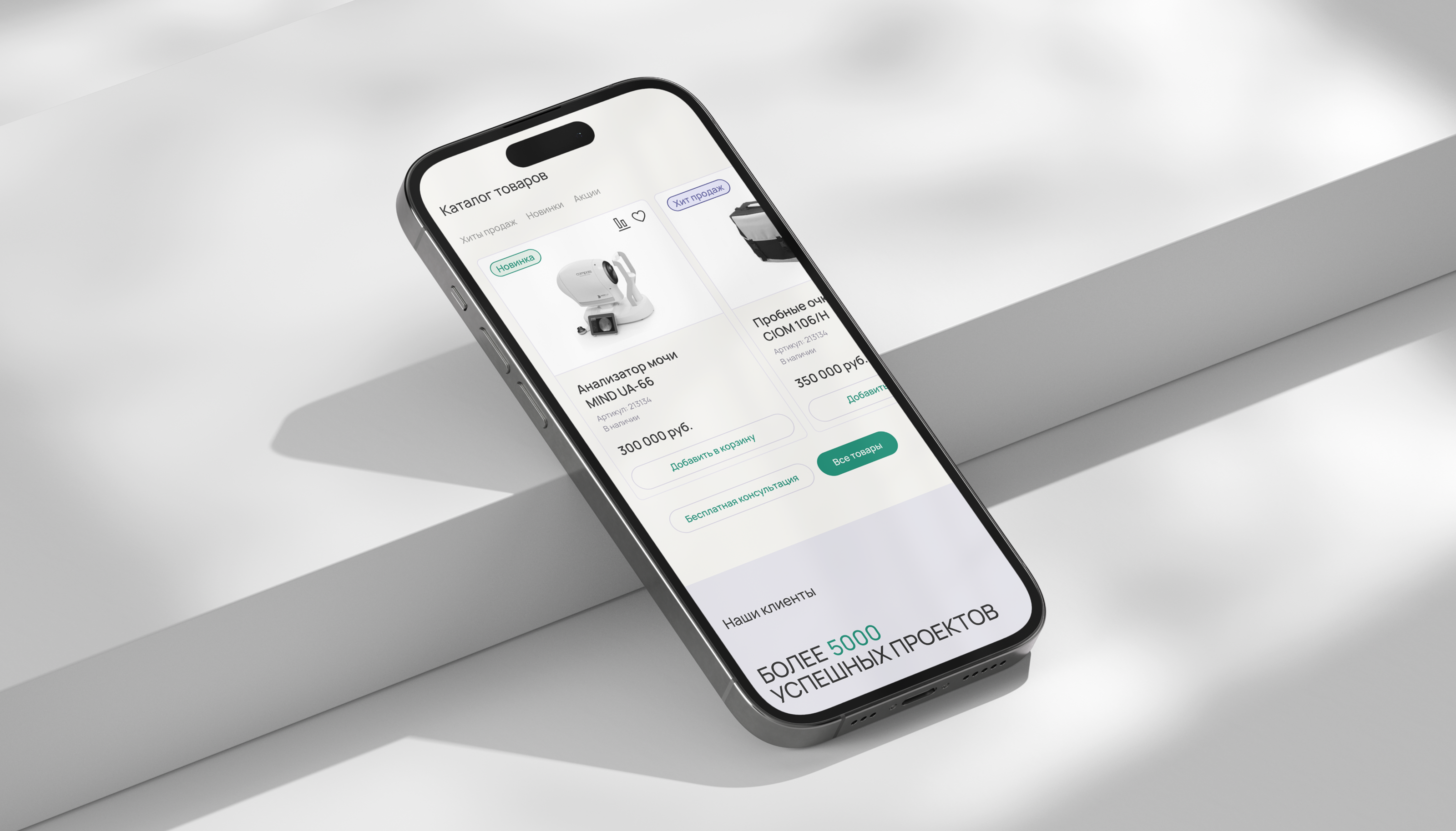
The home page of the GMT online store is the heart of the brand’s online presence. It’s where the client and the company meet for the first time, which sets the tone for the rest of their collaboration. This is why, when implementing the new visual identity, we were tasked with improving the usability of the home page and making it reflect the company’s values and possibilities.
Catalog
With Products, we mainly focused on creating simple and intuitive navigation to help users explore GMT’s wide range of goods. This page provides detailed information on the products while remaining clearly structured and uncluttered.
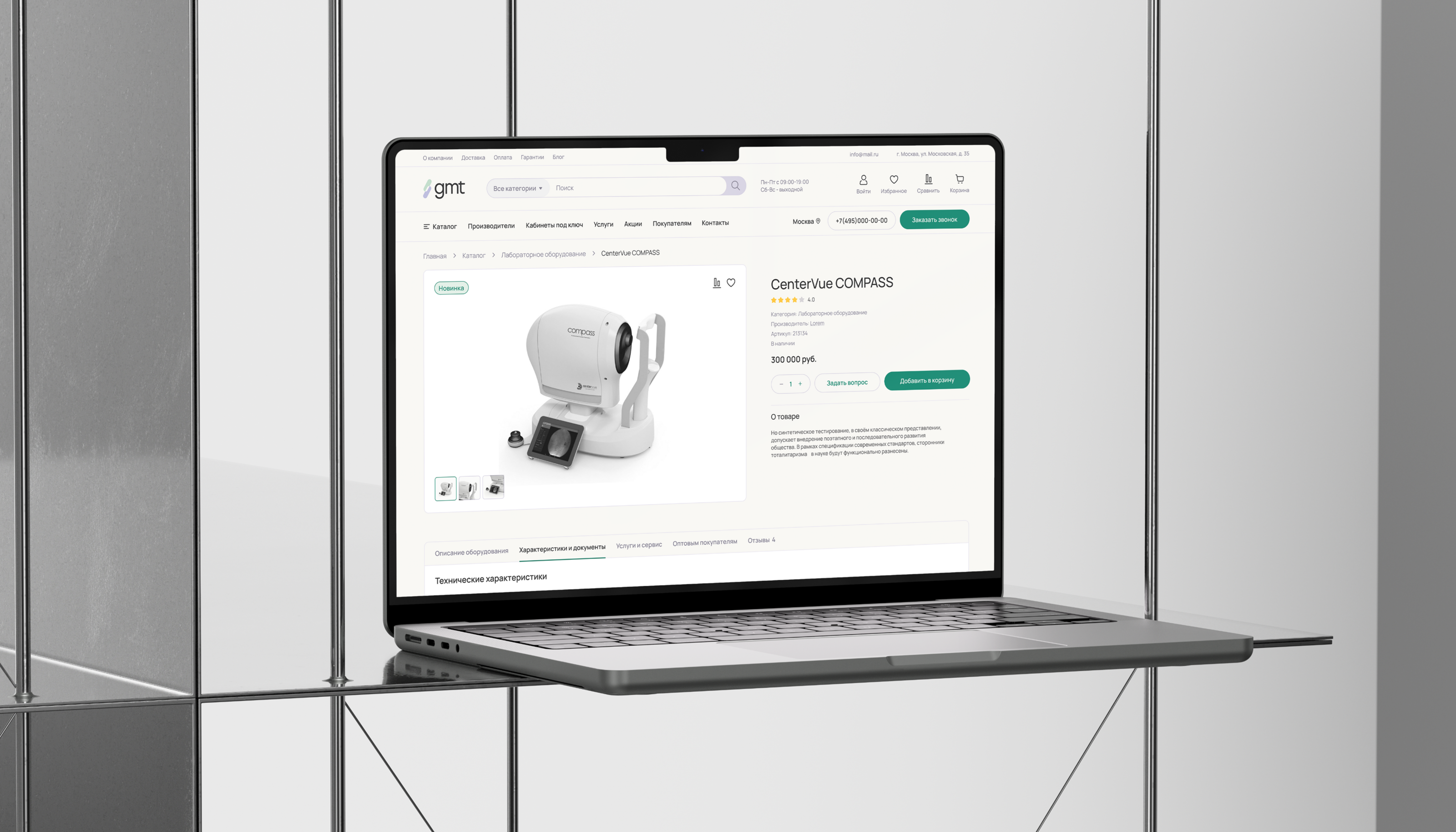
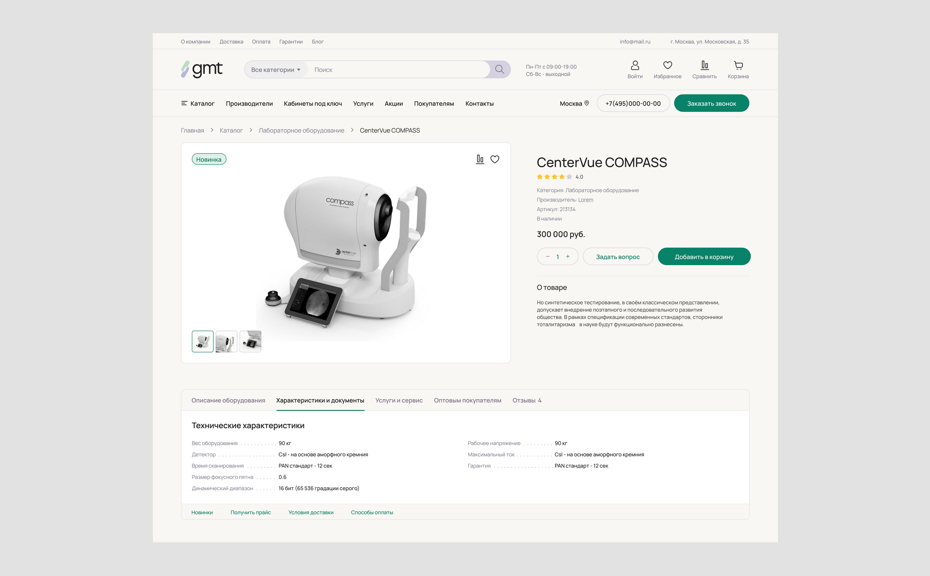
Product page
The product page plays a crucial role in the buying process. Our goal was to make this page an informative showcase of the product, helping potential buyers discover the full range of its features and advantages and make a well-considered buying decision. Detailed features are the key element of the product page. They are structured in a way that helps customers quickly scan the information and assess whether the product meets their requirements
Shopping cart
The first thing the user sees on opening the shopping cart is a detailed overview of all the selected goods. Each item is illustrated and lists its name, price, and quantity. This allows users to double-check the chosen products before placing an order.
Results
Our complex efforts have yielded a modern and recognizable visual identity for GMT. We have optimized the website for more convenient and informative customer interaction. We have also improved its structure and navigation, thus greatly enhancing user experience.