The King's Speech
School branding
2021
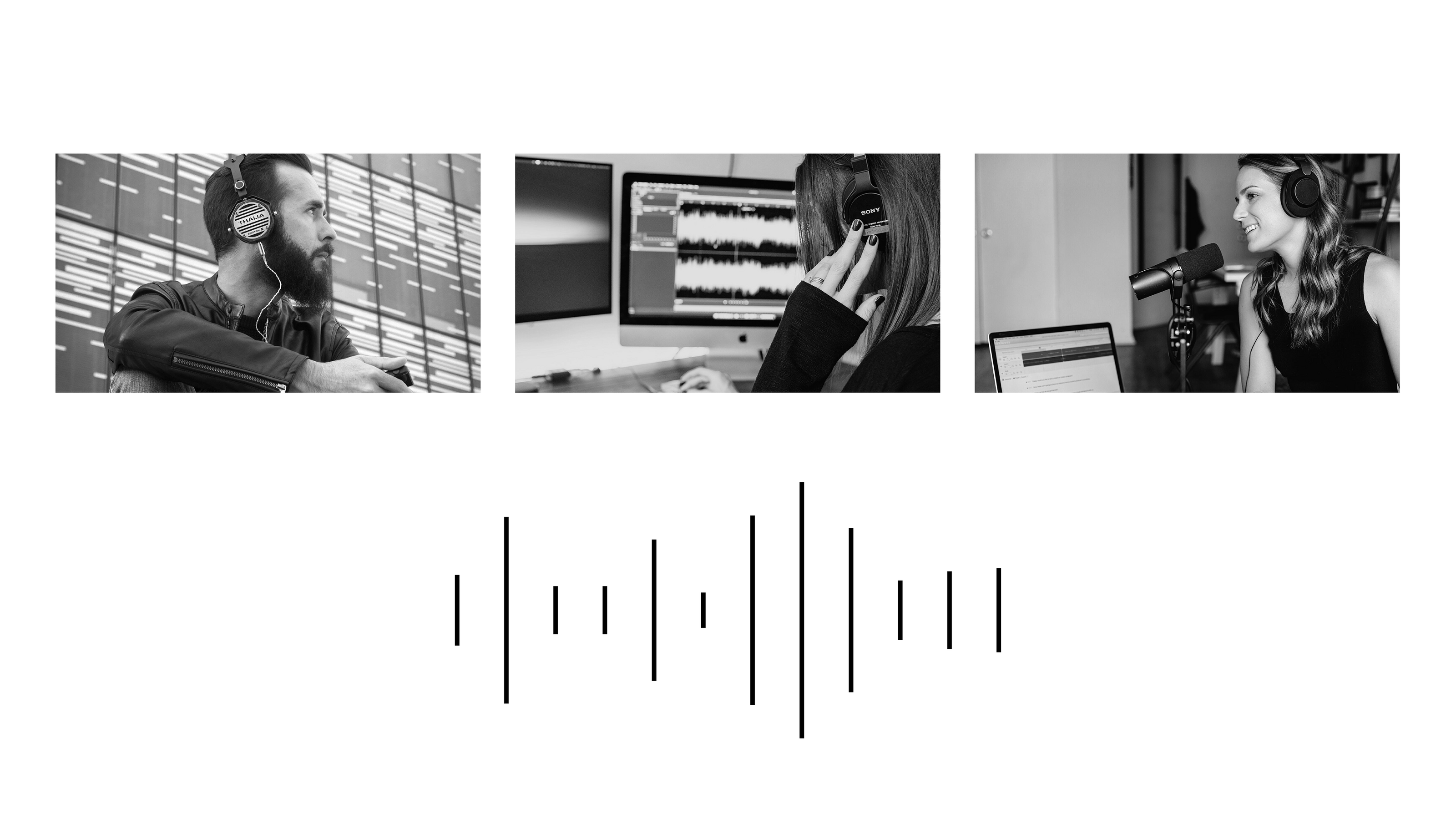
The King's Speech is a public speaking school that helps people from all walks of life, including public speakers, negotiators, bloggers, and broadcasters, boost their oratory skills. Some of the students are there to improve their public speaking skills for their own enjoyment.
The school’s organizational and marketing processes as well as classes are well structured. The methodology and the teachers are definitely among the school’s key assets.
To understand the key features to be reflected in the design, we had to define the brand personality. To that end, we interviewed the client in as much detail as possible and carried out an in-depth study.
Based on the results of the briefing and the study, we singled out the following features:
- Calm restraint
- High-tech effectiveness
- Aristocratic dignity
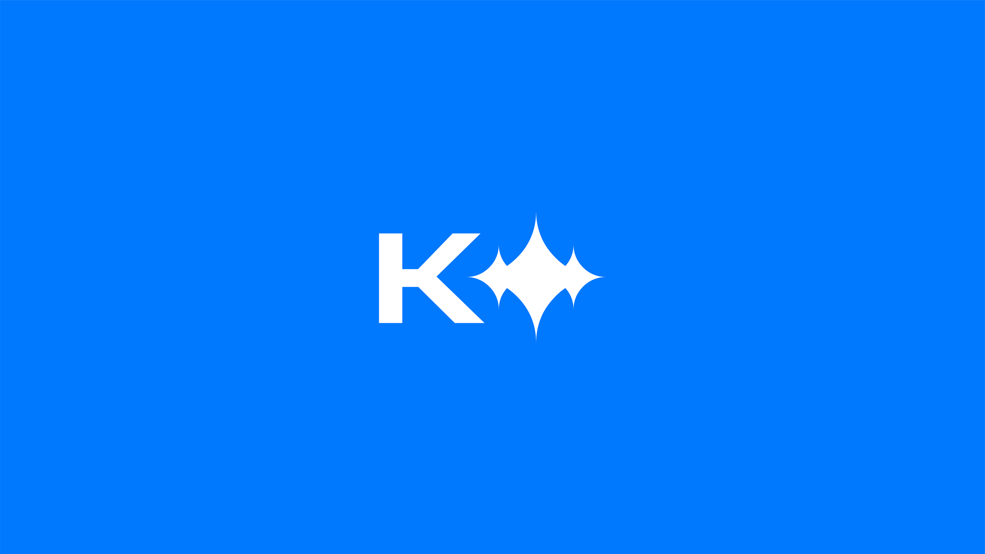
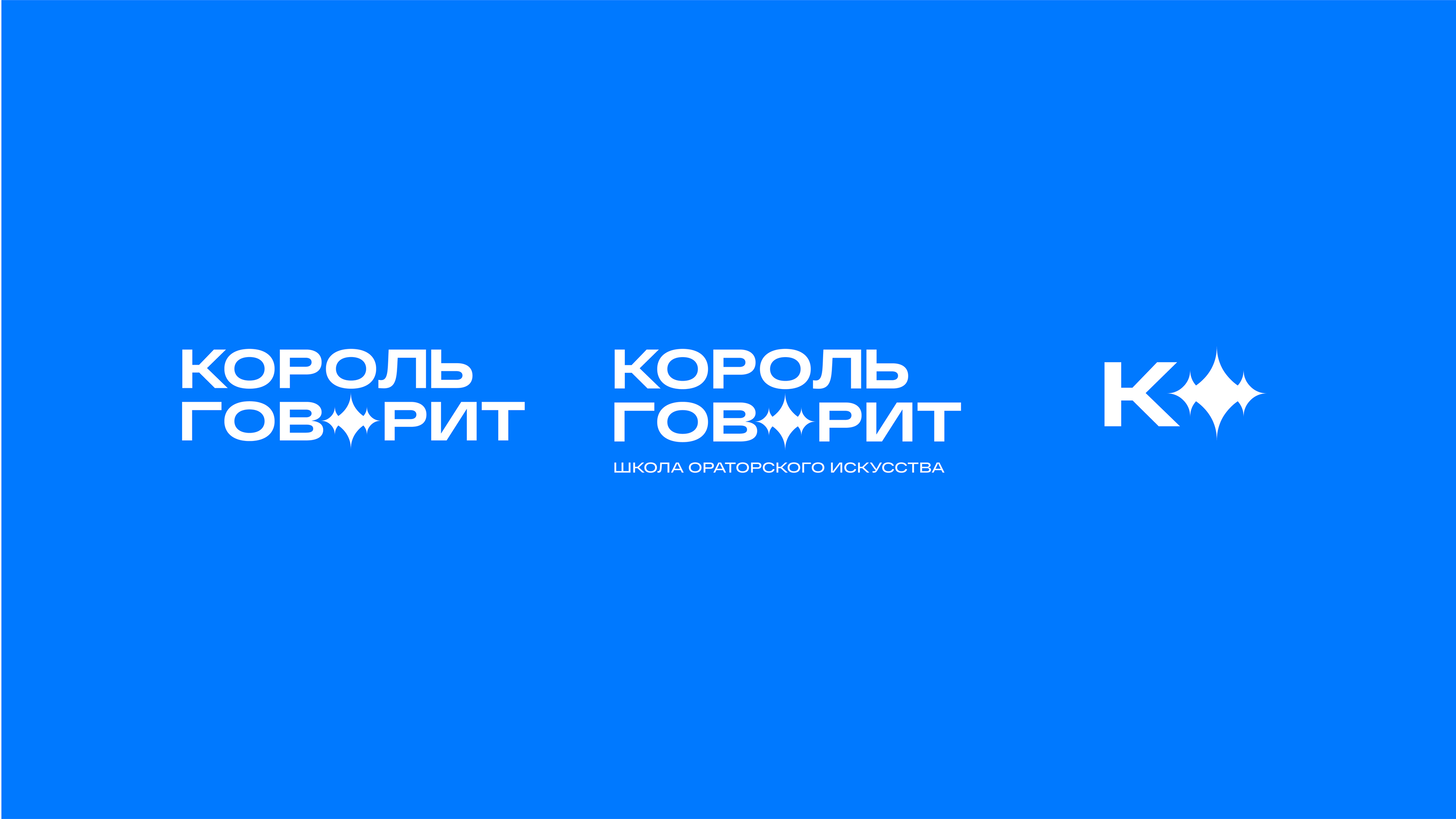
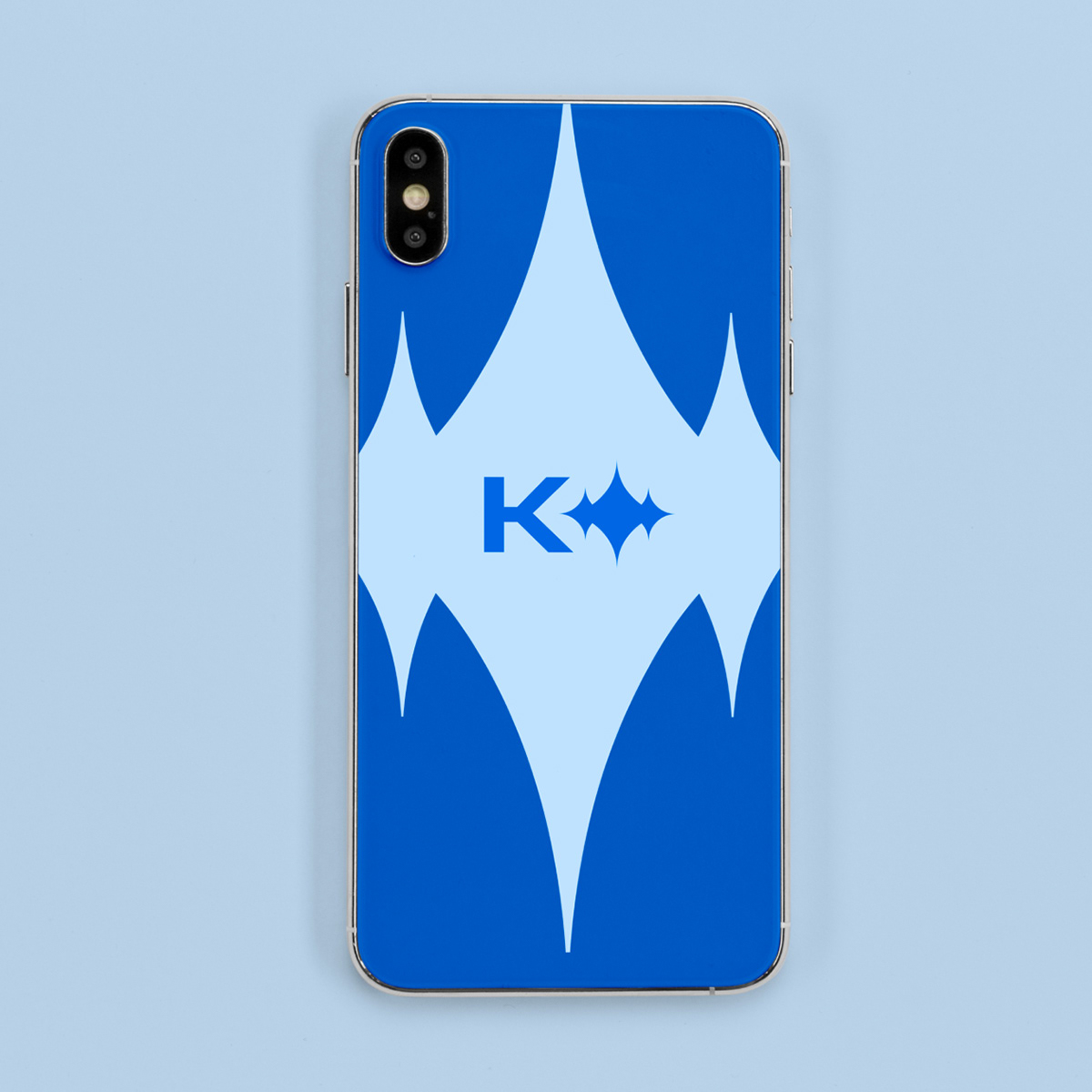
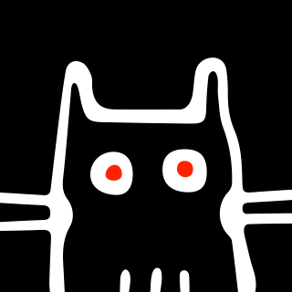
We were inspired by the sound of the human voice, the stories of the school’s students, and their feelings about the school. During conceptualization, we realized that the image of a sound wave would be the perfect choice for the logo.
Despite its simple abstract form, the image of a sound wave is easily recognizable even in its miniature version, unlike the original crown.
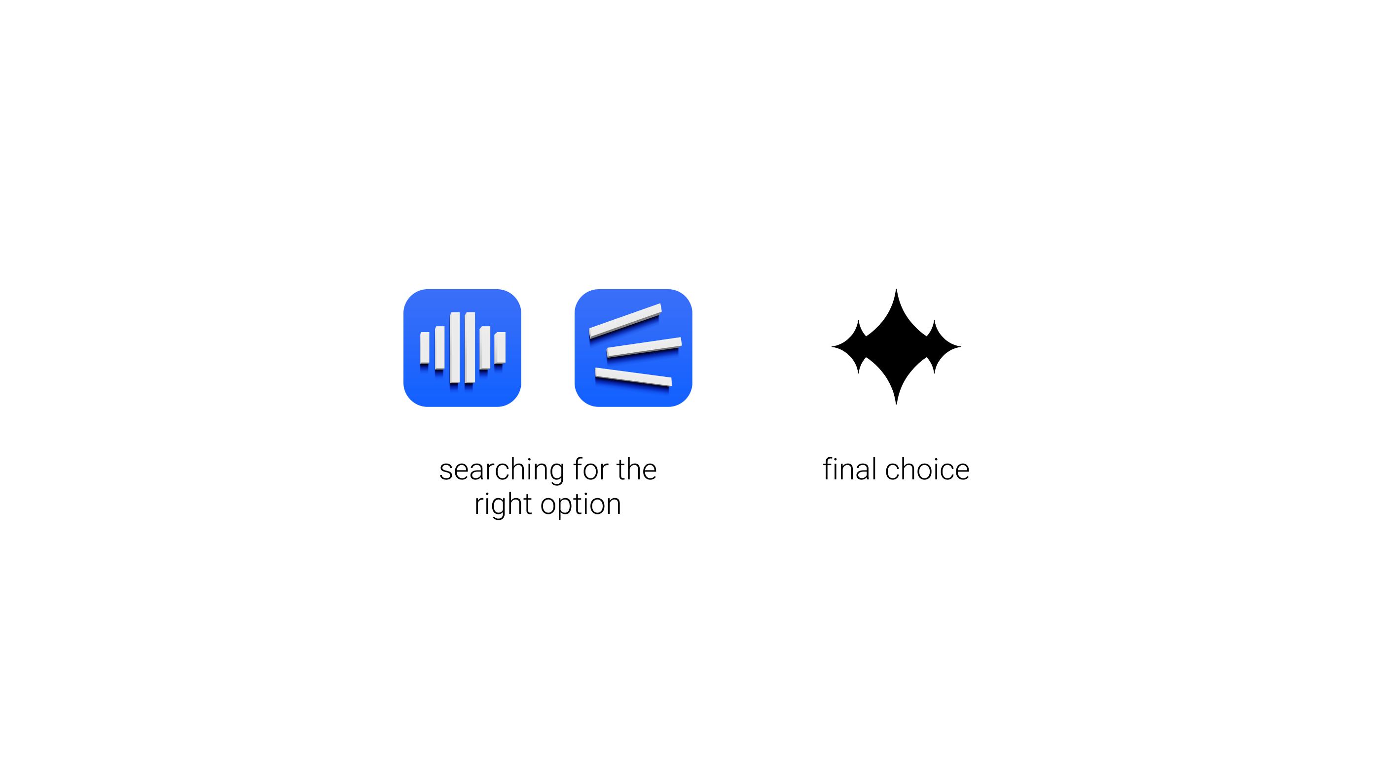
Different options were put to the test. We tried to visualize a wave, a voice, a clear direction. We also tested specific images to see how they would fare in different layouts and formats.
Taking into consideration the client’s wishes and the need to scale the logo, we thought it would be a great idea to add to it the company name in a large font, making it clear and visible.
The font used in the logo emphasizes the plasticity of spoken words. The icon imitates the shape of a sound wave and at the same time references the images of a crown and a star.
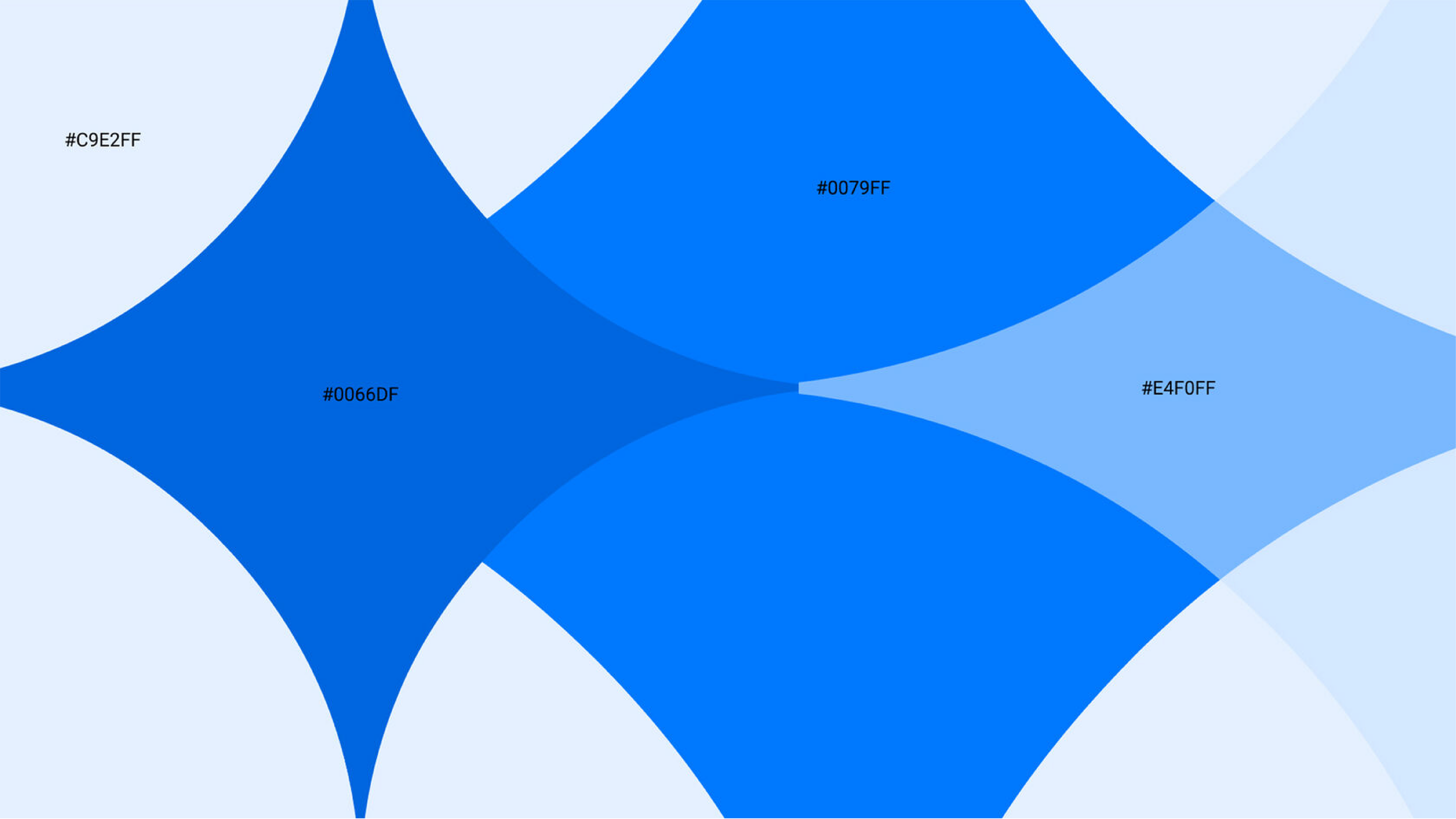
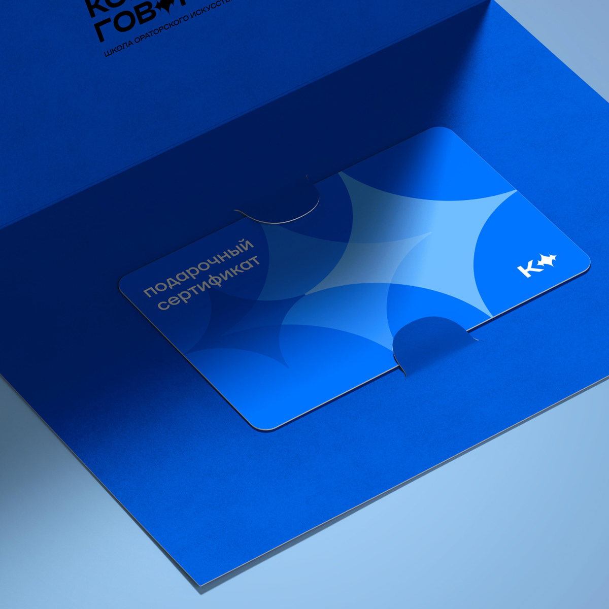
Color is important for the integrity of brand perception. To that end, we enabled changing the opacity of the colors from the main palette to create additional shades. These shades can be used in building interfaces and illustrations.
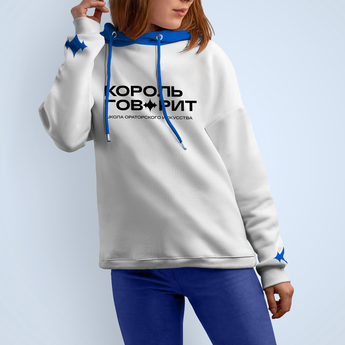
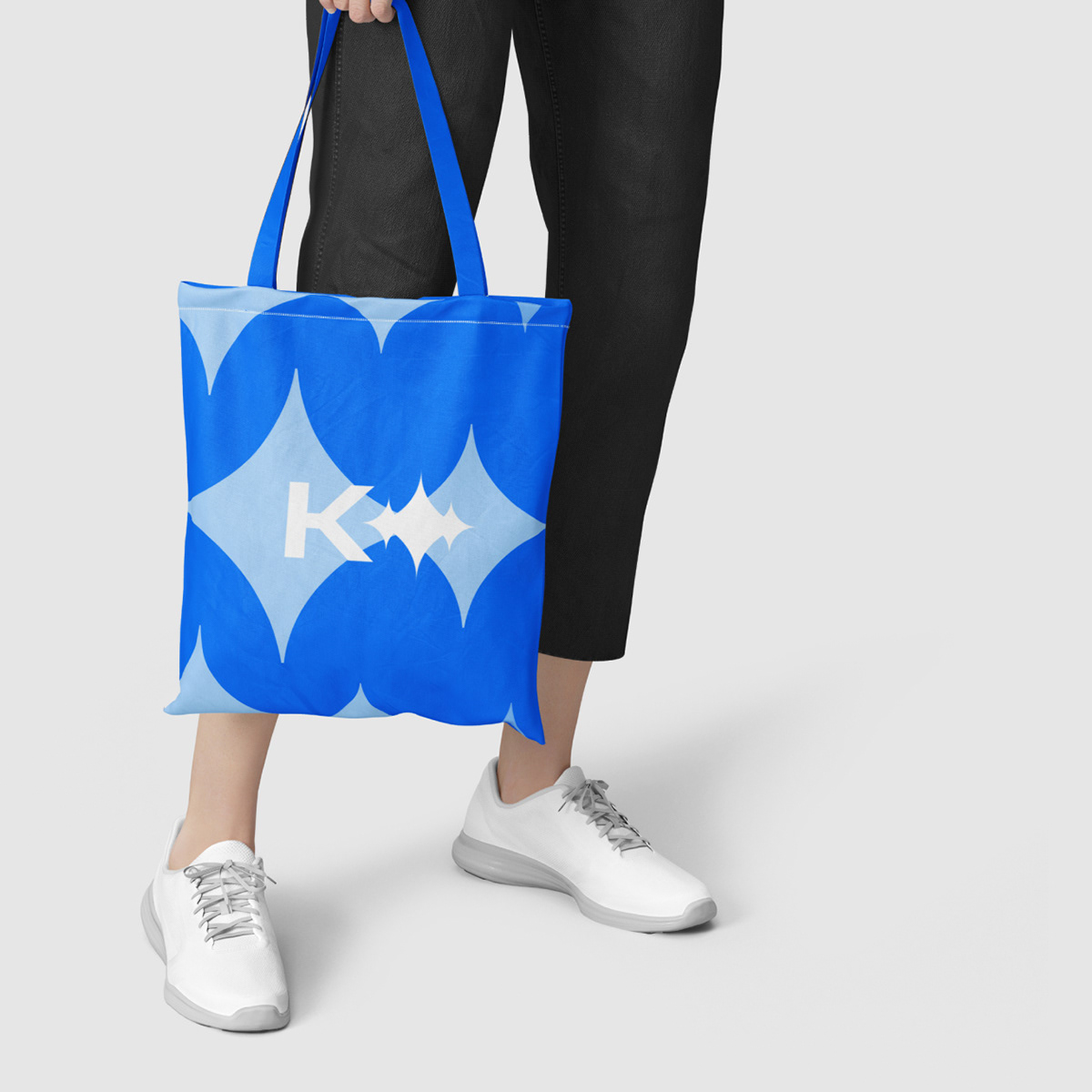
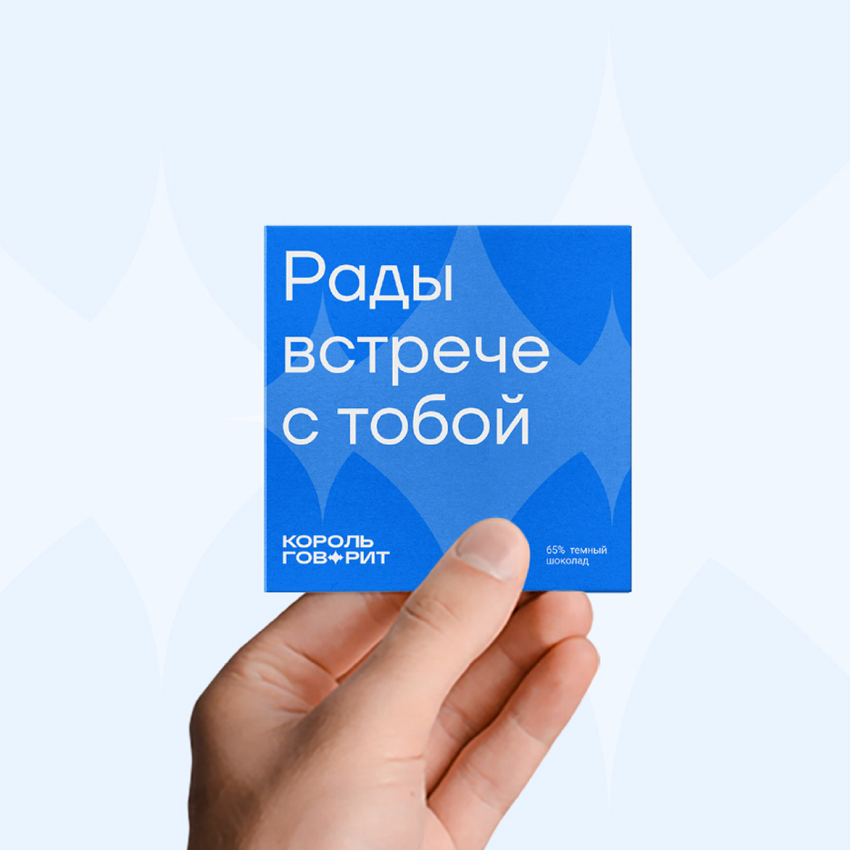
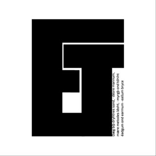
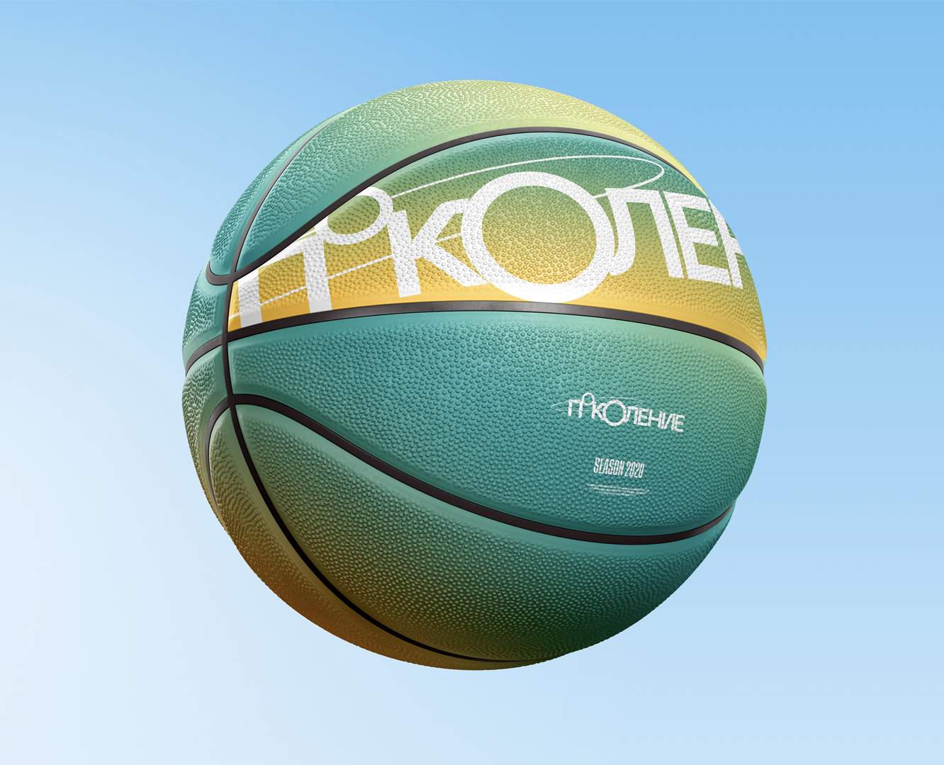
The branded graphics play with the various types of communication in the modern world: offline public performances, online chats, and voice messages.
The composition can be changed depending on the design purpose —for example, simple geometric shapes can be added to it.
Graphics can be used in settings that require visual differentiation of layouts — for example, on social media.
Also, in order to design the branded graphics, we used the shape of the sound wave from the logo, but with less acute peaks. This image can be taken apart, and other shapes can be built on its basis.
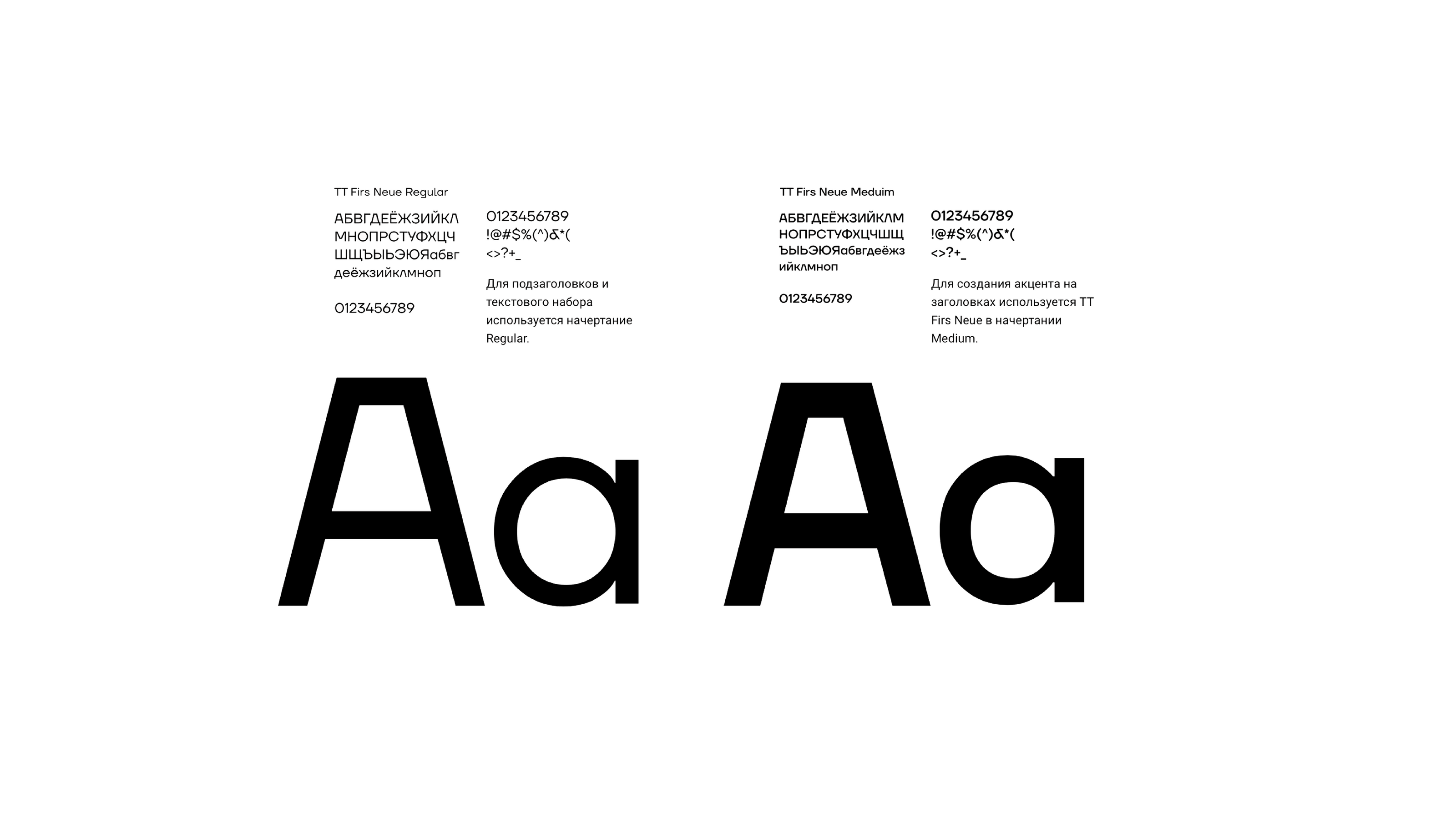
We used the TT Firs Neue Sans Serif typeface from TypeType. Thanks to it, the typography became airy, yet geometric and eye-catching. Thus, it developed a stronger “personality.”
For subheadings and texts, Regular font was used.
The TT Firs Neue in Medium was used to emphasize headings.
After working out the brand identity, we outlined the rules for its use in the brand book and implemented them in layouts.
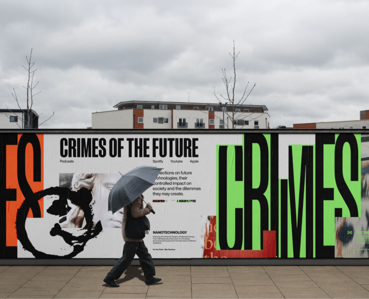
Each layout uses the logo as well as its elements in all kinds of formats.
Most importantly, the system we developed allows for natural use of the brand identity in a variety of settings without ruining the unity of the branding.
As a result, we have developed a meaningful brand design that meets all of the client's goals. The branding components are interconnected and scalable for different purposes. We have also provided implementations for different settings and formats, in which the branding could be used today or in the future.
An important element of this kind of work is design supervision or assistance in the implementation of the branding. Quite often, a design system will collapse during implementation. At that point, the key task is to assess the system correctly and use it in specific formats without distorting the original idea.
We make digital solutions that BRING BRANDS AND PEOPLE CLOSER.
Want to be closer? Work with us!
we@hvbrains.com