A fresh look at history: an identity for a confectionery factory.
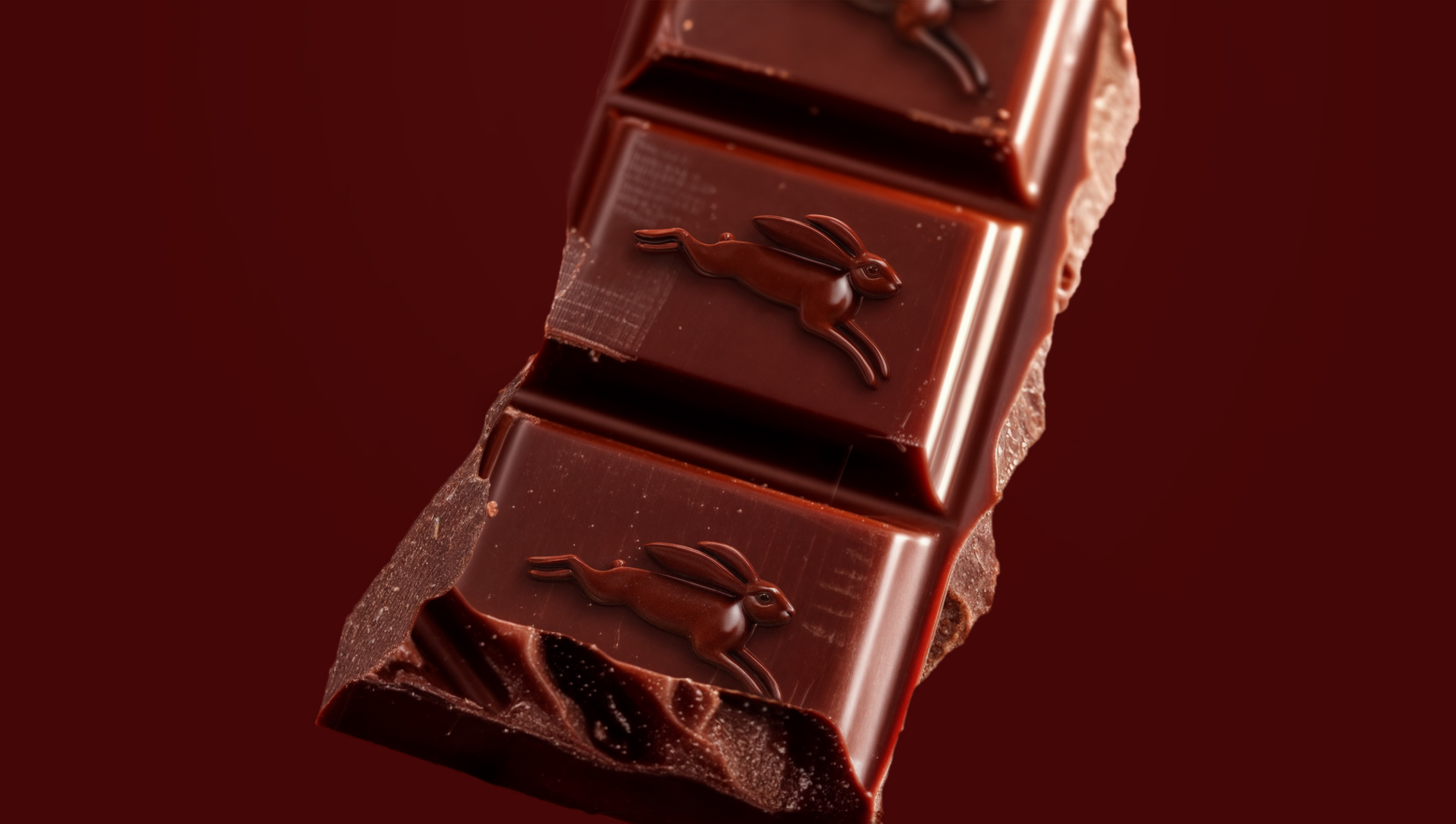
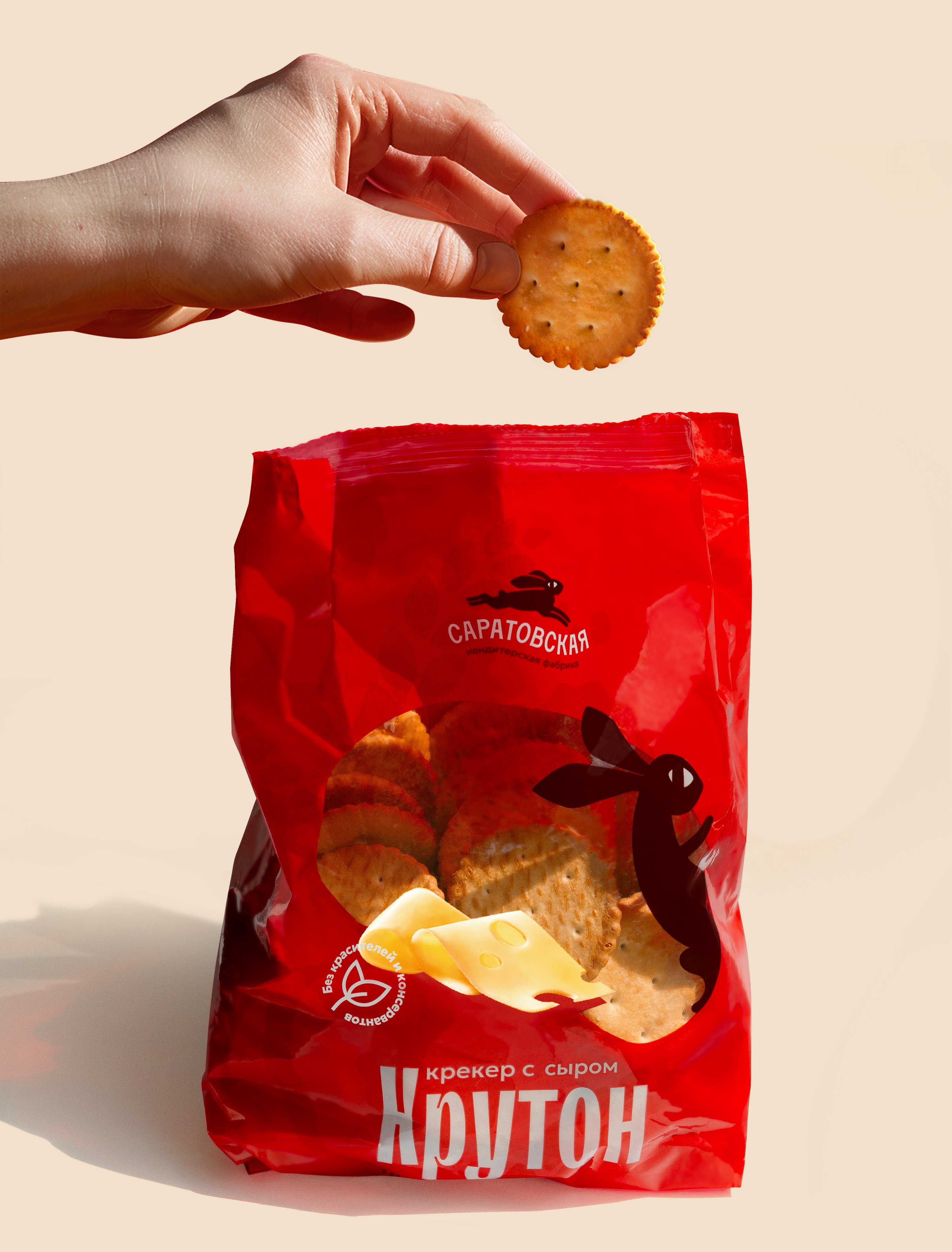
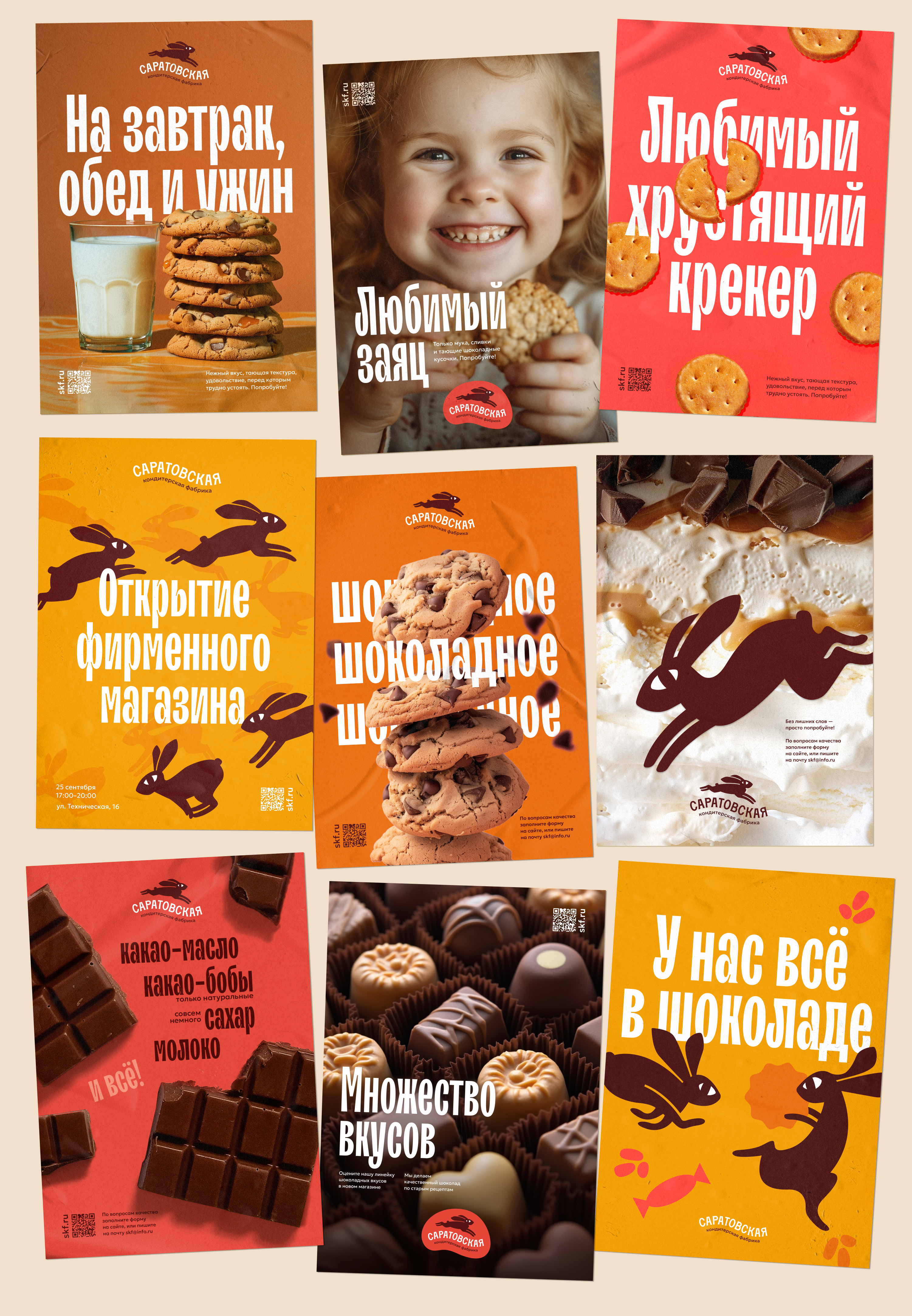
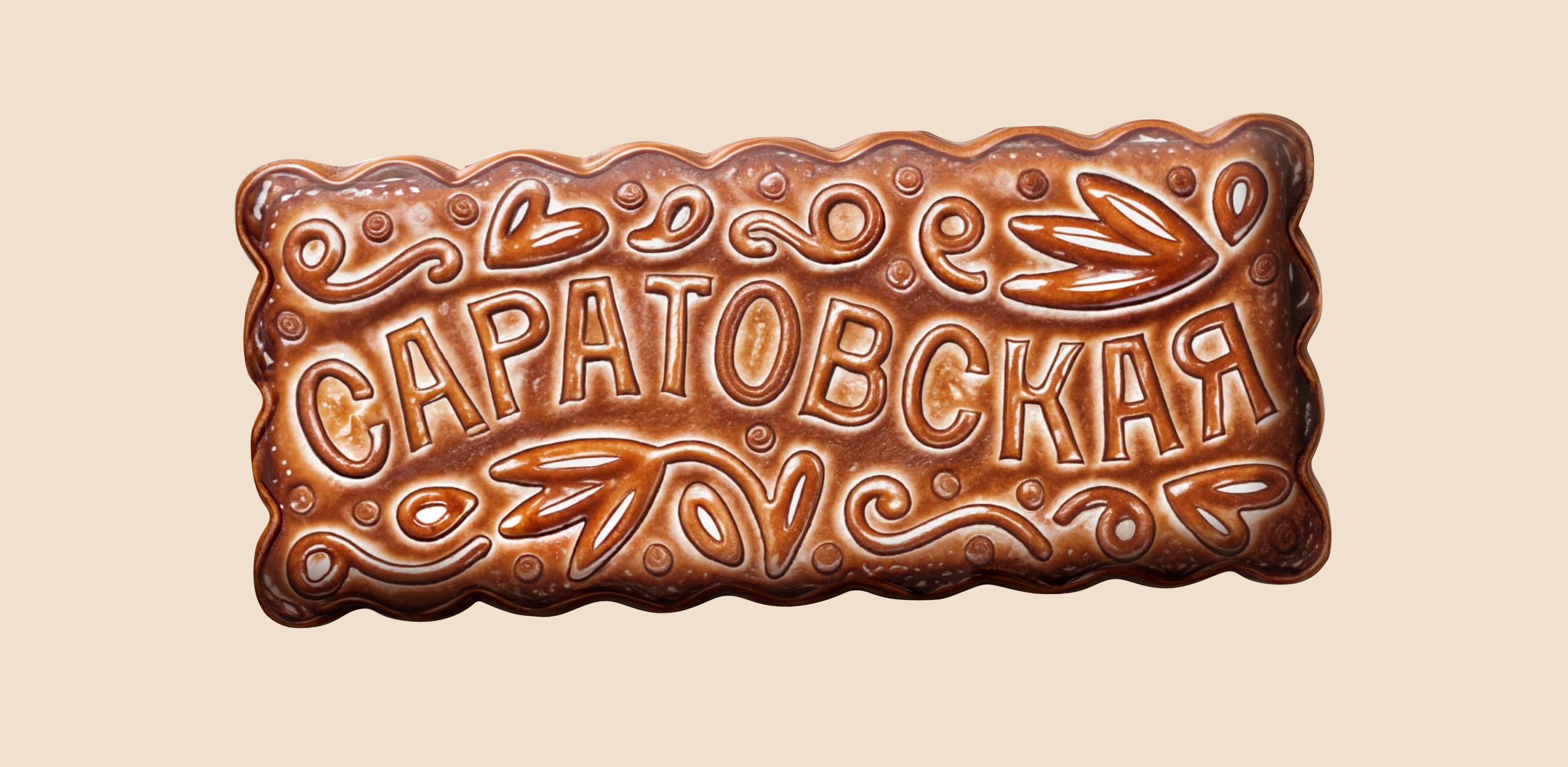
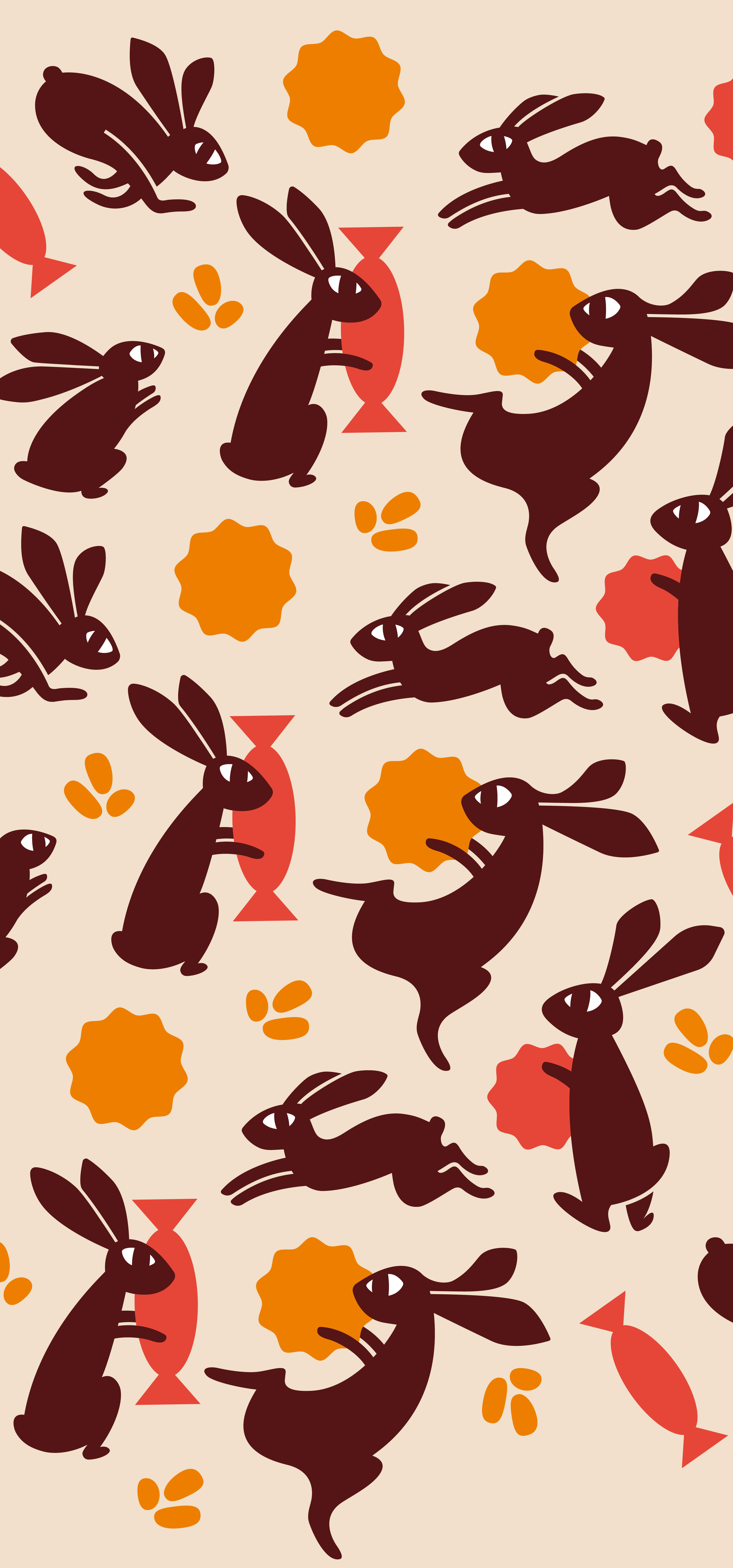
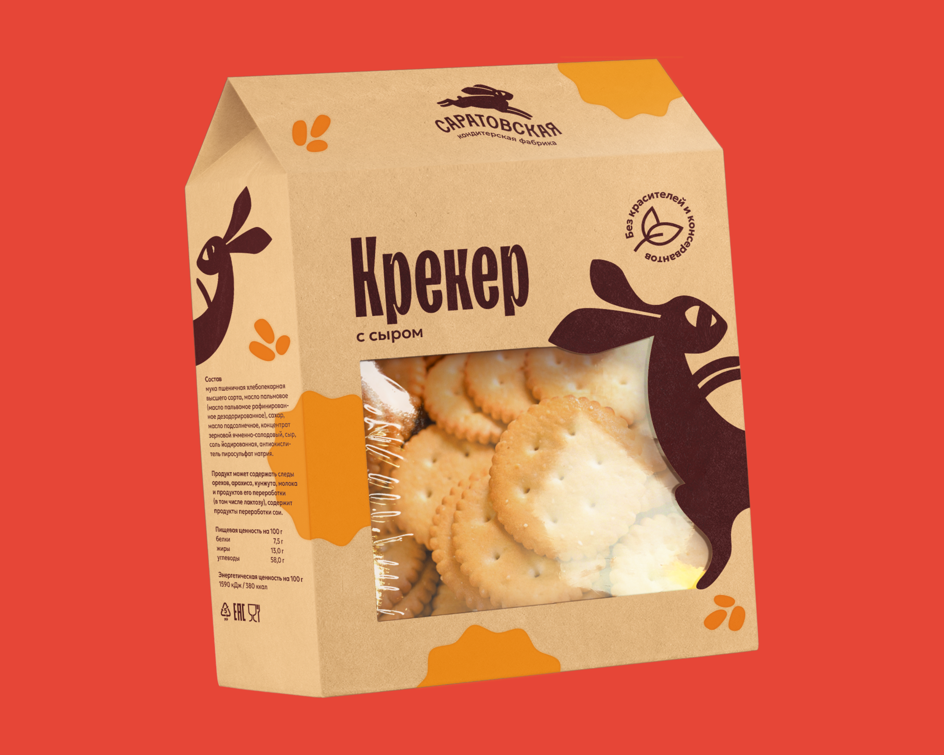
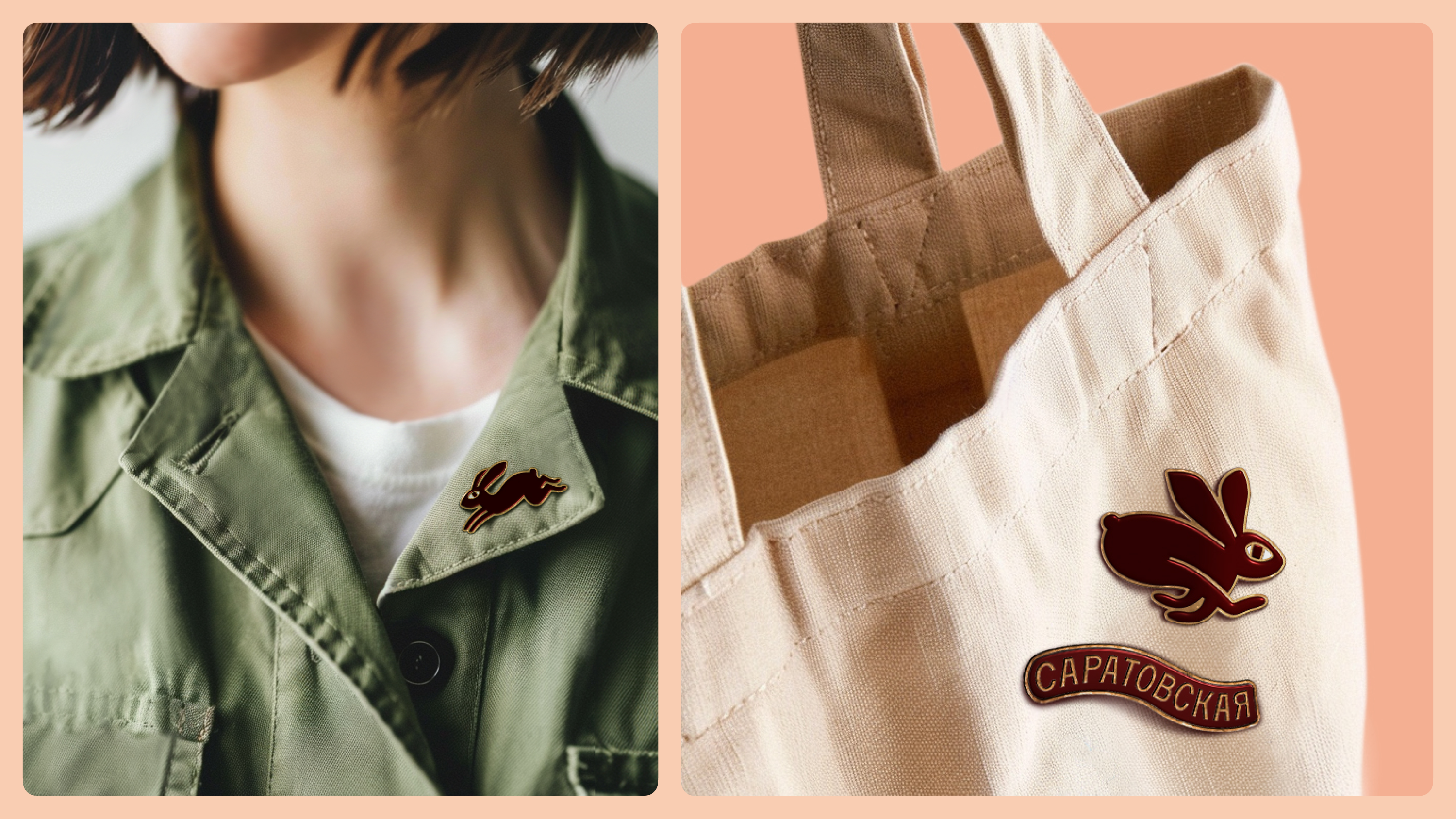
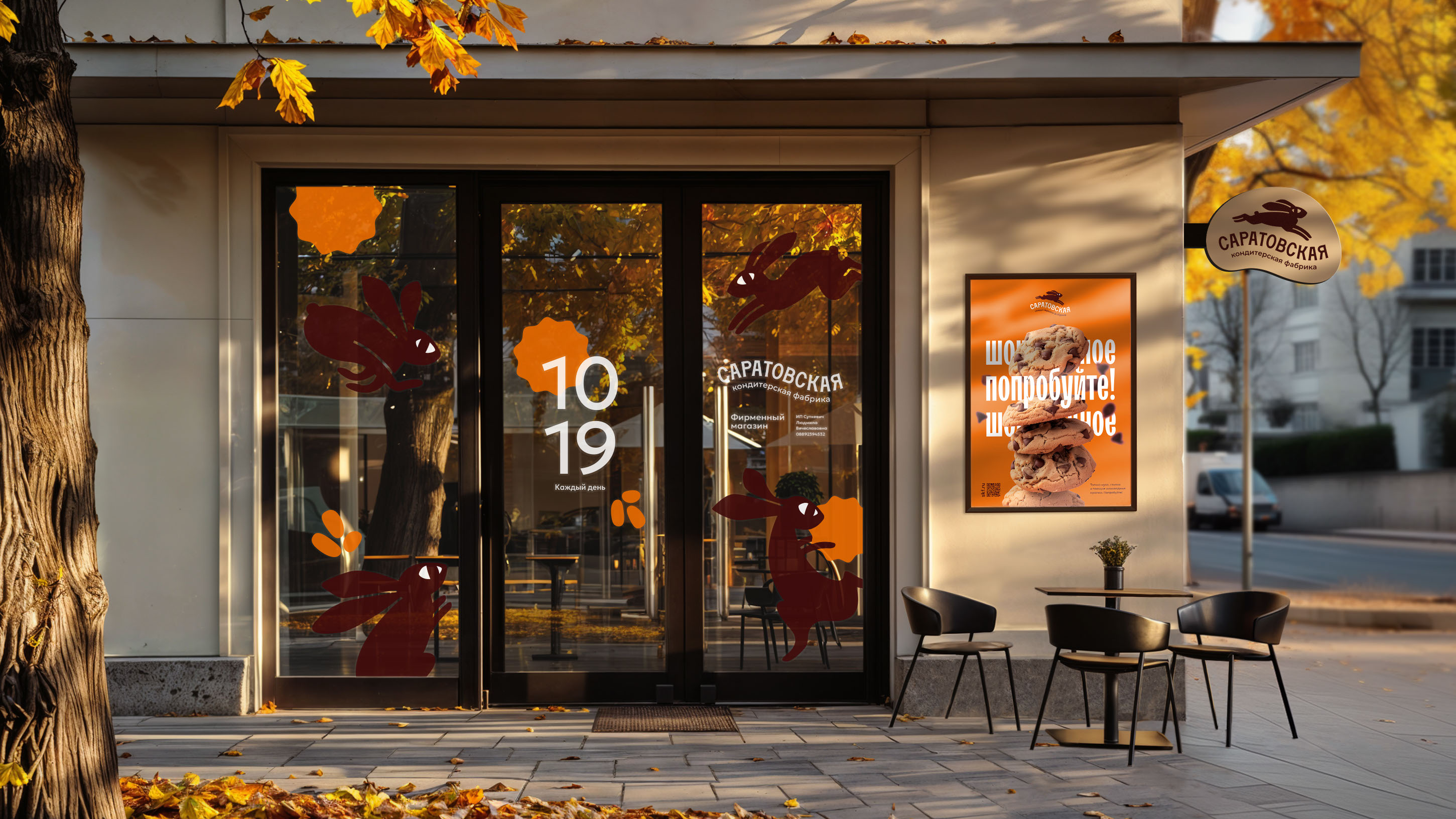
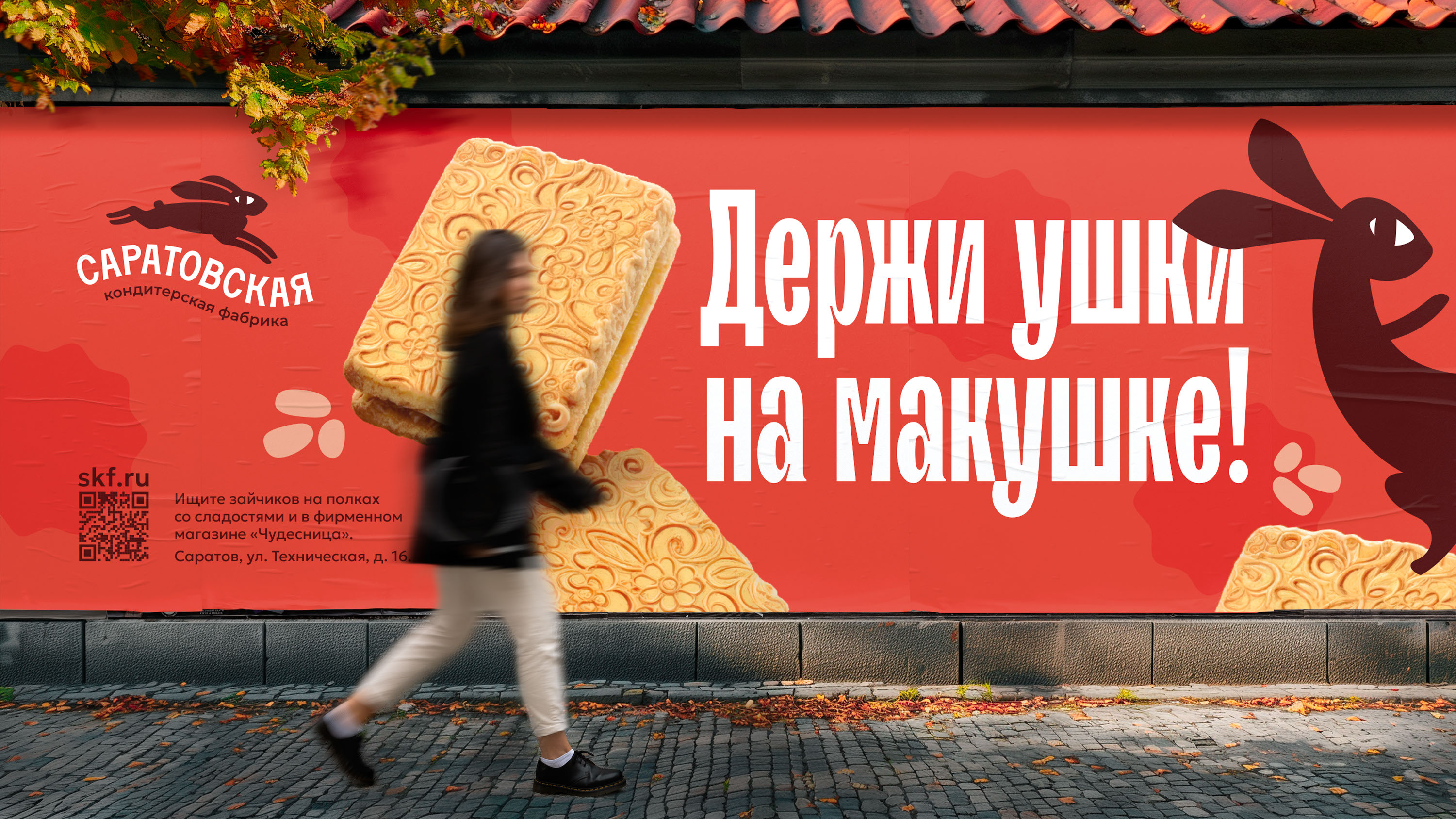
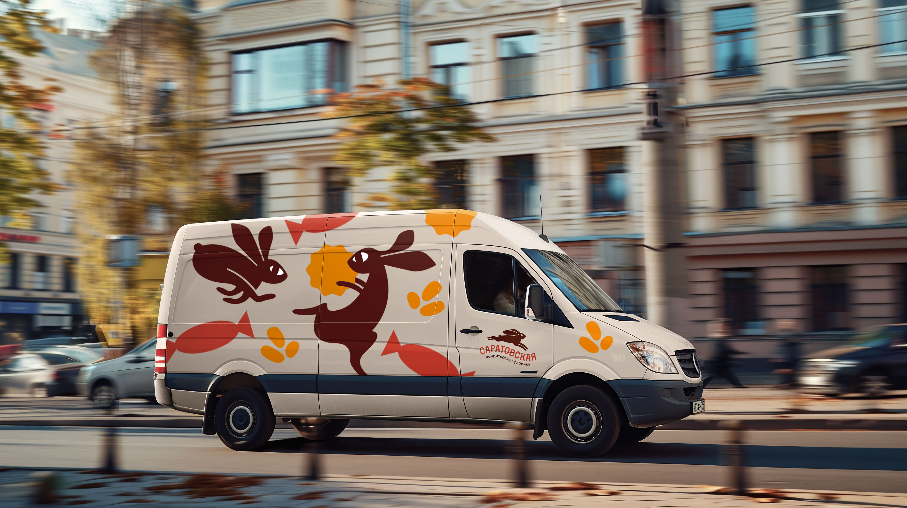
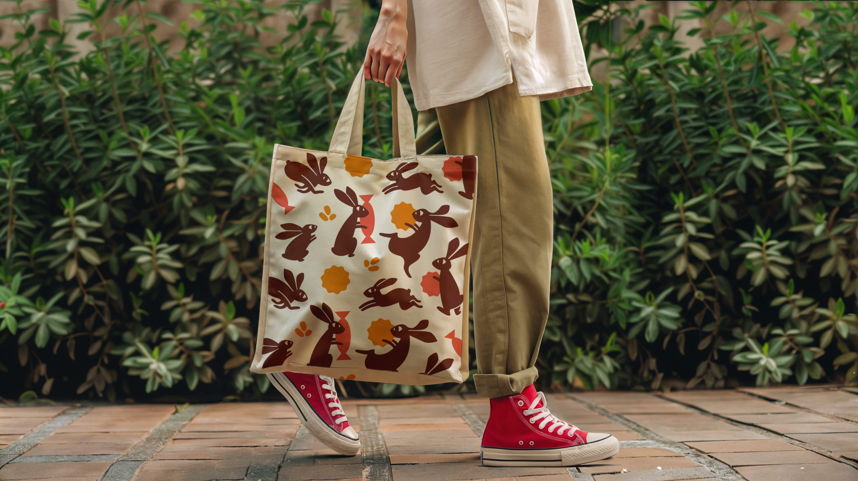
A chocolate hare is the new symbol of the Saratovskaya confectionery factory. The company with almost 100-year history decided to update its image and made the first step with Voskhod: now the brand has a new identity, logo and packaging.
The range of coral, caramel and bright yellow was chosen for a reason: the colors emphasize and combine well with the main one - chocolate. We were looking for a cute and at the same time dynamic image of an animal, understandable to the Russian consumer. The hare suited us just fine. The new trademark character personifies movement: different images of the long-eared hare will decorate the whole range of the company's products. The logo also reflects the mood of the brand - to actively move forward.
VOSKHOD BRANDING
Strategist: Pavel Putintsev
Design Director: Vladislav Derevyannykh
Art Direction: Alina Kogteva
Designer: Maxim Geychenko, Alexey Klimov, Dariya Harina
Motion Design: Ildar Biktimirov
Photo Retouching: Marat Dzhantuganov