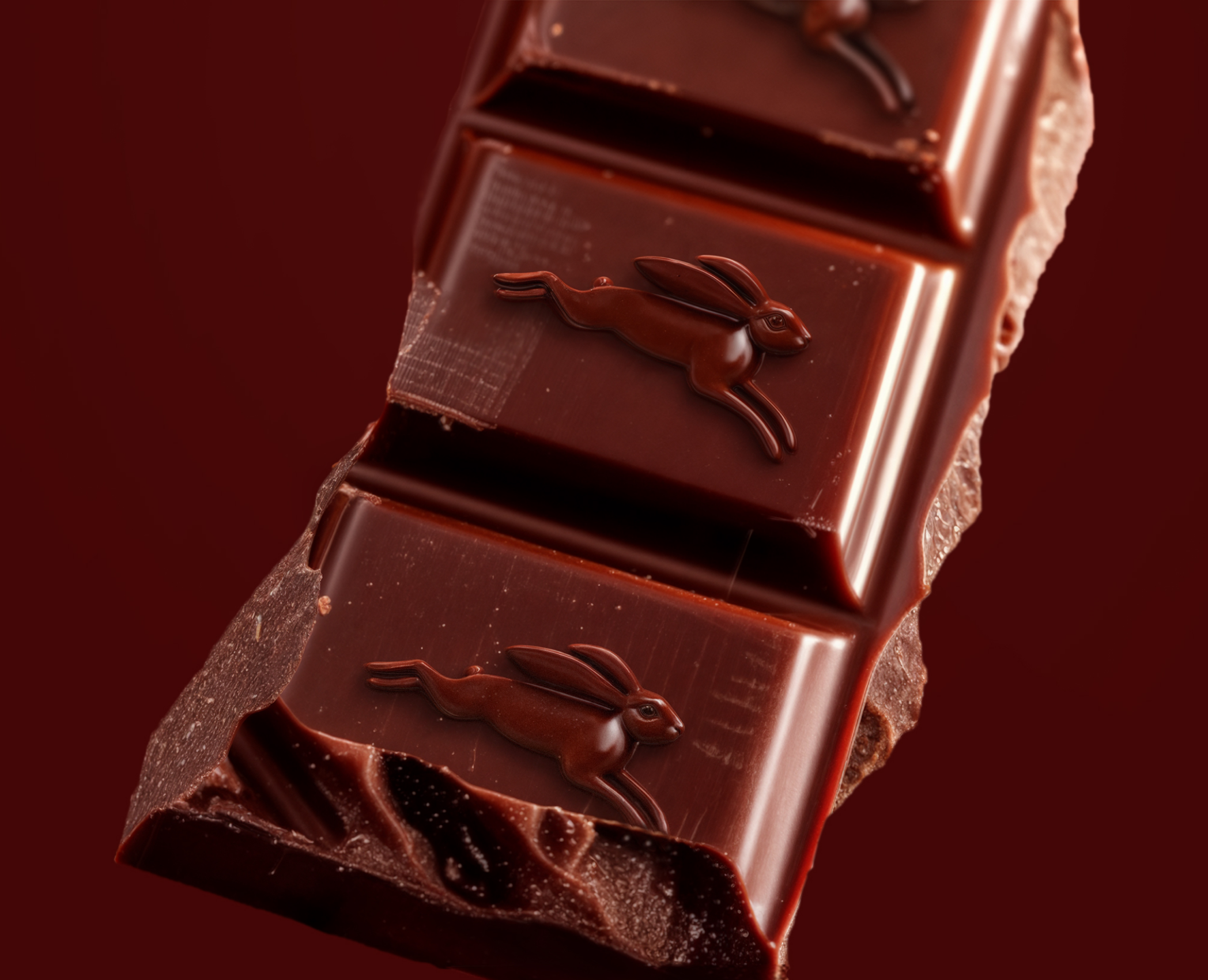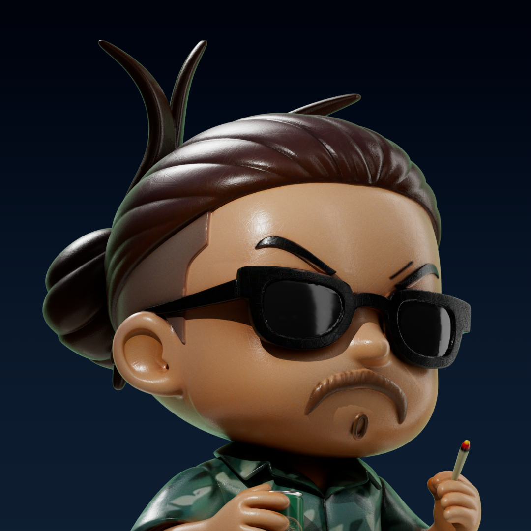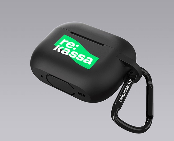

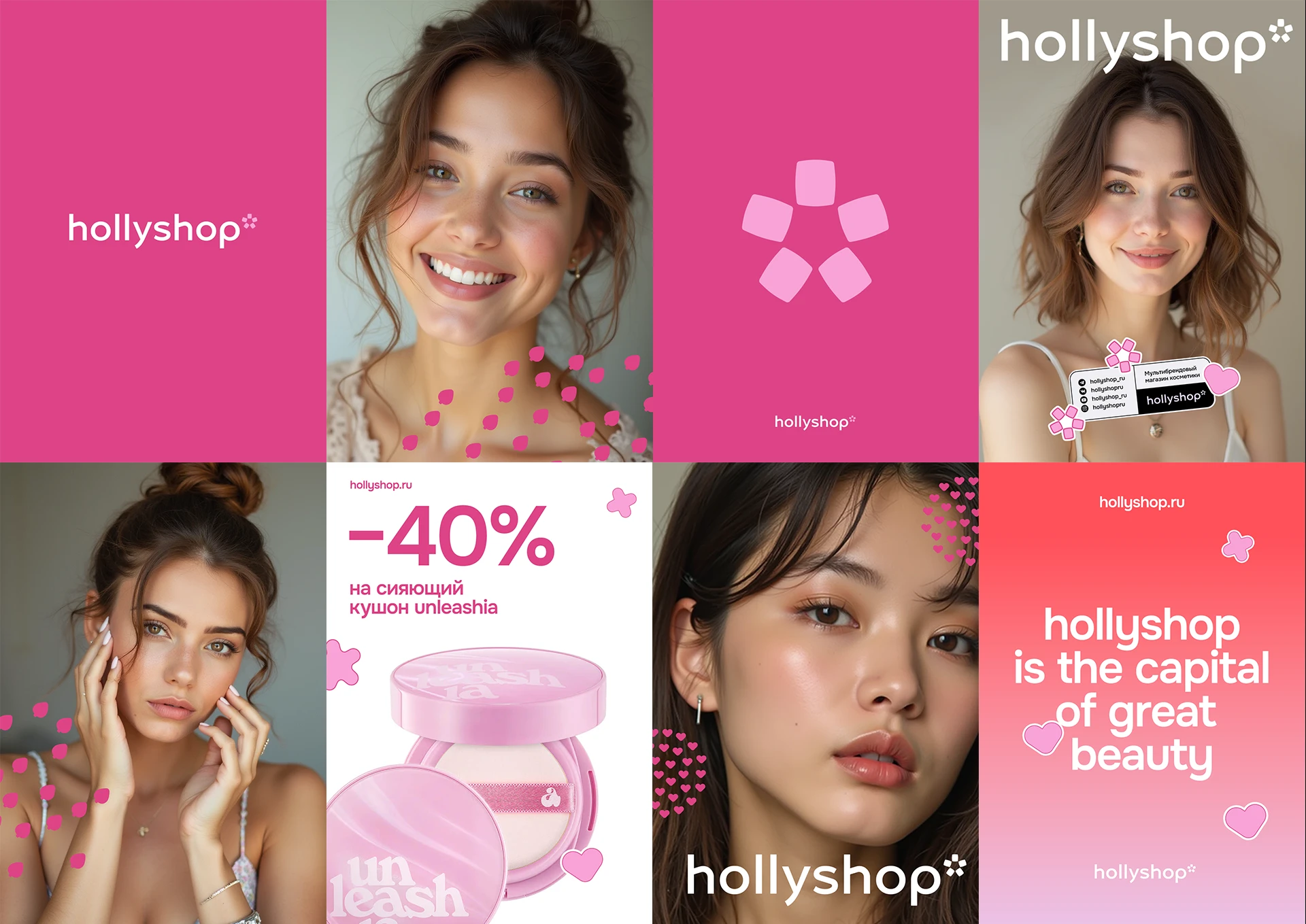
Айдентика Hollyshop была обновлена к юбилею бренда, отражая как рост аудитории компании, так и изменения визуальных ожиданий в сфере beauty e-commerce. За годы работы бренд стал одним из ведущих игроков на рынке корейской косметики, предлагая тысячи оригинальных и редких продуктов. Обновлённая визуальная система стала естественным этапом развития бренда, позволяя ему говорить на более современном визуальном языке и уверенно конкурировать как с локальными, так и с международными digital-игроками.
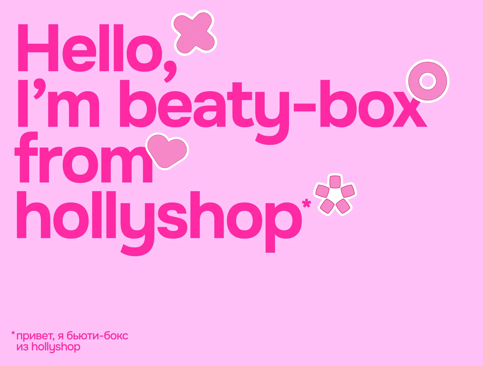
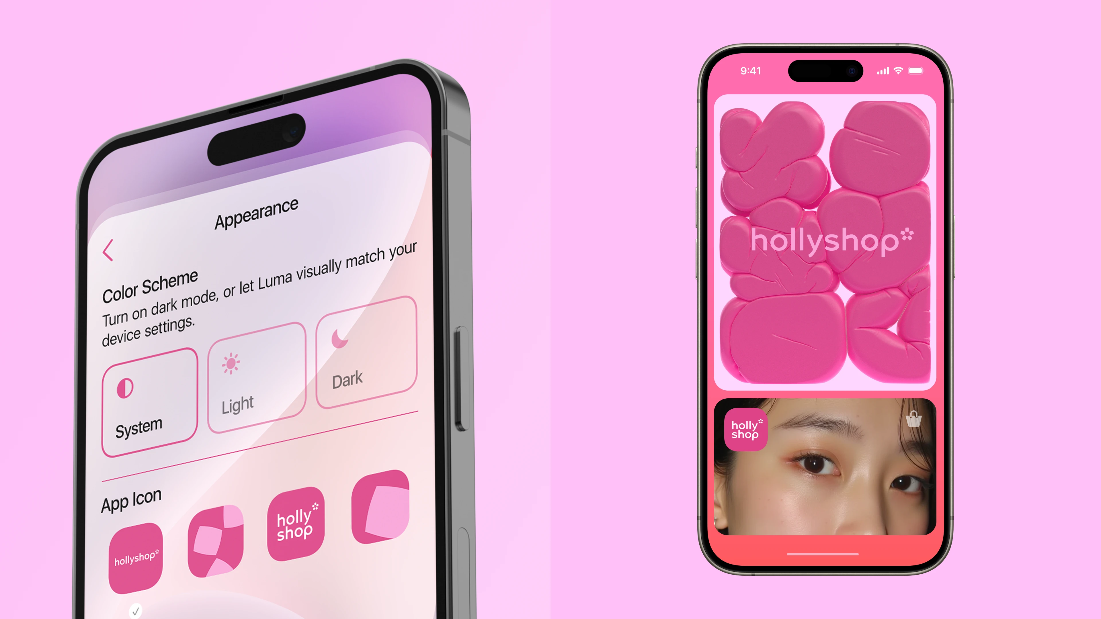
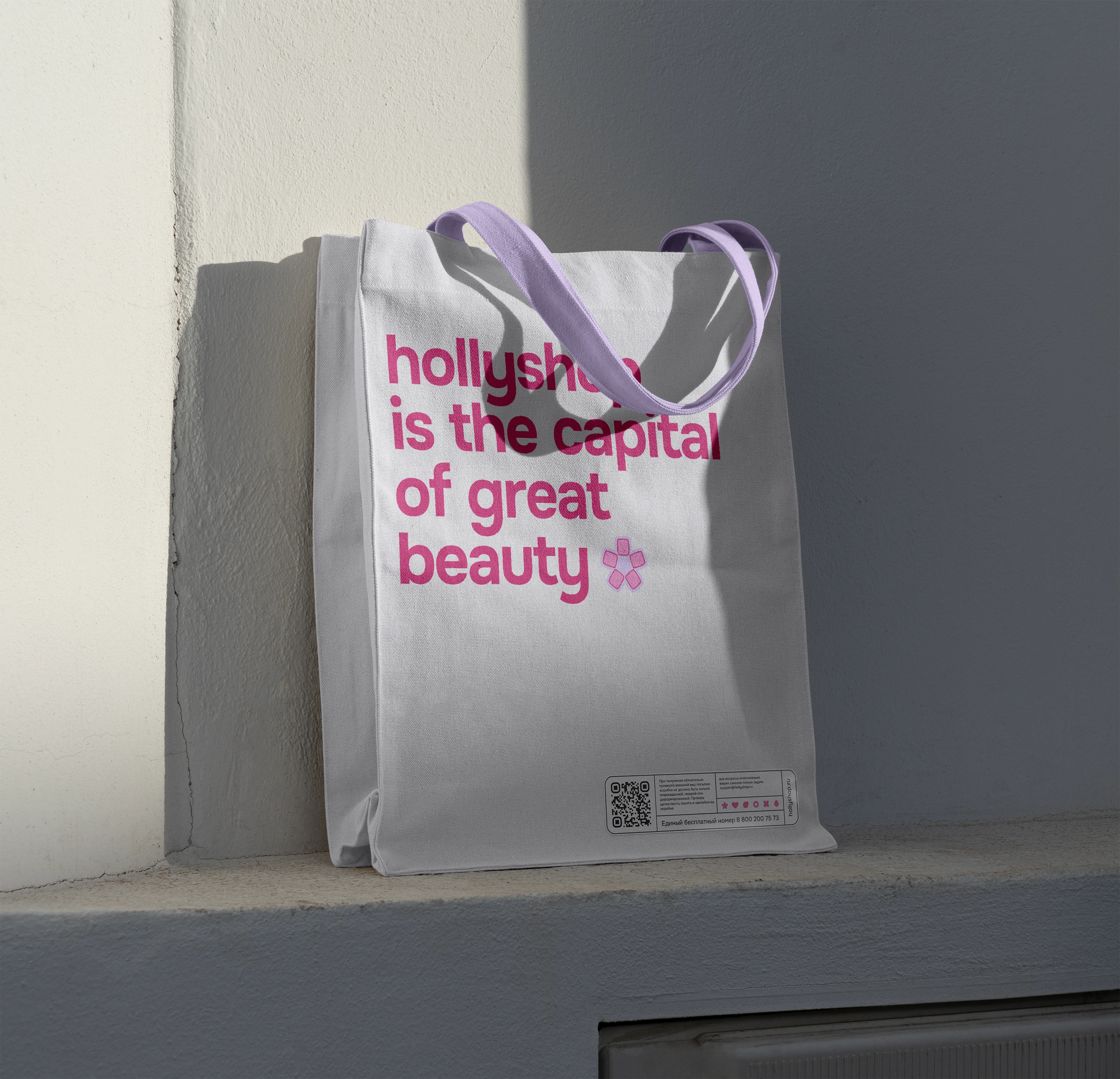
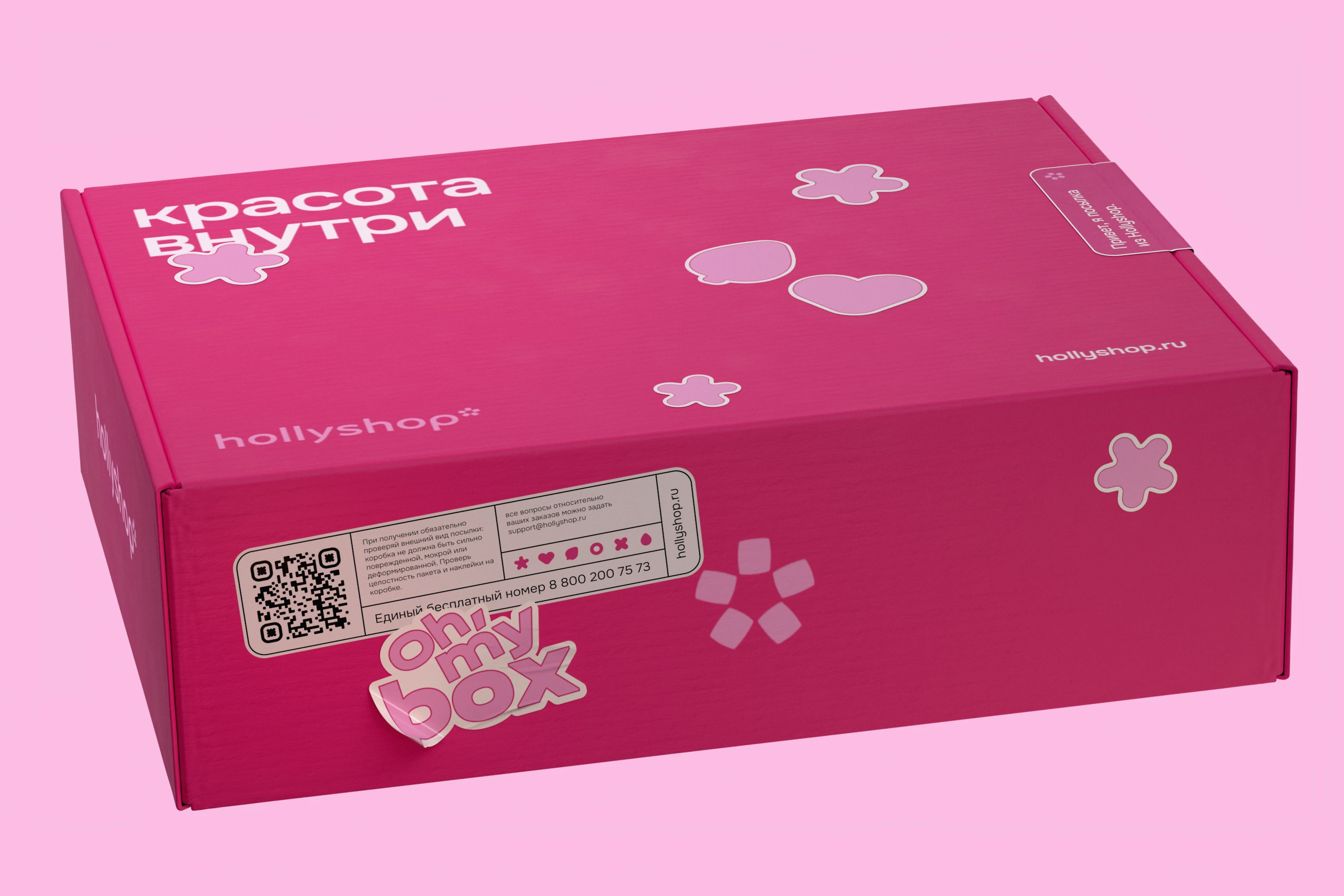
В основе редизайна — баланс между дружелюбностью и экспертностью. Обновлённый логотип получил тонкую отсылку к корейскому происхождению ассортимента, усиливая ассоциации с K-beauty без использования прямолинейной символики. Дополнительные элементы — иконки, стикеры и паттерны — формируют гибкую и динамичную визуальную систему. Цветовая палитра и графический язык передают ощущение лёгкости и доступности, сохраняя при этом чувство точности и высокого качества.
Identity introduction video
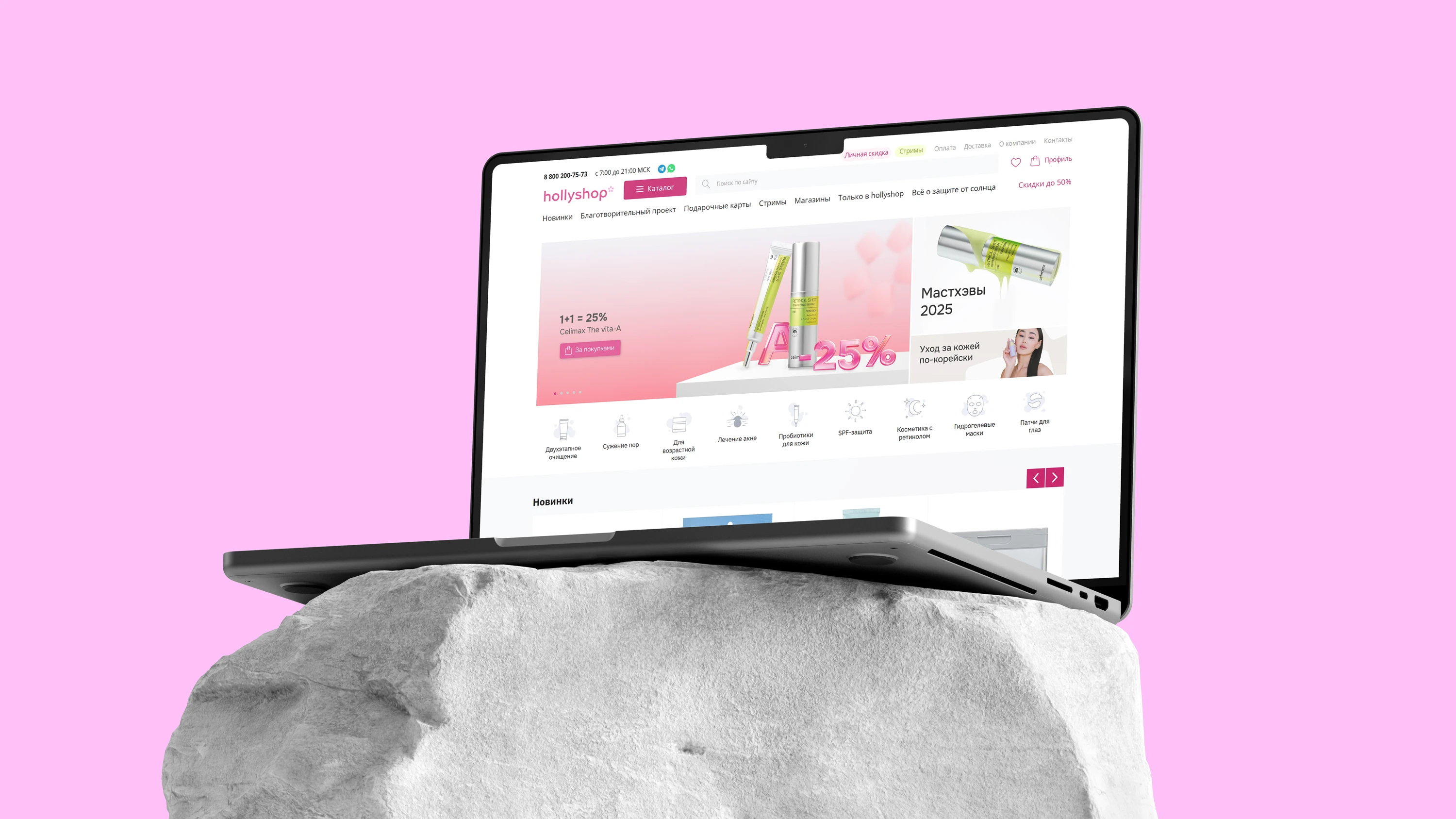
Обновлённая айдентика усиливает общее восприятие Hollyshop, делая бренд более премиальным, но при этом близким и понятным аудитории. Такой подход укрепляет позиционирование бренда как эксперта в области корейской косметики и формирует цельный пользовательский опыт — от первого контакта с коммуникацией до взаимодействия с продуктами на сайте.
VOSKHOD BRANDING
Стратег: Павел Путинцев
Бренд дизайн директор: Владислав Деревянных
Арт директор: Максим Гейченко
Дизайнер: Максим Гейченко, Алексей Климов
Моушн дизайнер: Максим Гейченко, Ильдар Биктимиров
Фоторетушь: Марат Джантуганов