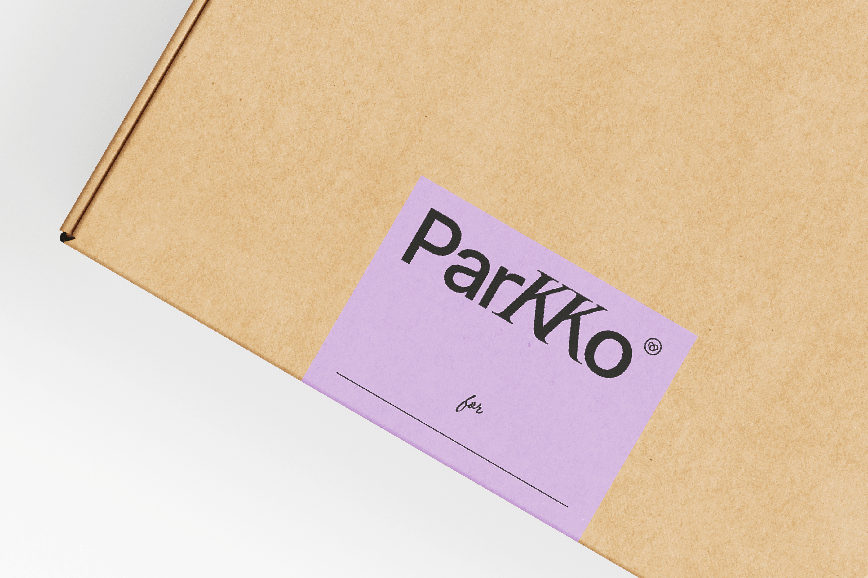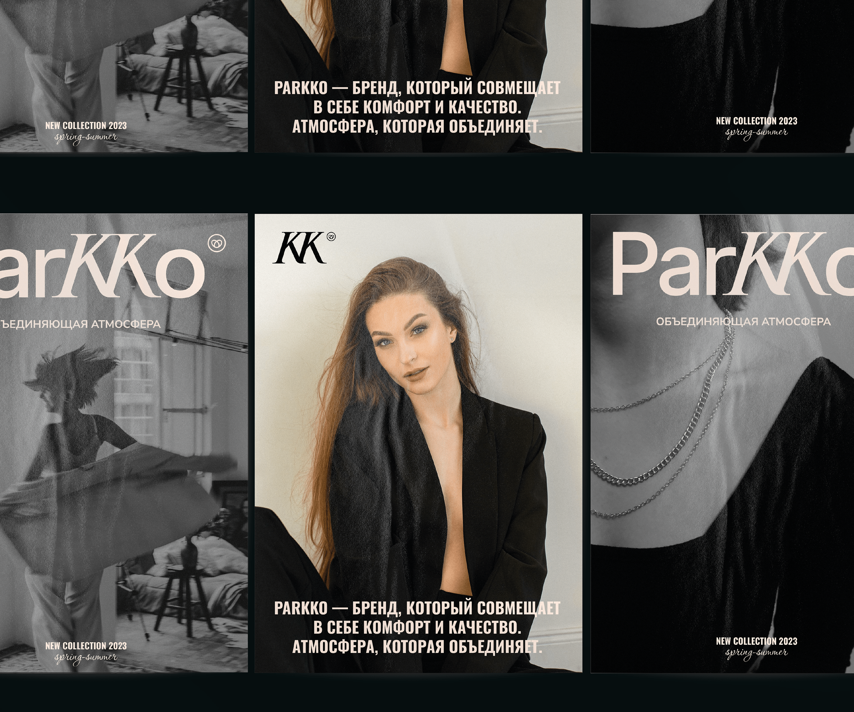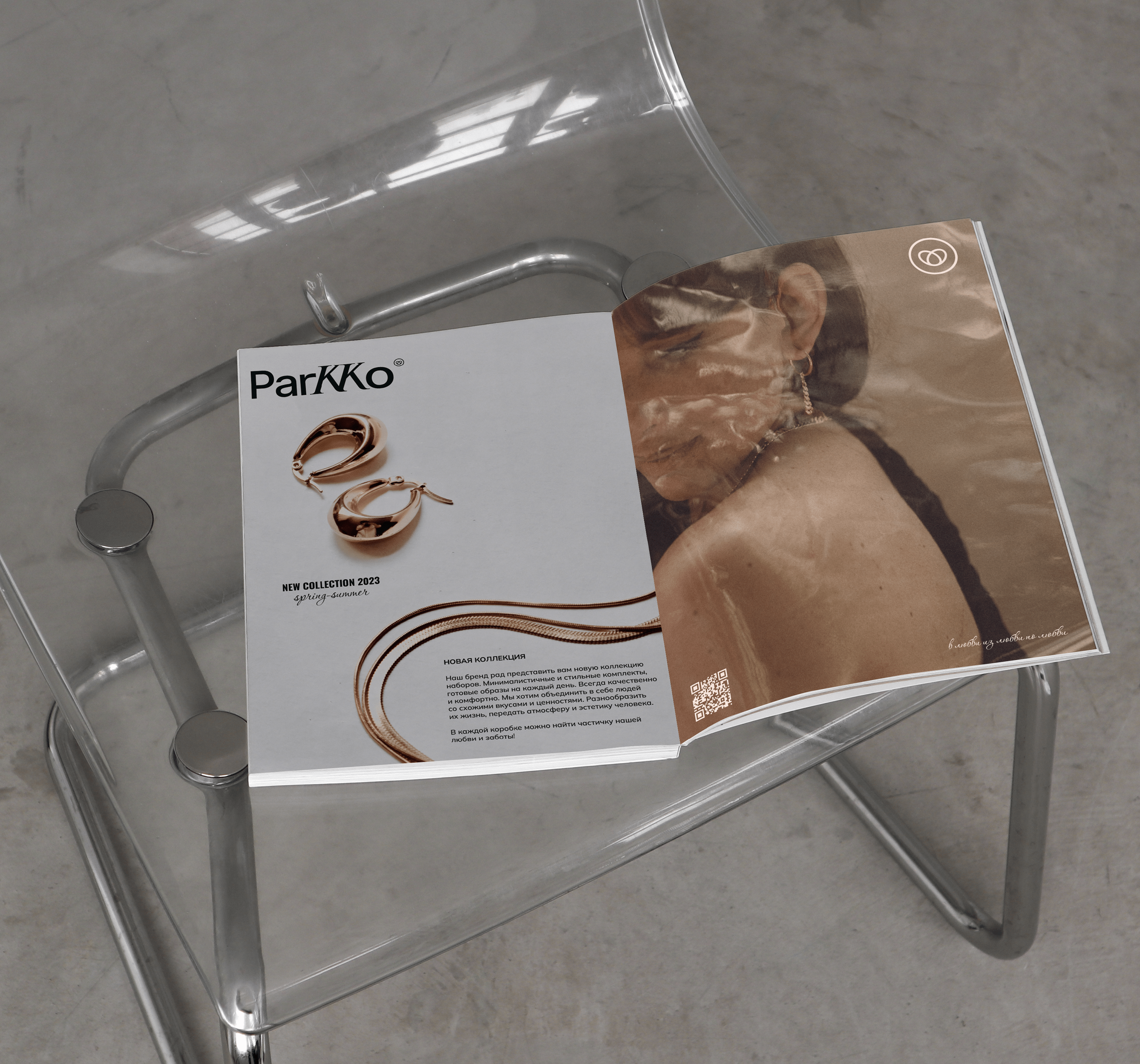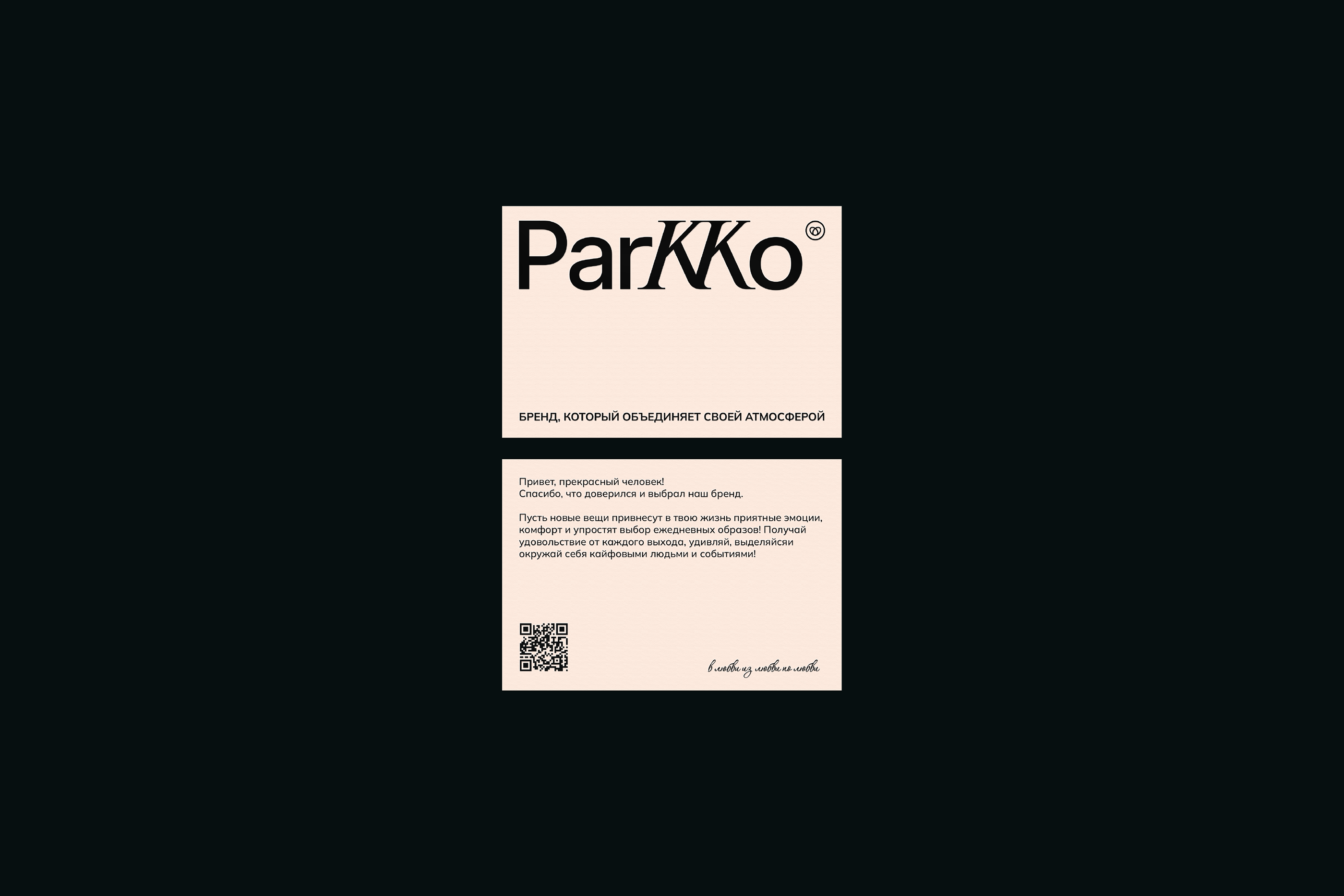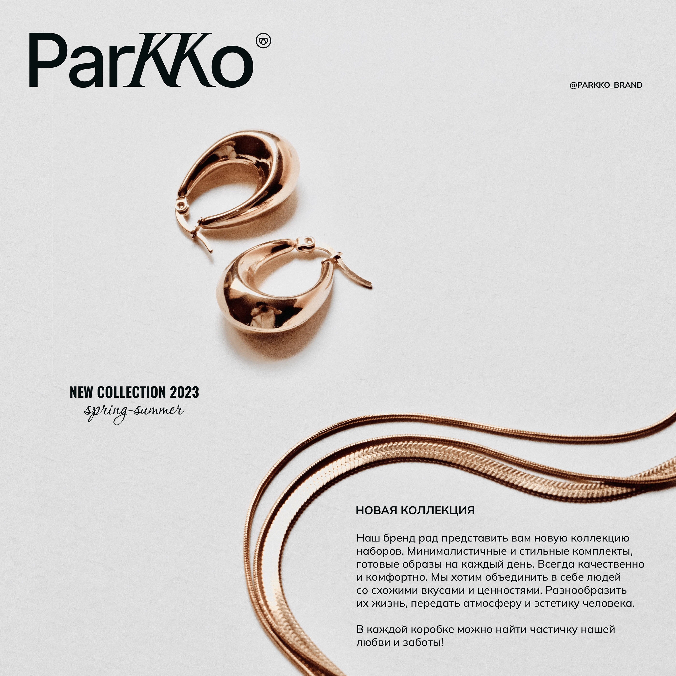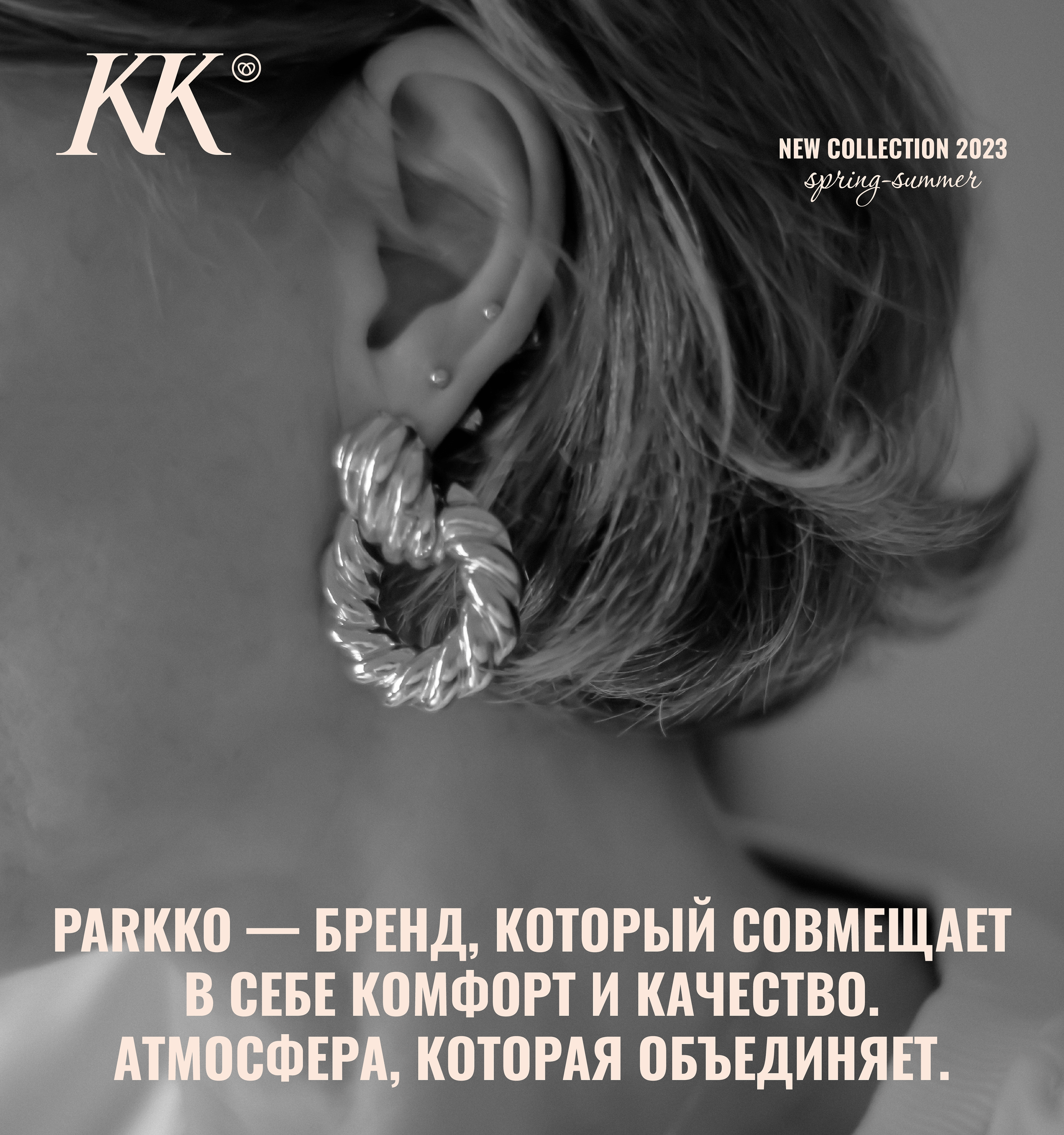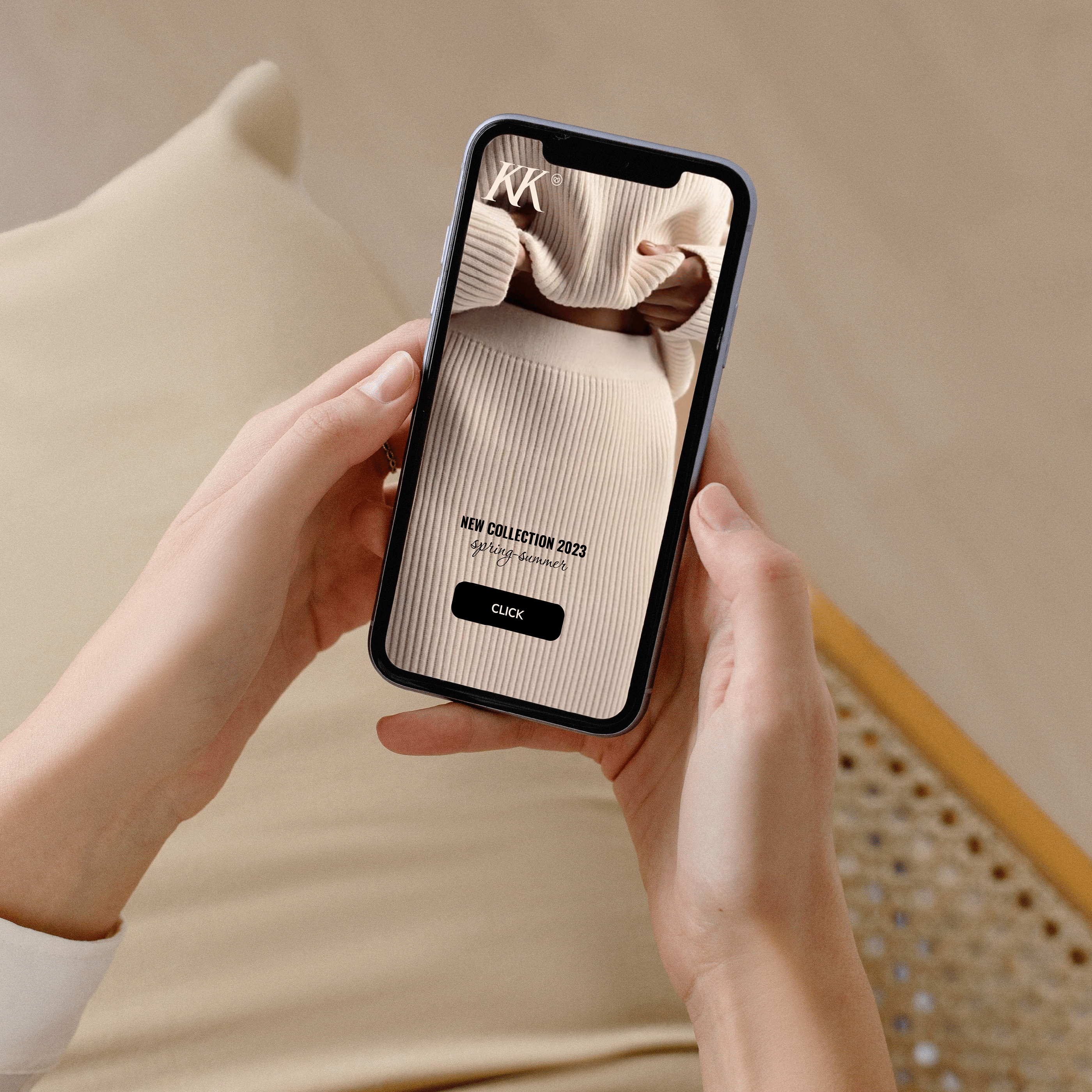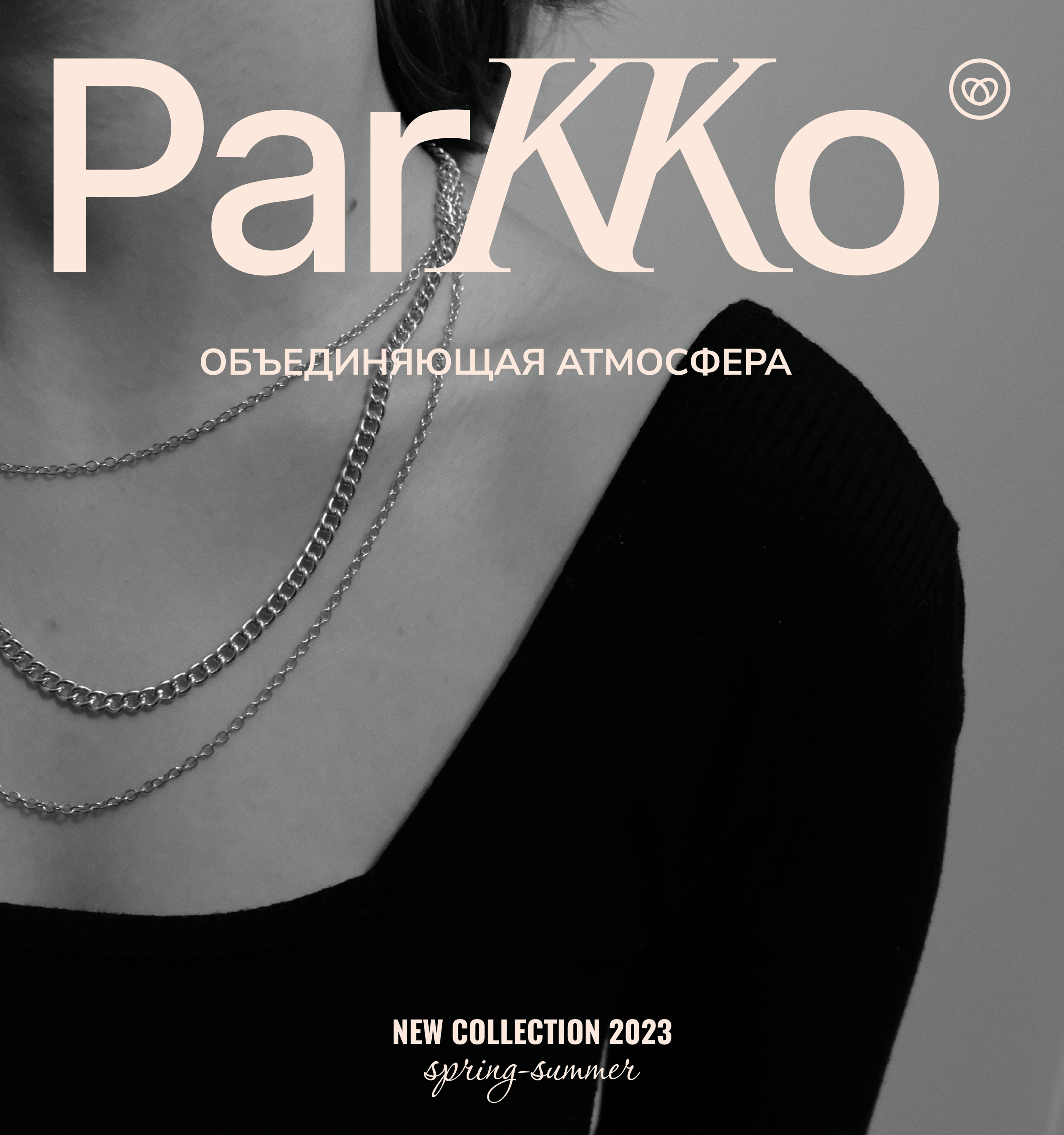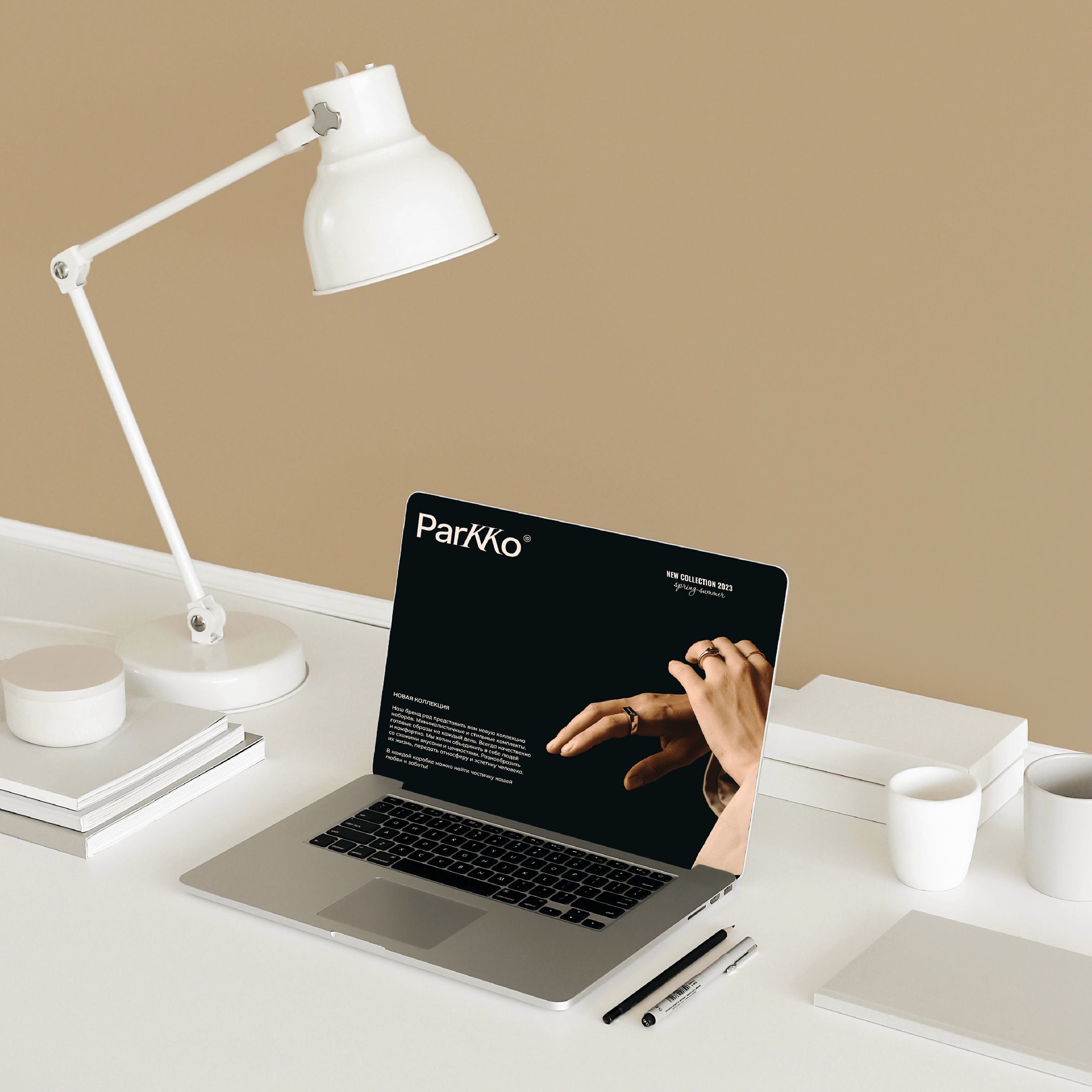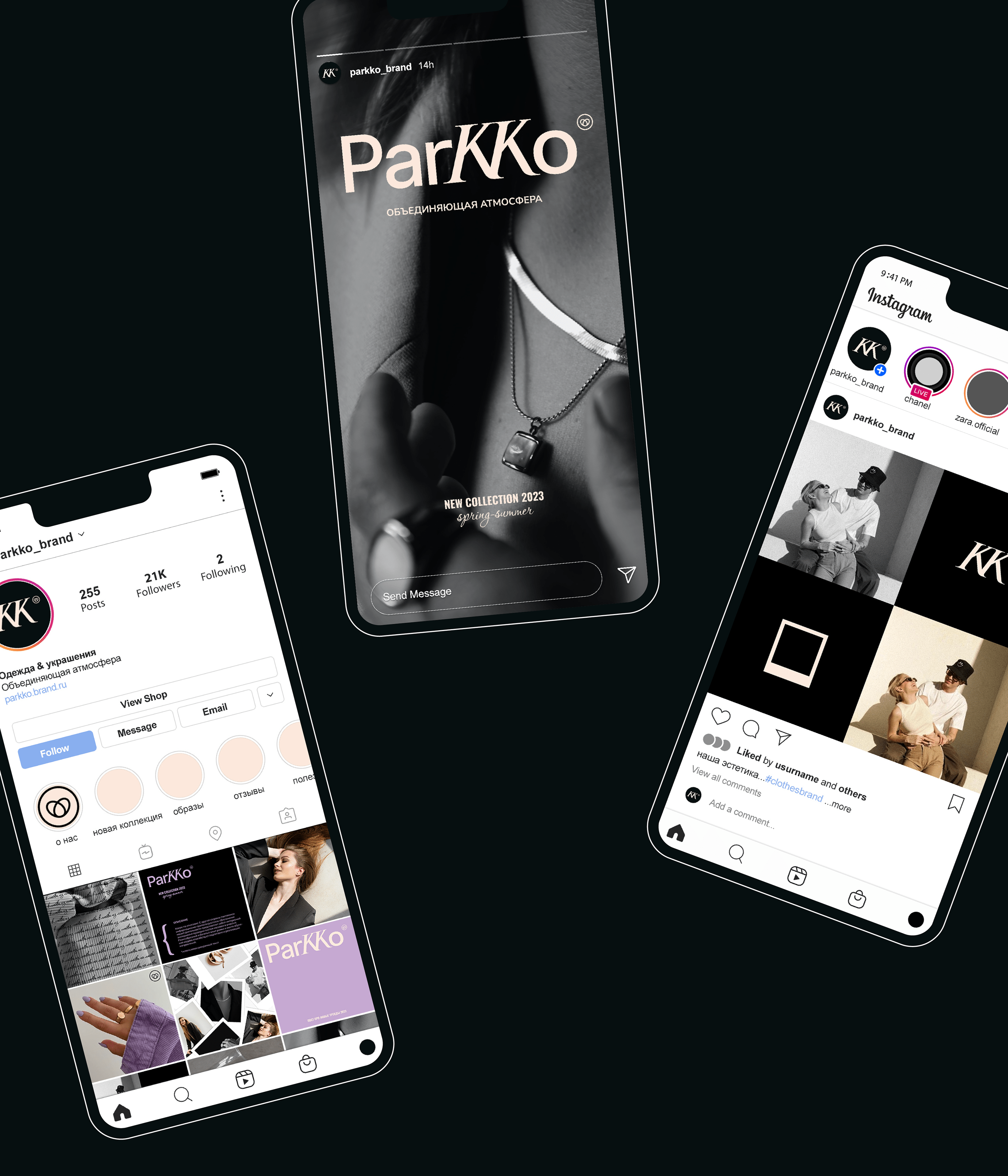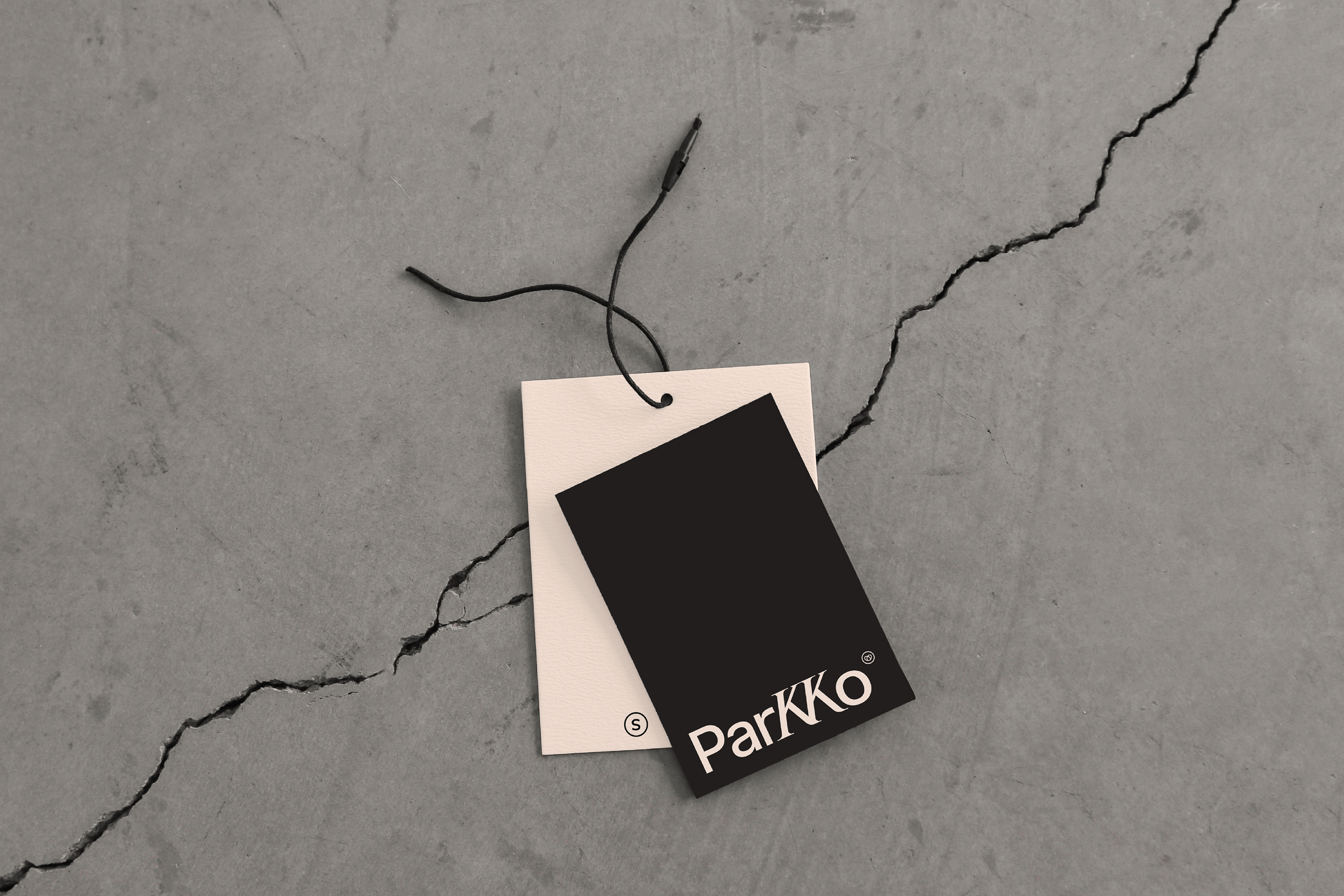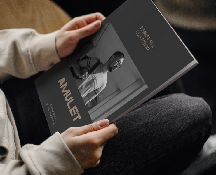
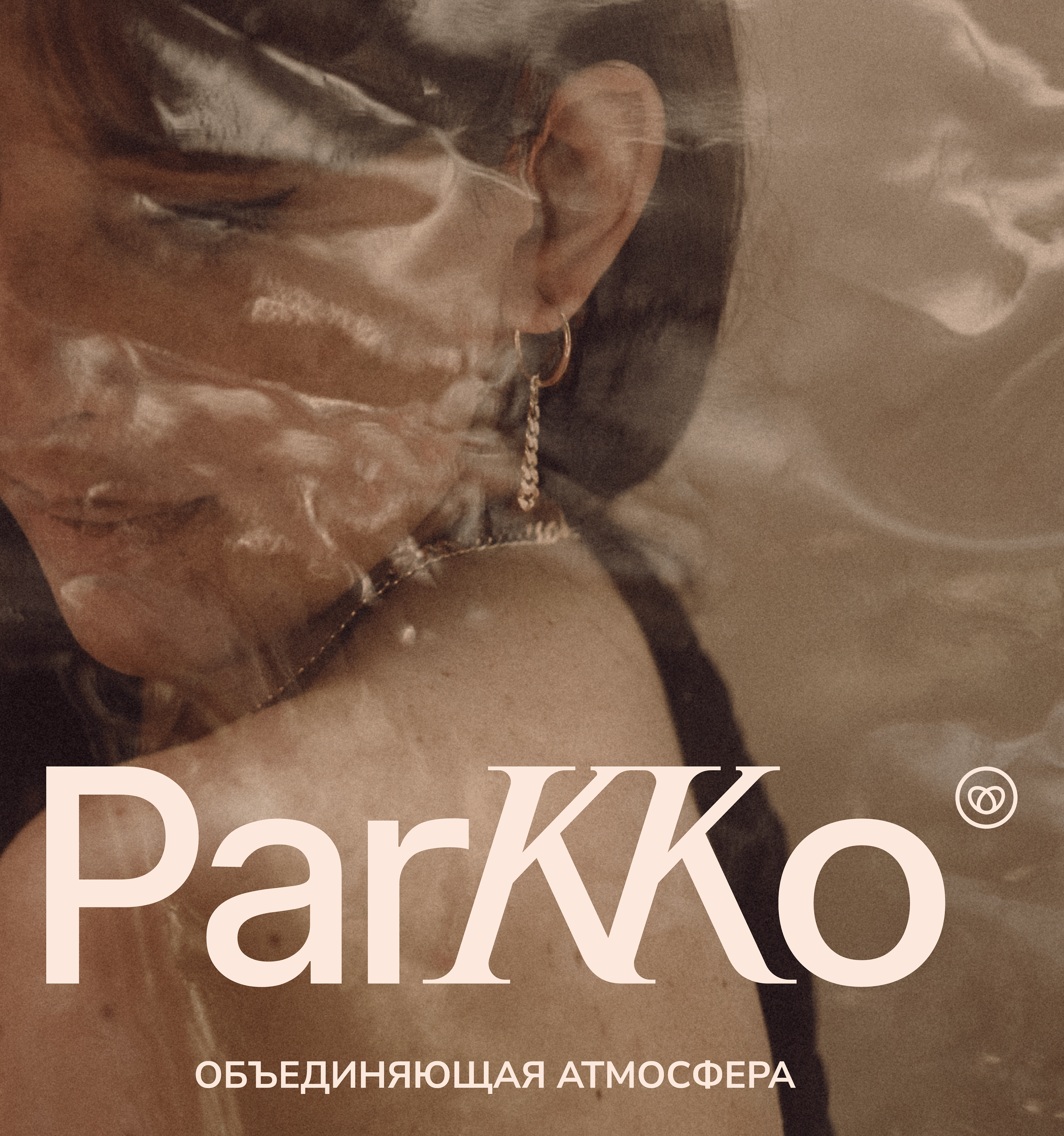
ParKKo is a brand of minimalistic jewelry and clothing.
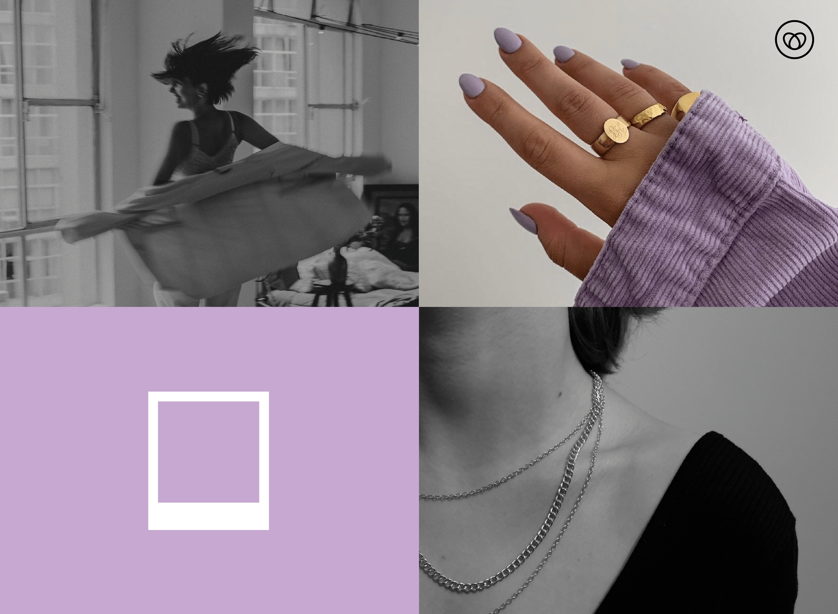
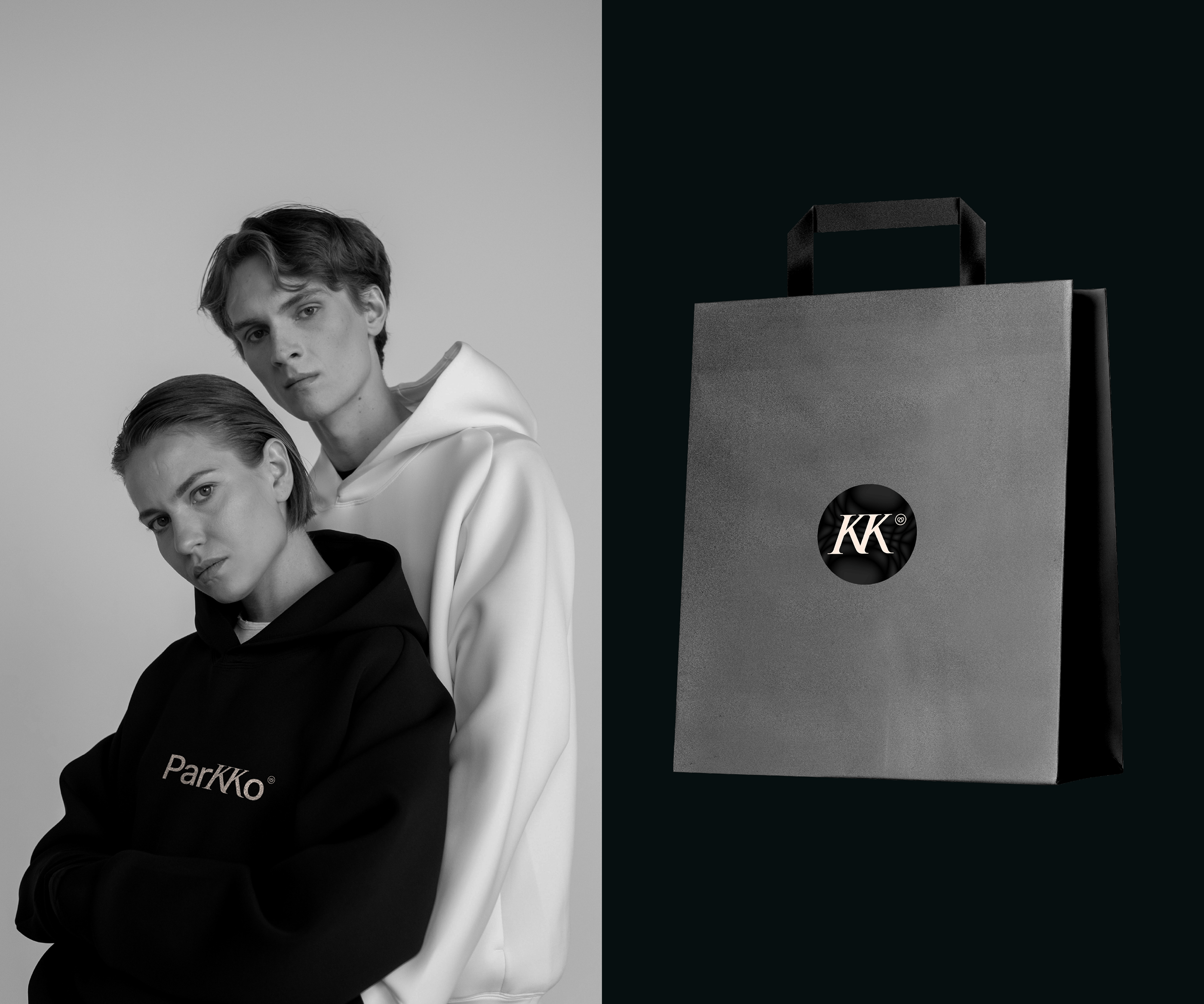
Sales will be in sets. Unification is a priority. Make an association with the creator through a personal blog. Features: comfort and quality. In the future, it is planned to add paired costumes and make it as a cute, unifying factor in life, as something that can strengthen romance in a couple or family relationships. Emotions: calmness and warmth, trust. Wishes: Minimalism, pastel and bright (accent). Emphasis on a doubled K.
Descriptor: unifying atmosphere
Description of developments:
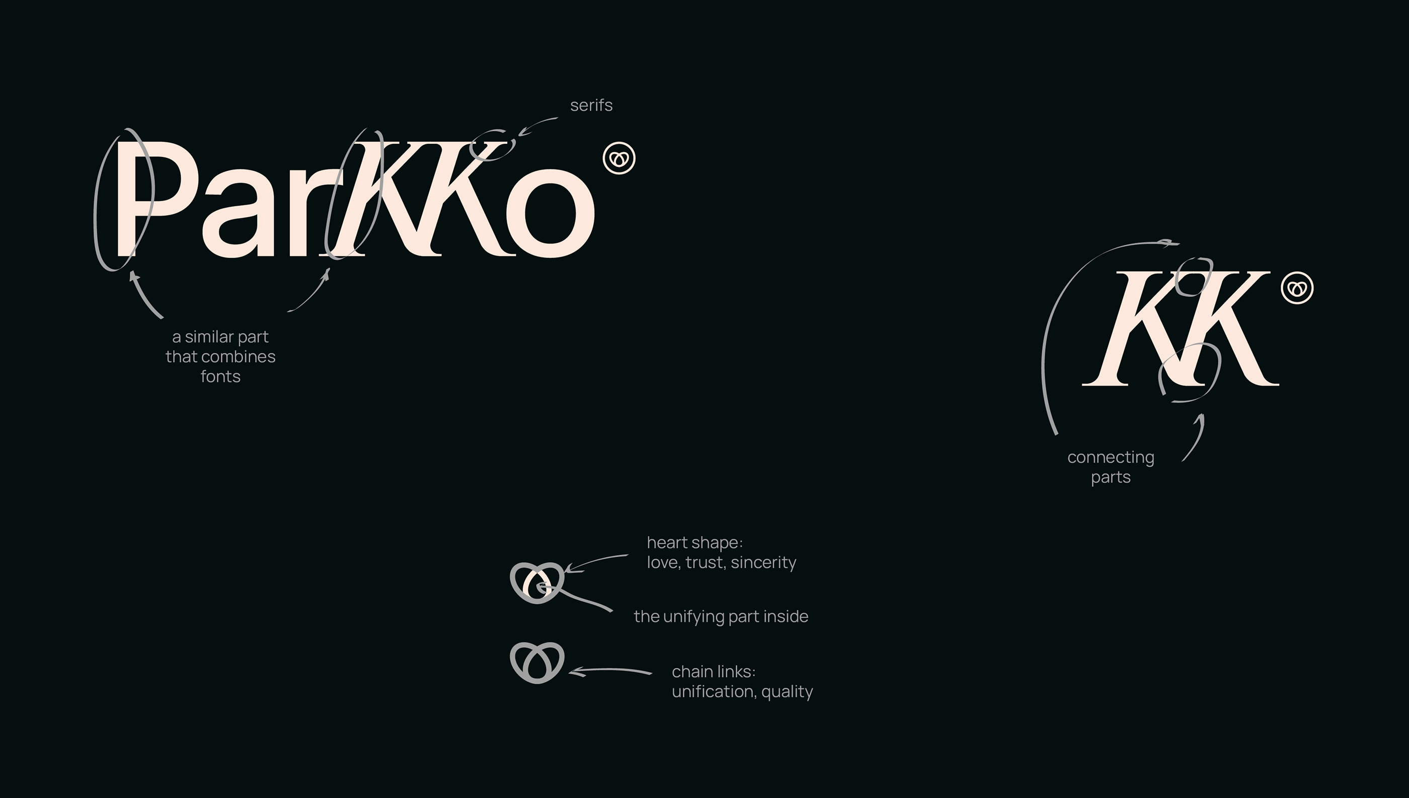
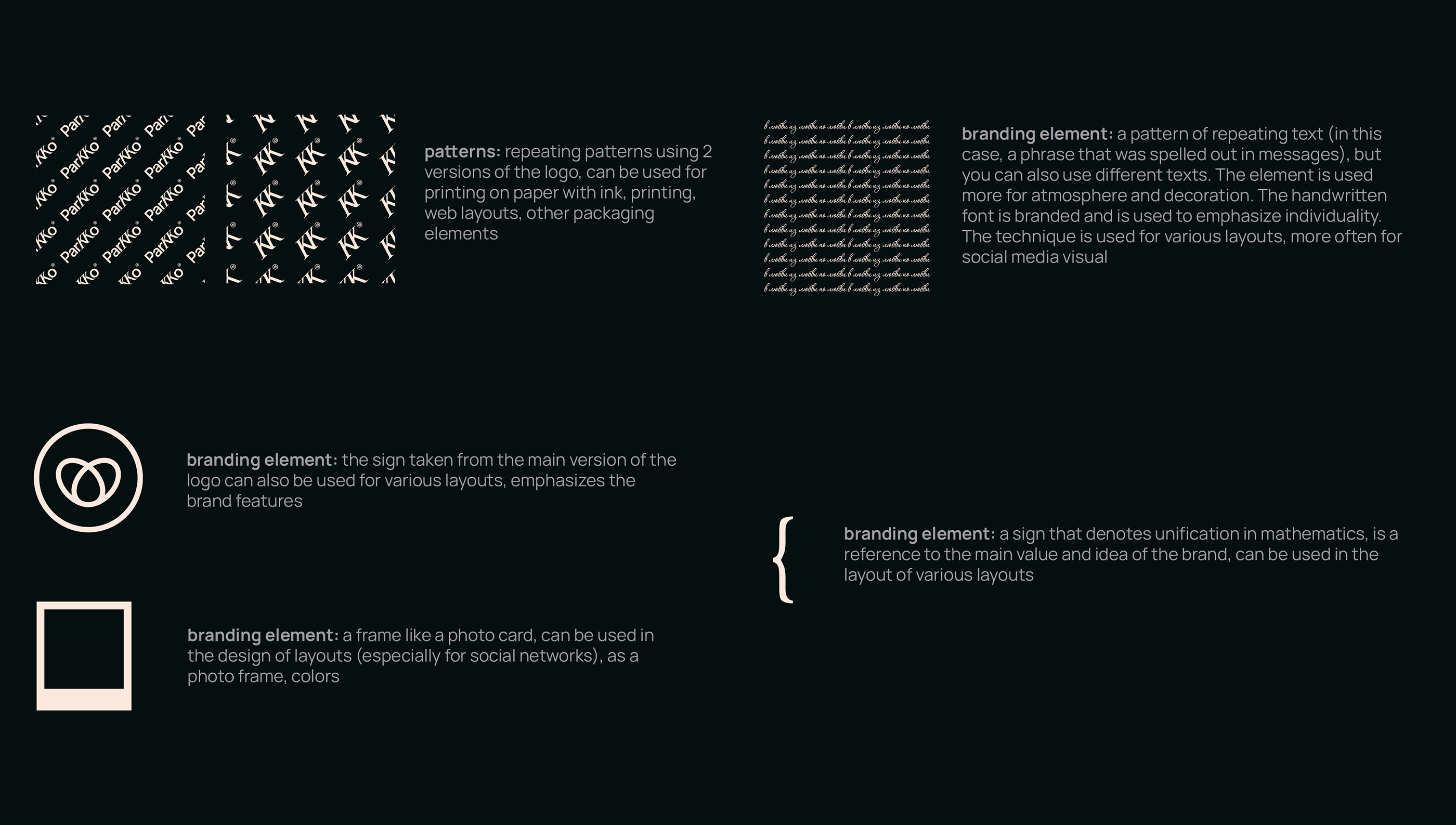
Font logo, letters drawn and edited by yourself. This combination works on contrast, the accent part is two letters KK. Unusual, attract attention. An additional element is a small sign similar to a mark ® (mnemonics is a sign
of a registered trademark), only in this case it serves as a mark, which contains the meanings and features
of the brand. Nice detail.
The main part of the letters is simple, easy to read, refers to the performance and inspires confidence. Doubled letters KK, on the contrary, are more elegant on the contrast, the slope gives them lightness, adds dynamics. Serifs also emphasize classicism and simplicity. The connection between the letters refers to the main priority
of the brand — unification. It can symbolize both a couple (partners) and just independent units that unite due
to similar tastes and values. They also keep the direction in one direction. In general, the logo is minimalistic
and simple, but at the expense of different details, it is filled with meanings and contasters.
DESIGNER: KSENDZ BRANDING