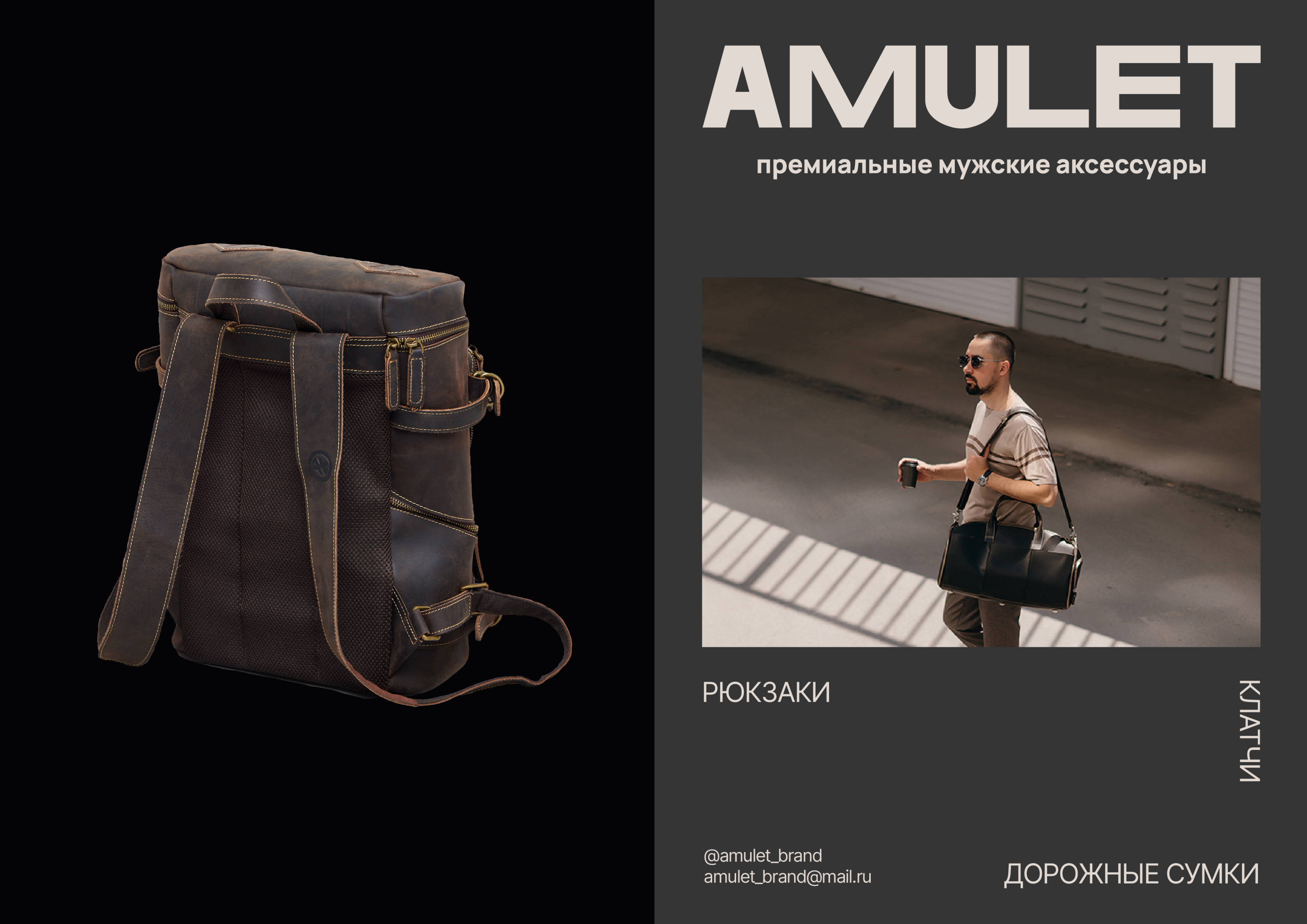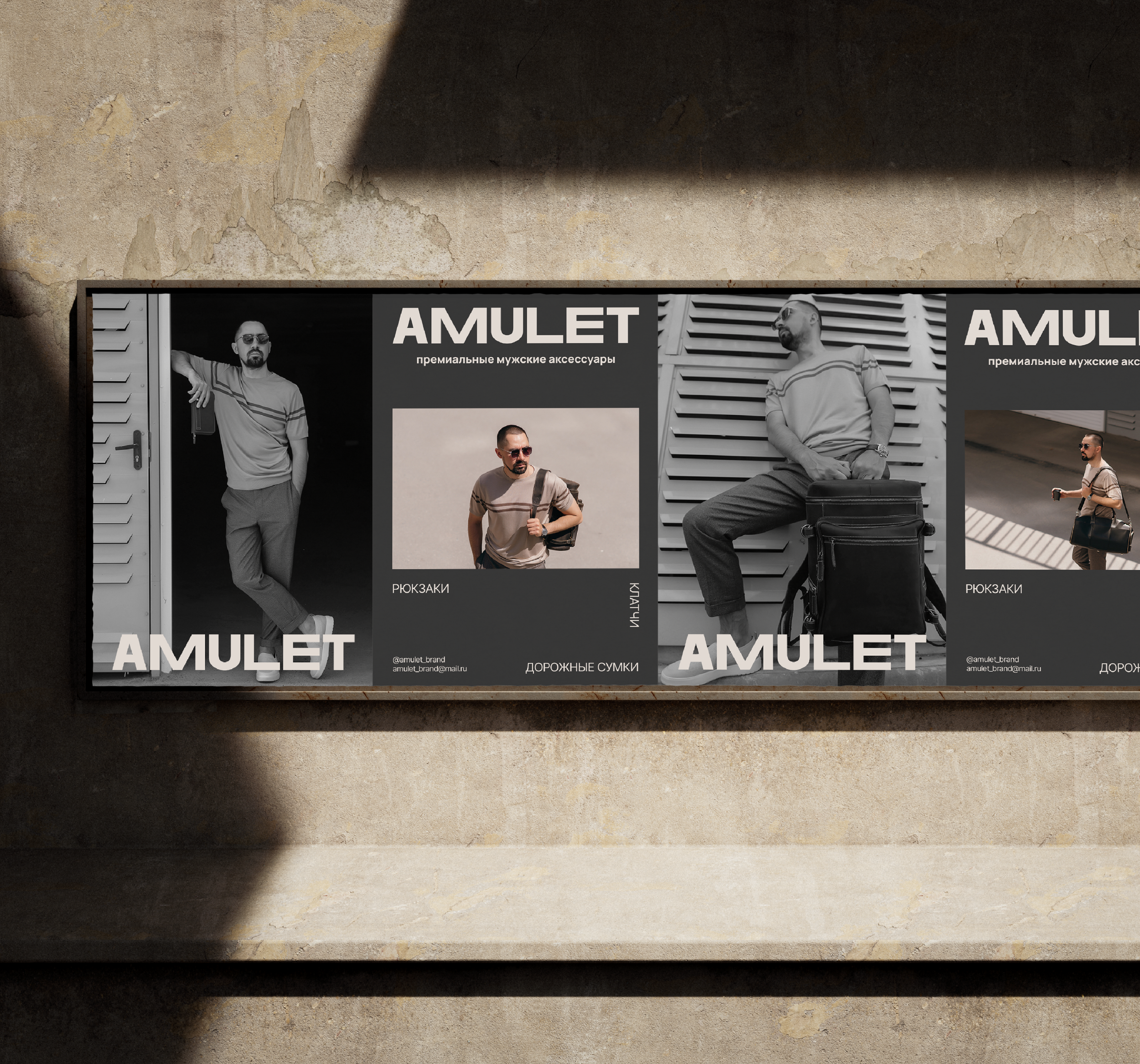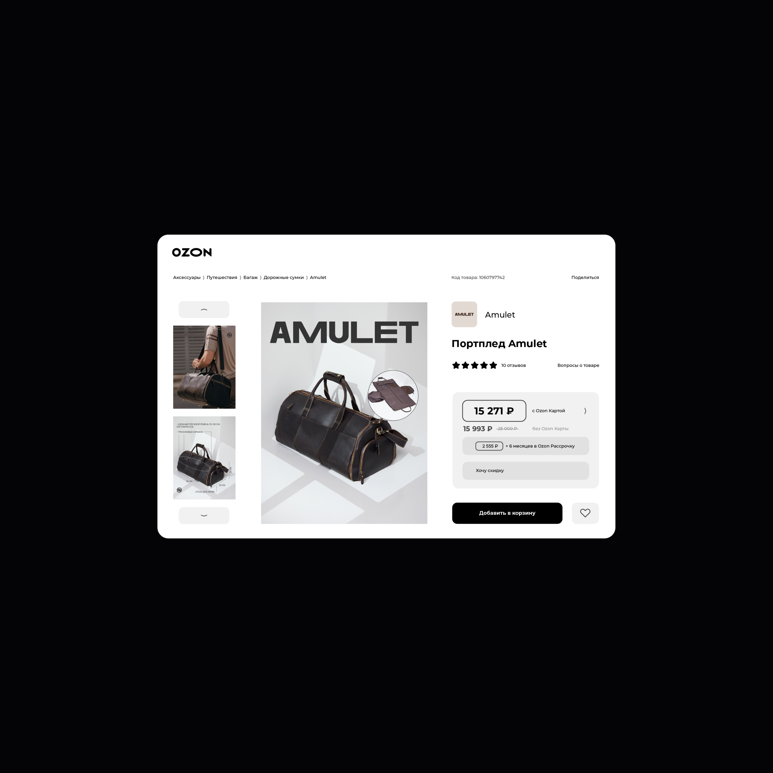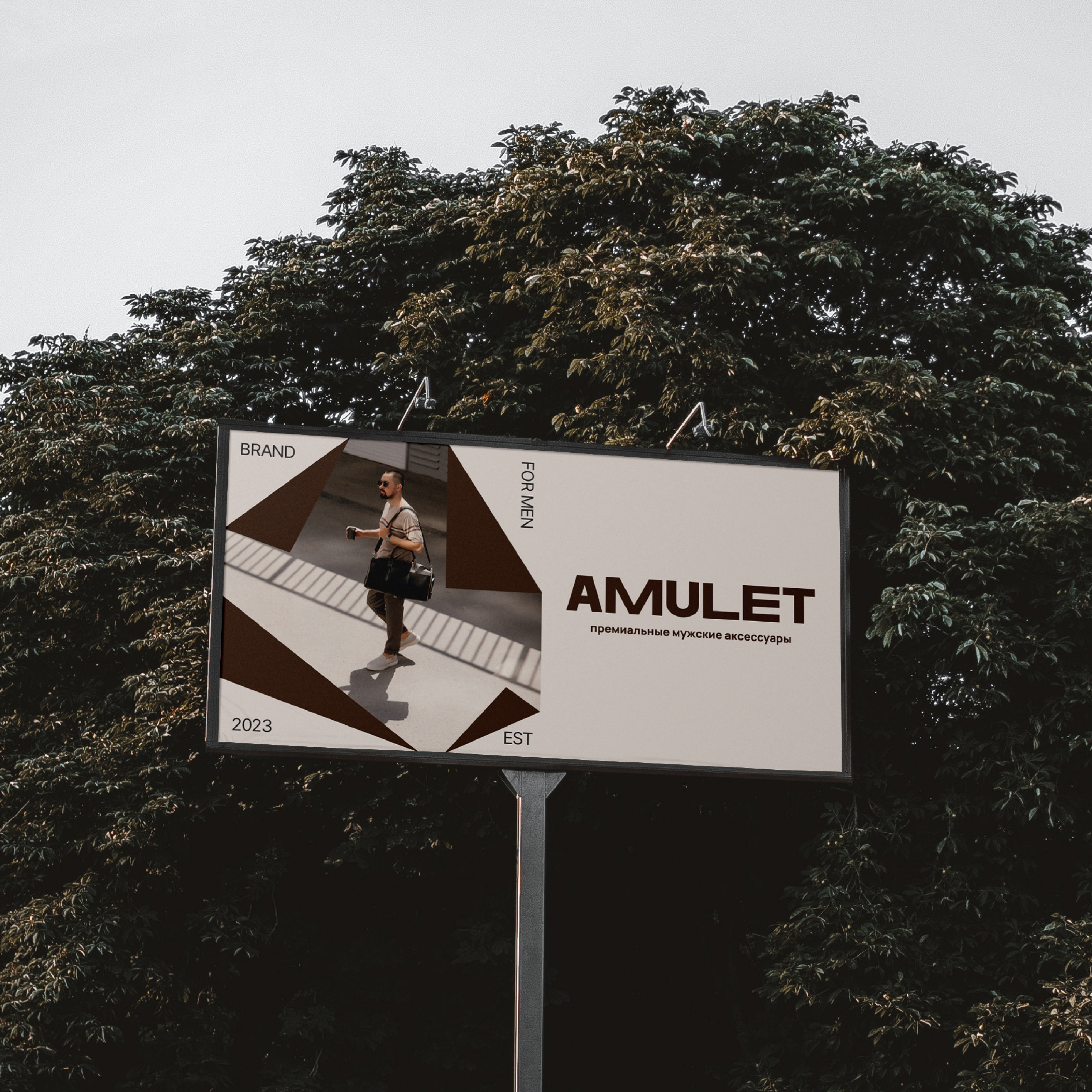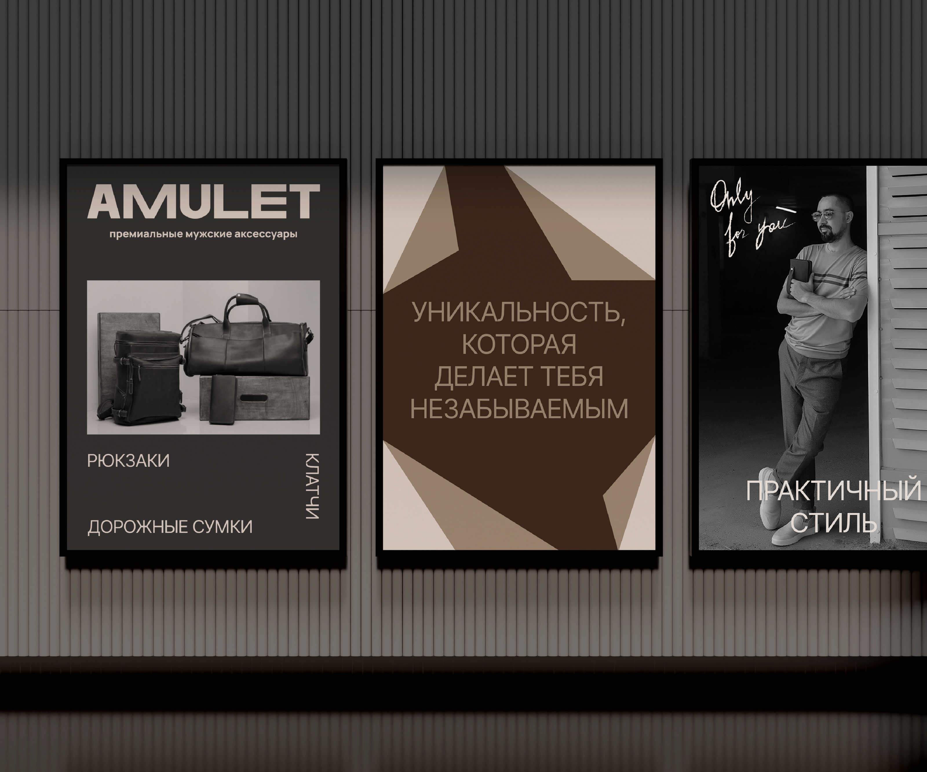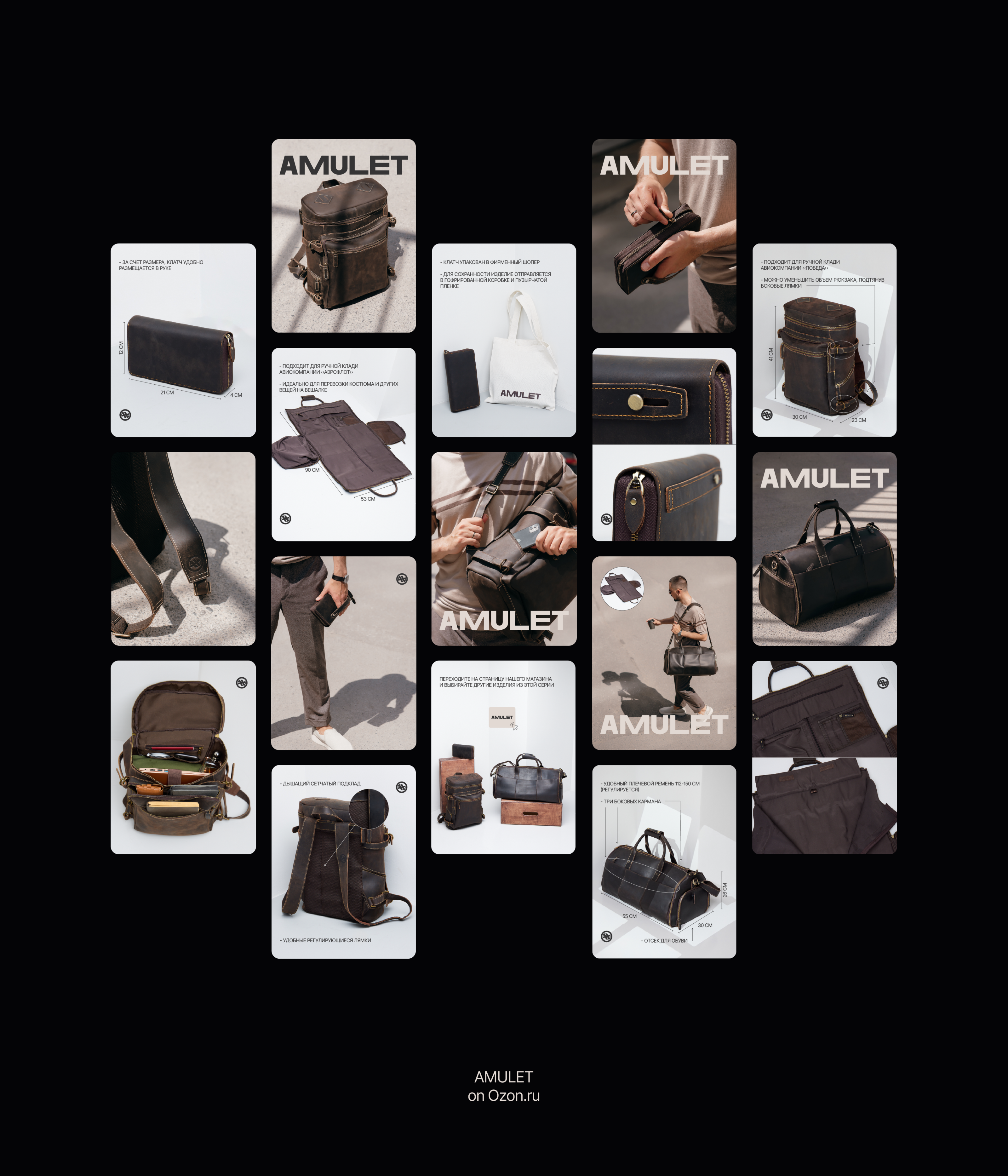

AMULET is a brand of premium men's accessories
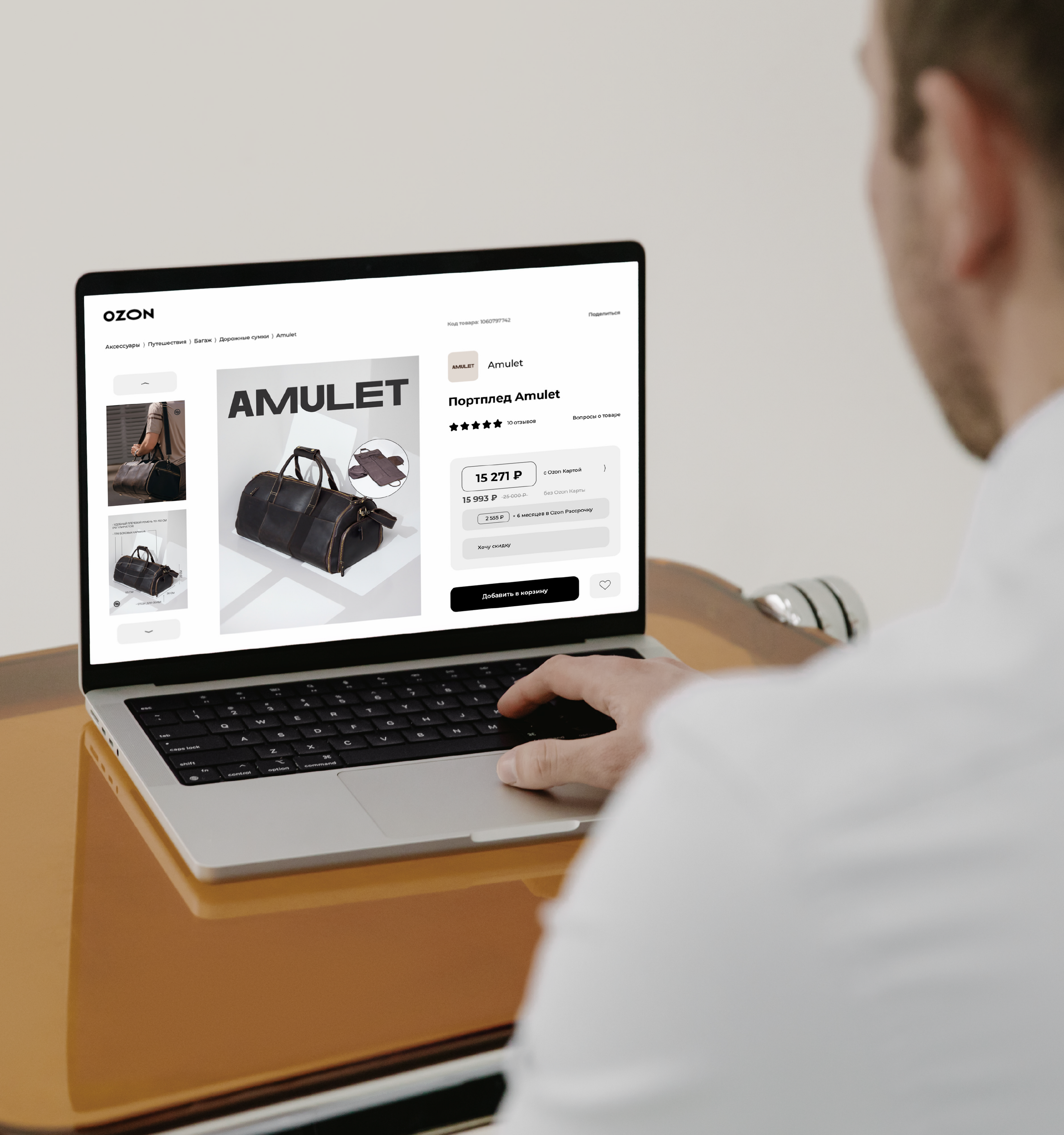
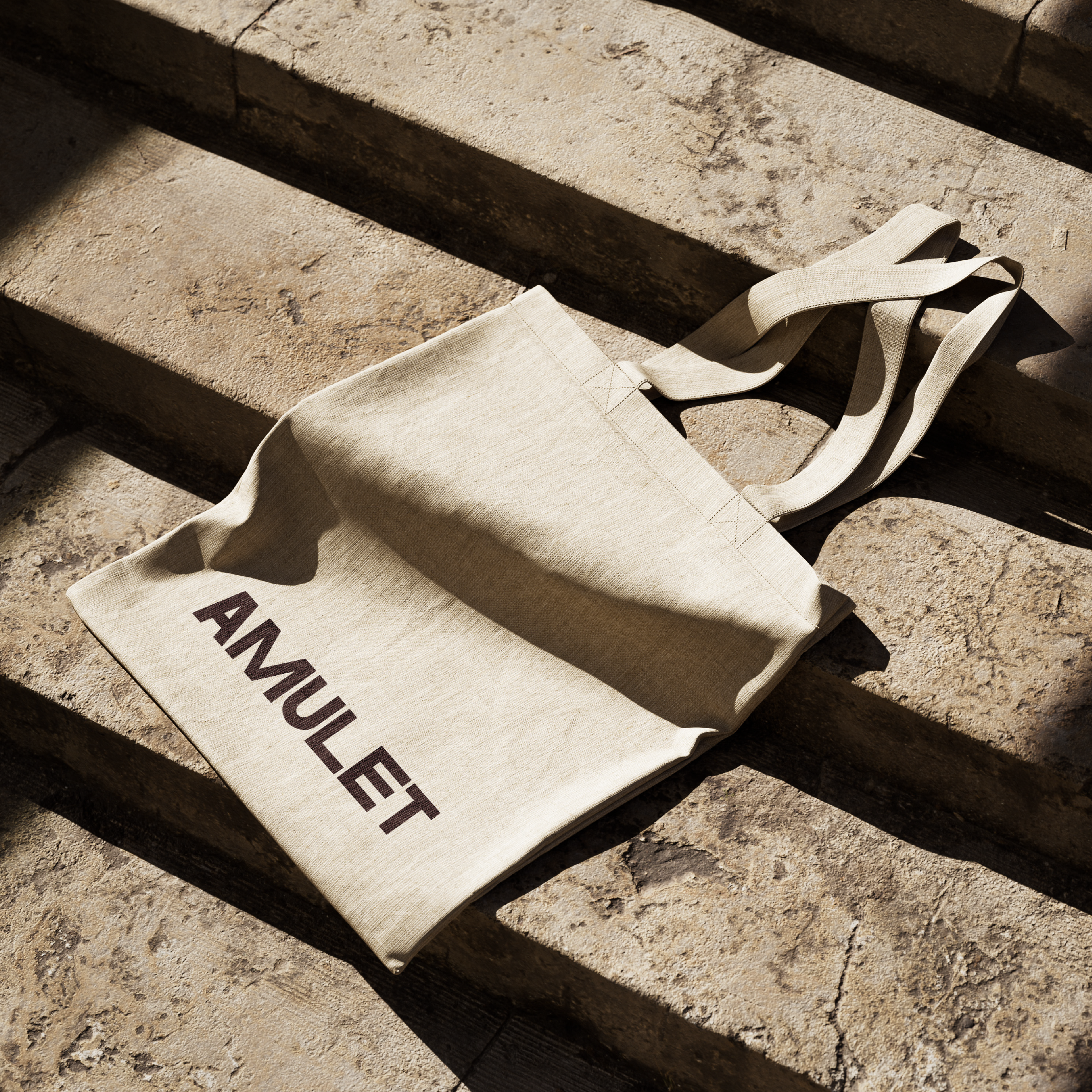
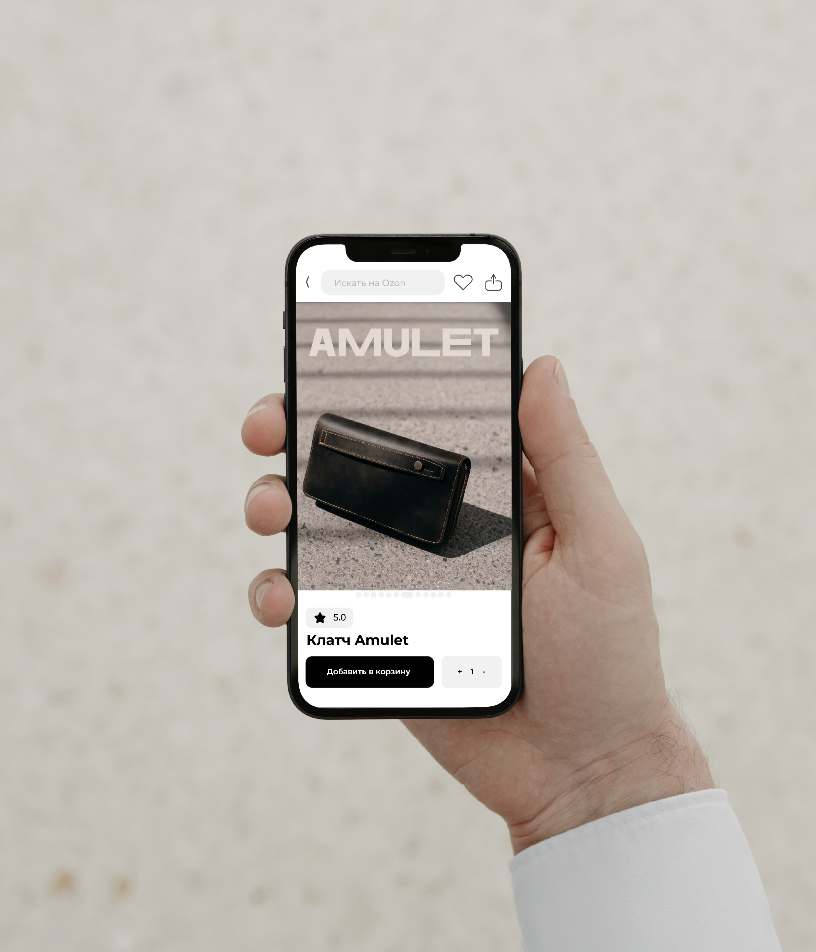
Metaphor: Accessories, like many other details of a person's style, are a reflection of character, lifestyle and unique features. Accessories are amulets that can bring good luck, become a part of your work, training or travel. This is a unique experience for everyone. At the moment, the main line of the brand is men's accessories made of crazy horse leather: a bag, a backpack and a clutch. It is planned to expand the range in the near future.
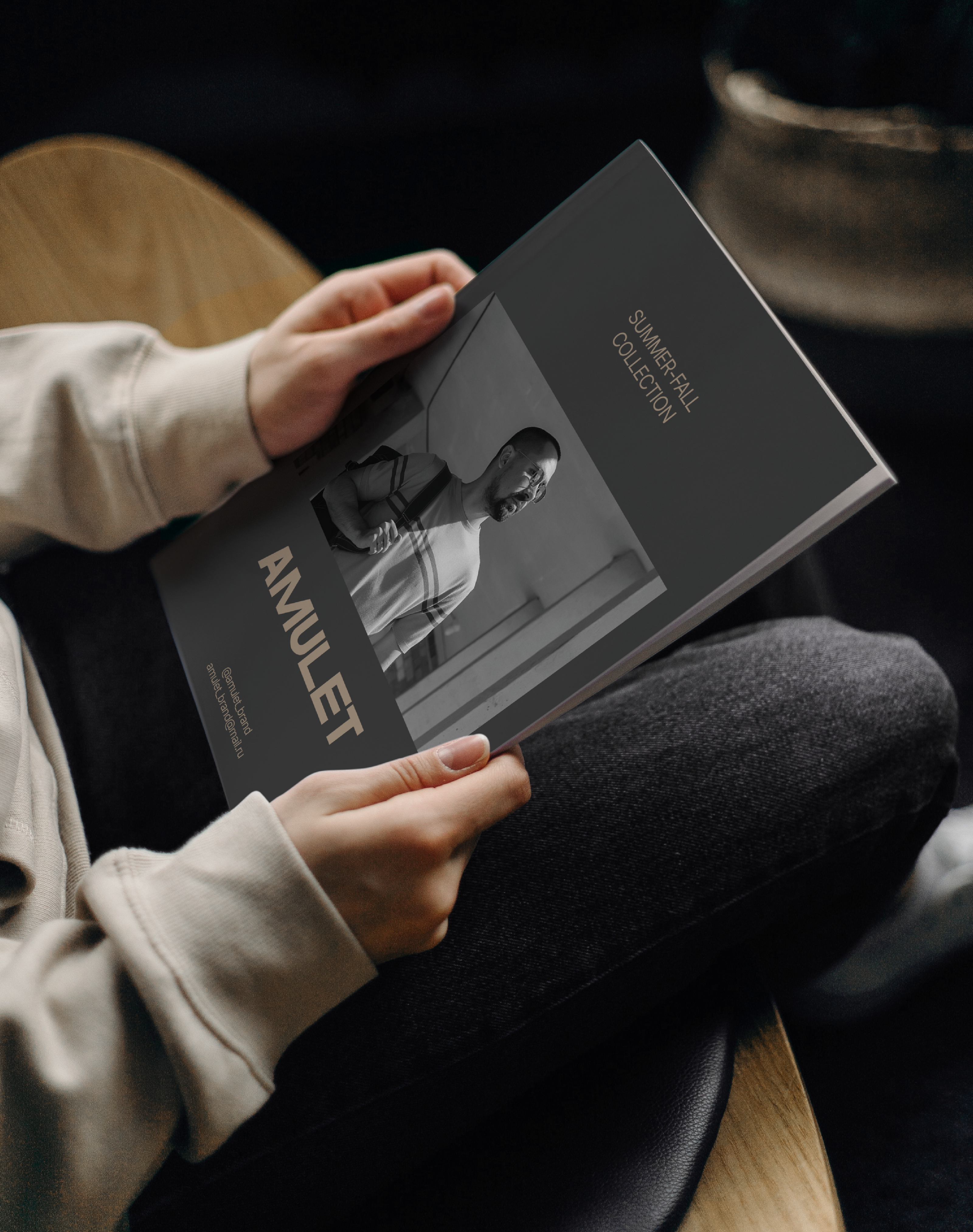
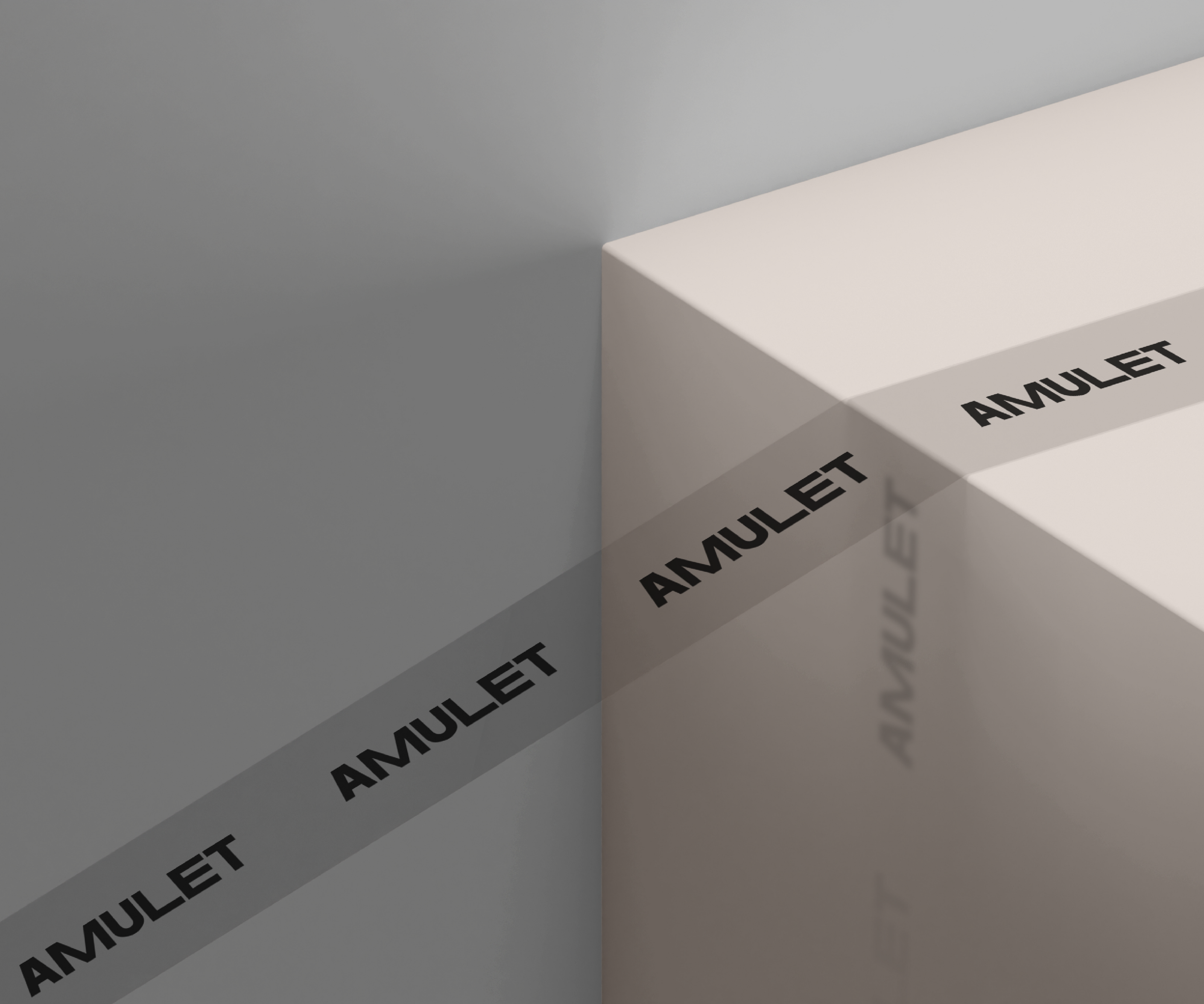
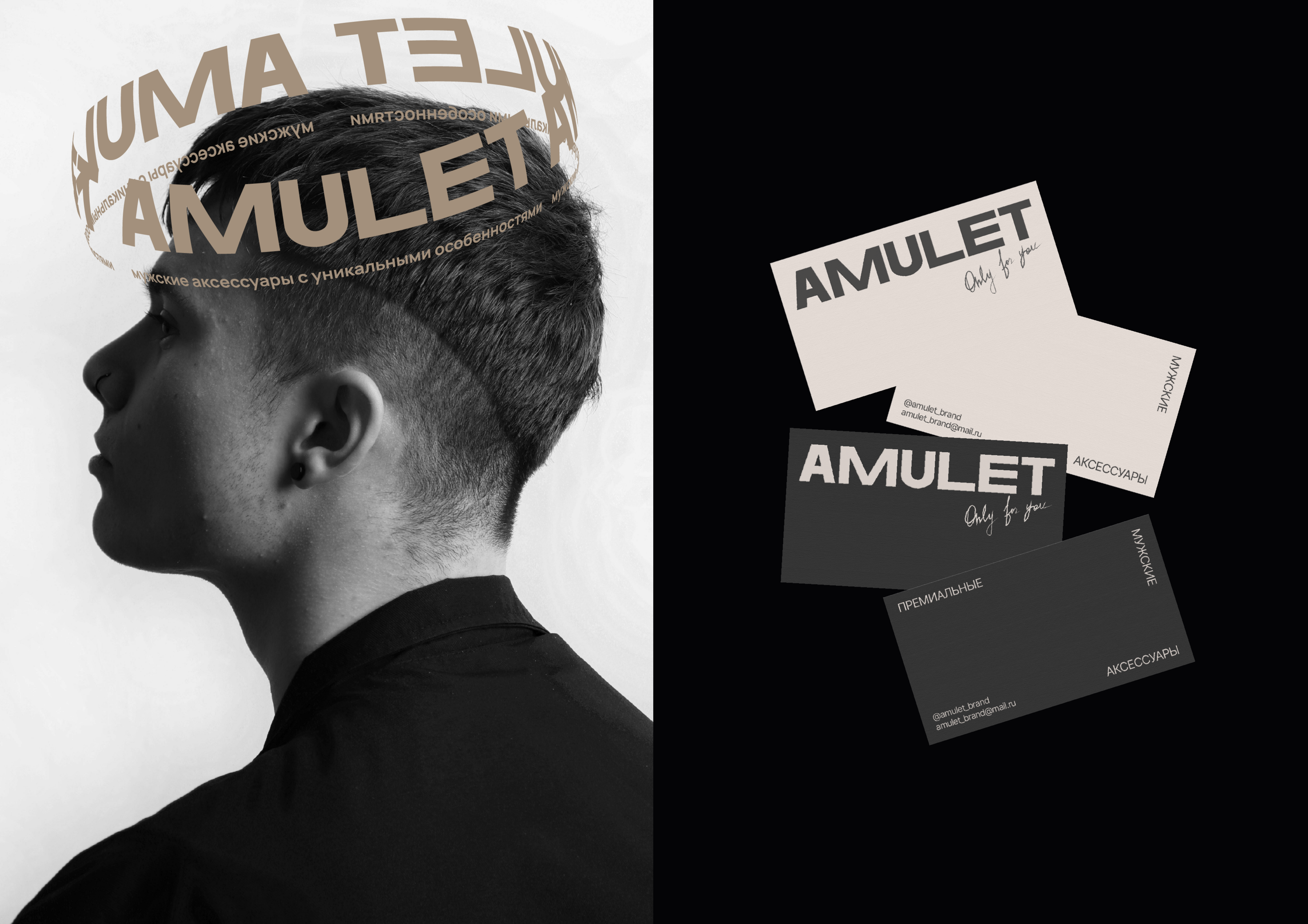
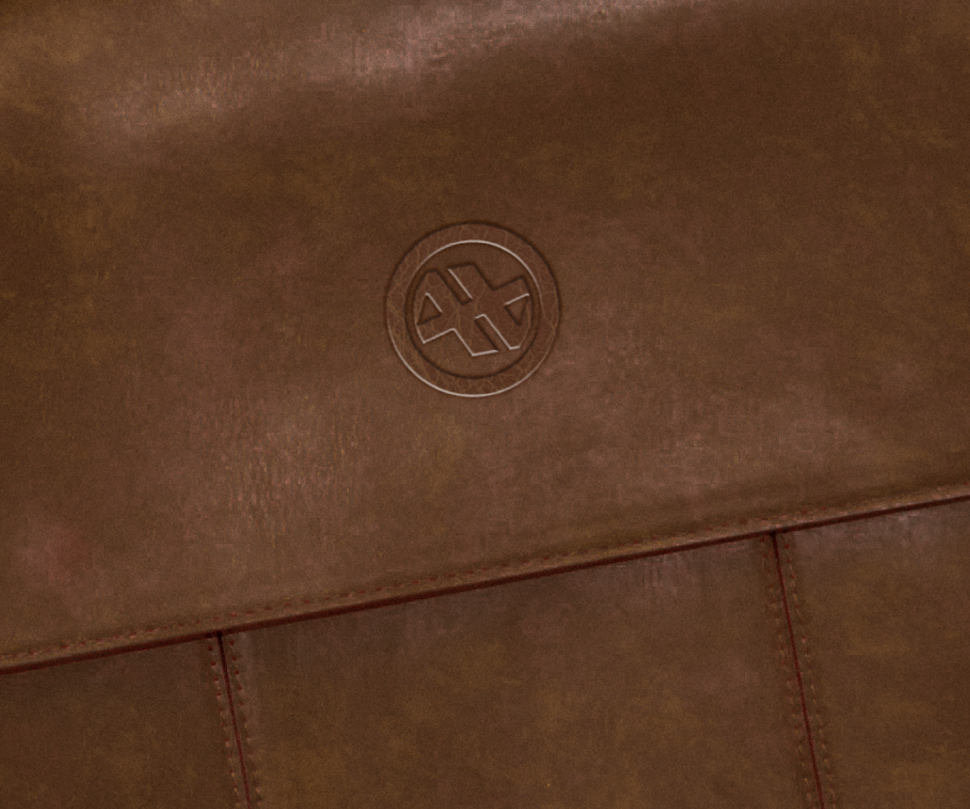
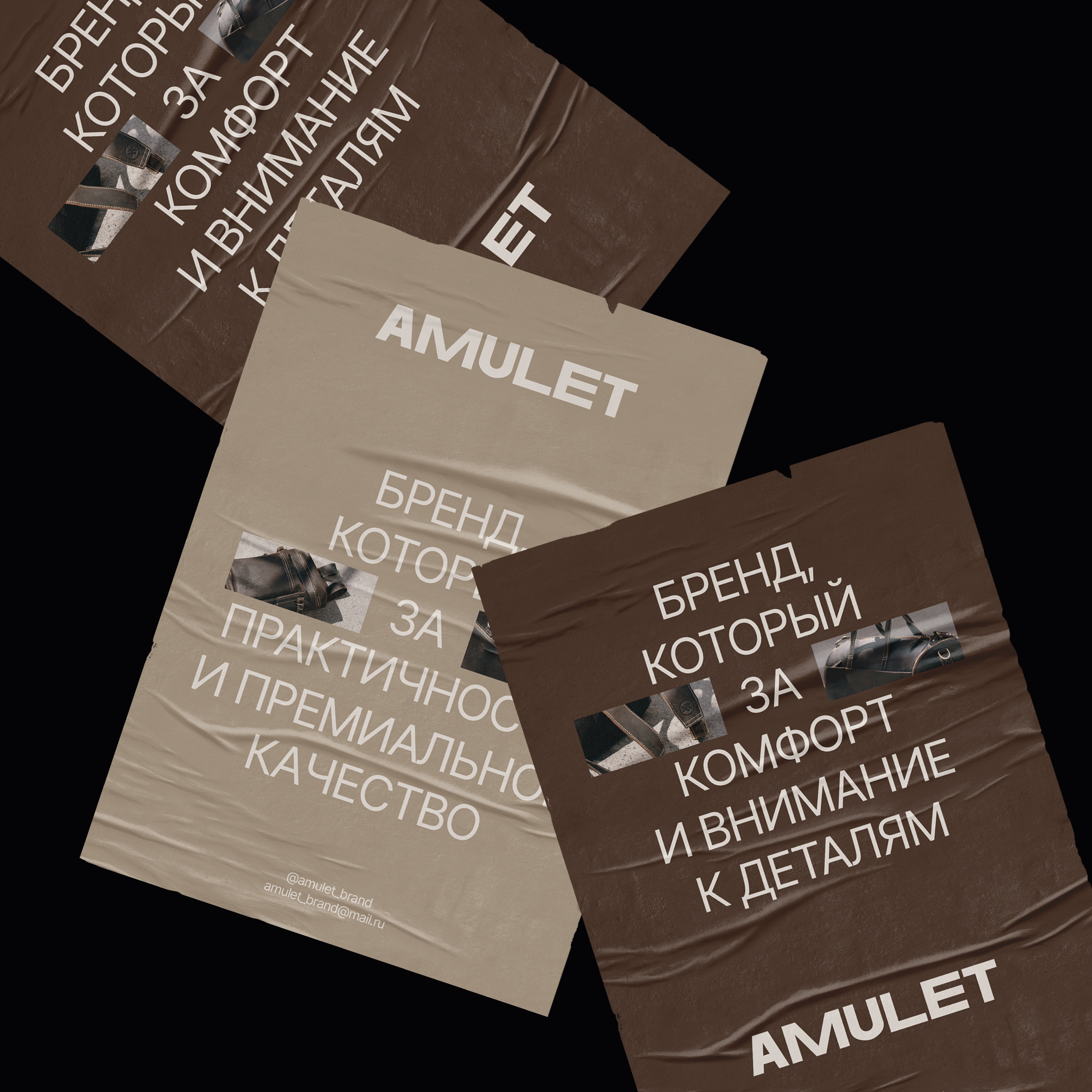
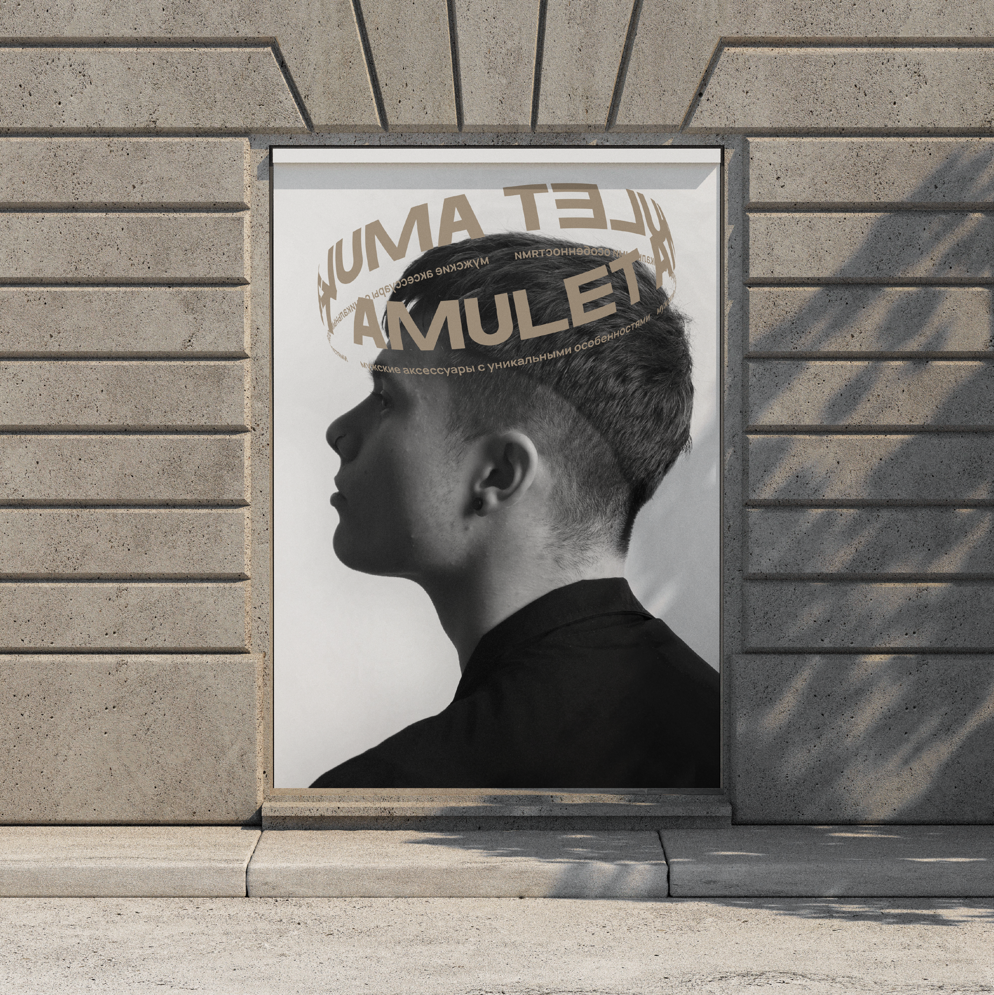
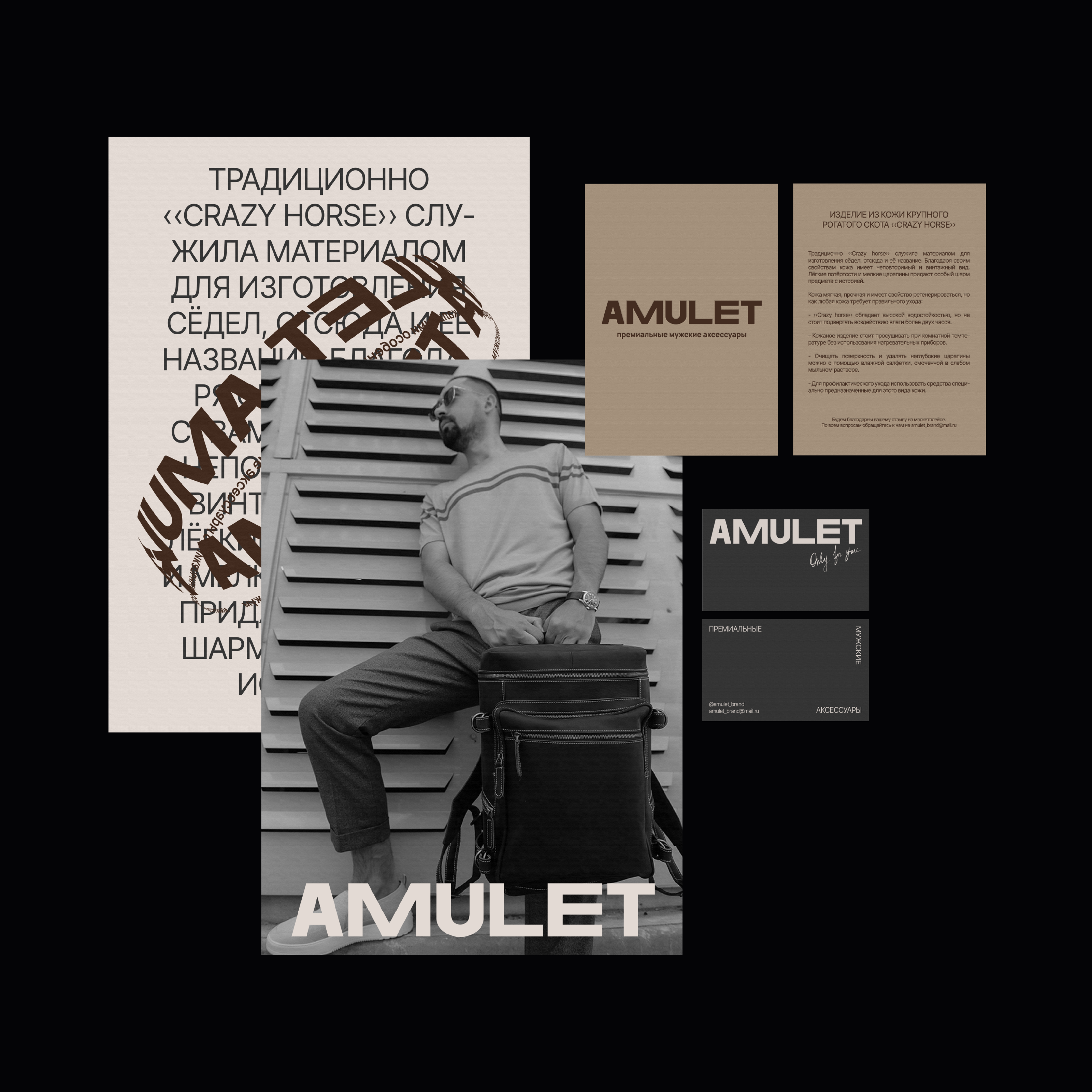
For this brand, I was engaged in the development of a logo and branding identity, as well as various layouts. The logo is drawn from scratch. The letters are quite thick and stable, which reflects the seriousness of the brand and its main target audience. The letters also have a contrast in size, which also draws attention and balances out the font. The main version is a font version, an additional one is a monogram, which is convenient to use for embossing on leather products.
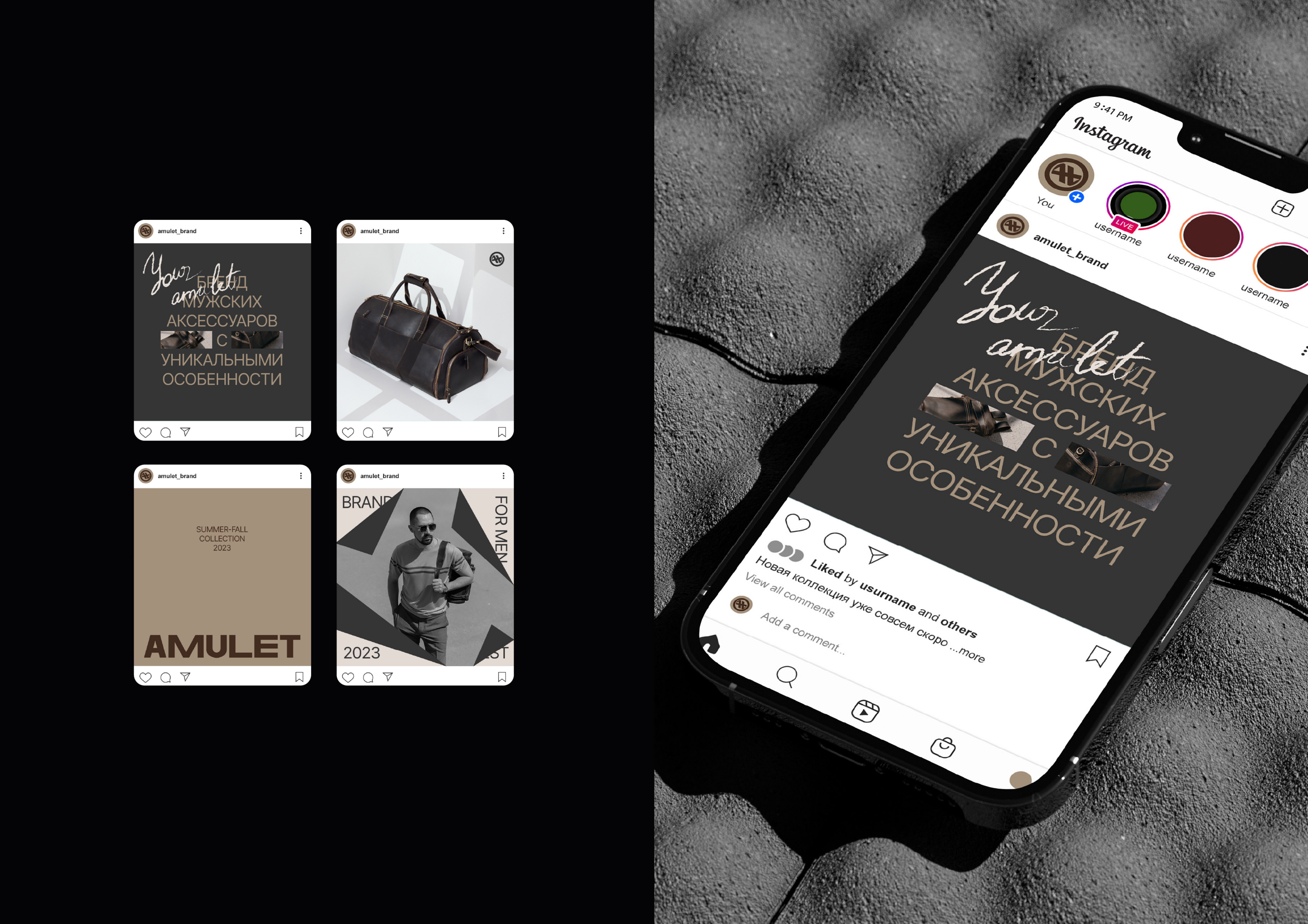
The main direction of the brand is minimalism, which is also emphasized through the design. Basic text alignment in the center or placement on the edges of the layout. Neat layout with slight contrasts.
Additional stylistic devices are: frames in the form of curled paper edges and handwritten inscriptions. The first adds volume to the layouts and liveliness, shows and gives more, a reference that with the brand, as it were, you can look over the edge. The second refers to something unique and special, like a handwritten lettering, like the hands of the creator of the brand, lovingly assembling each piece. The 3D version of the logo is also an interesting design detail.
Brand: AMULET
Designer: Ksendz Anastasia