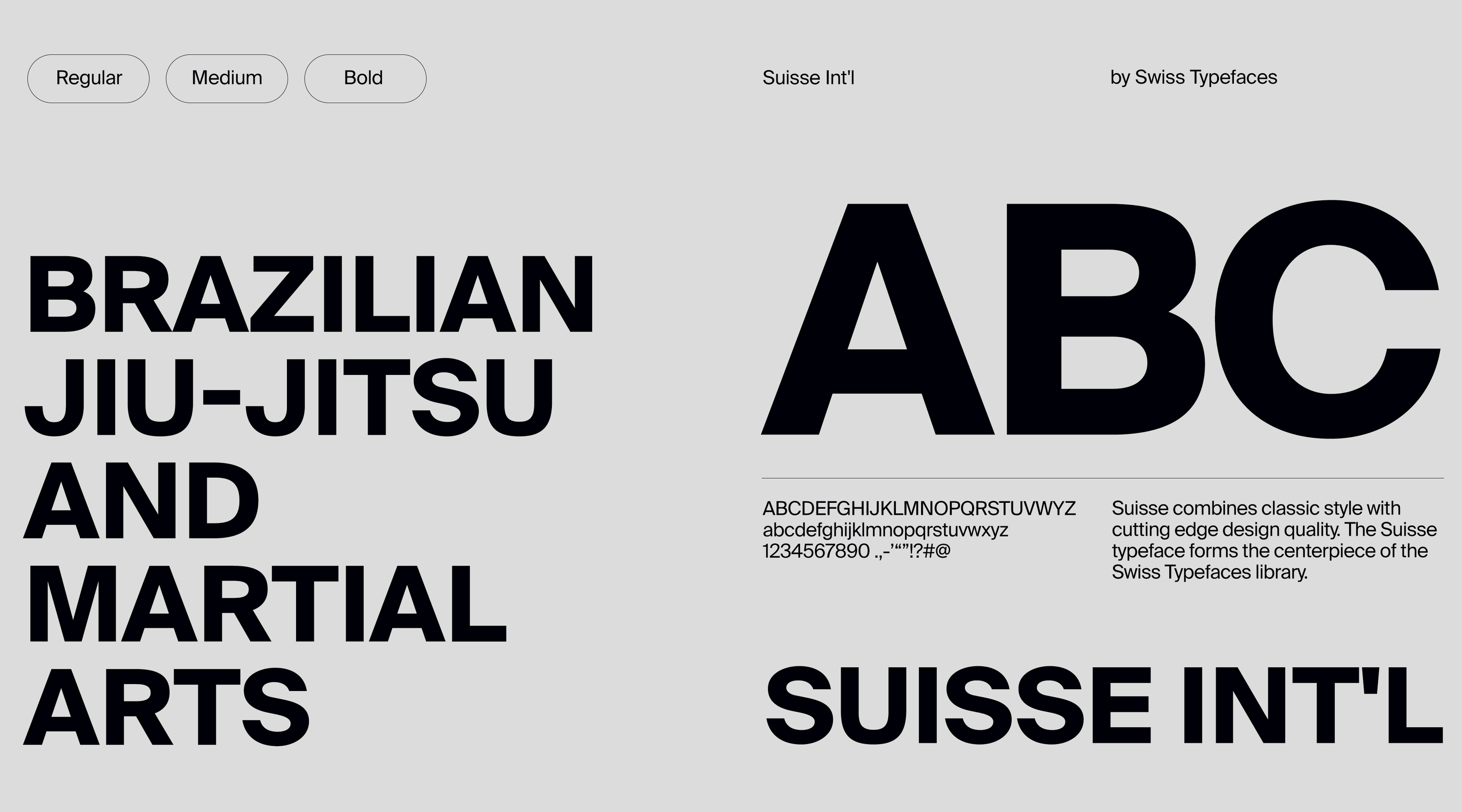
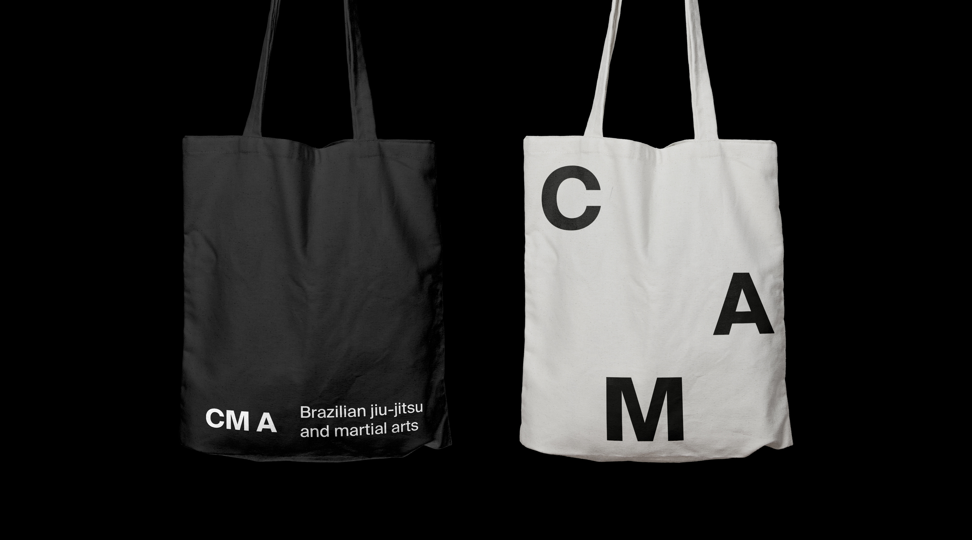
What we did: Identity
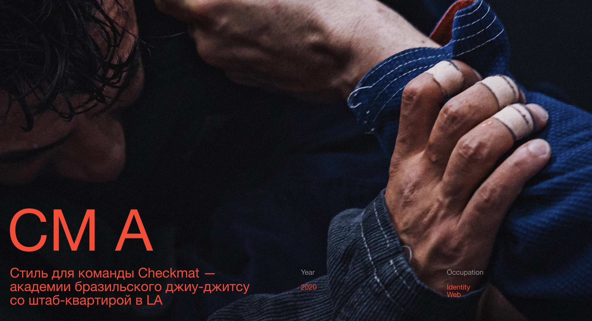
The design is dictated by the spirit of Brazilian
Jiu-Jitsu — it is dense, fundamental, clear.
The layout principle is based
on a modular structure. Like in chess.
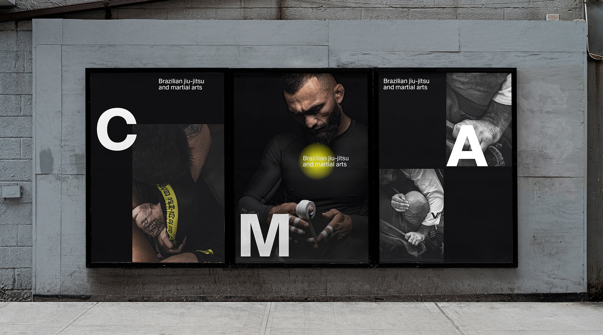
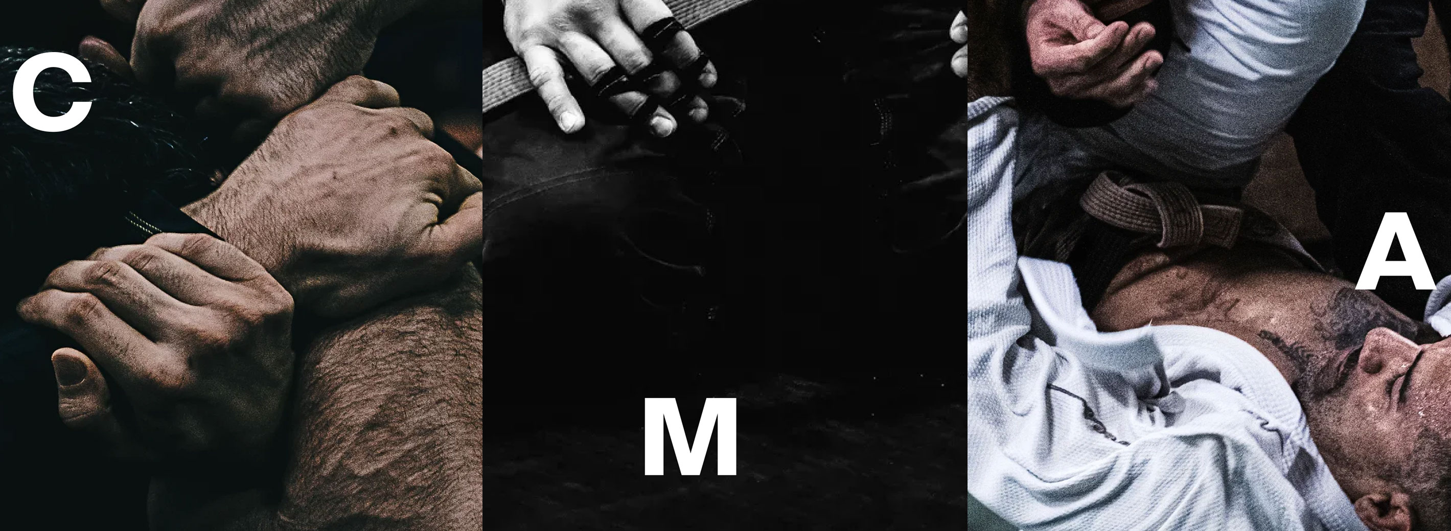
Abbreviation and name of the academy live in different
graphic options, moving one step and changing
position, like opponents in jiu-jitsu.
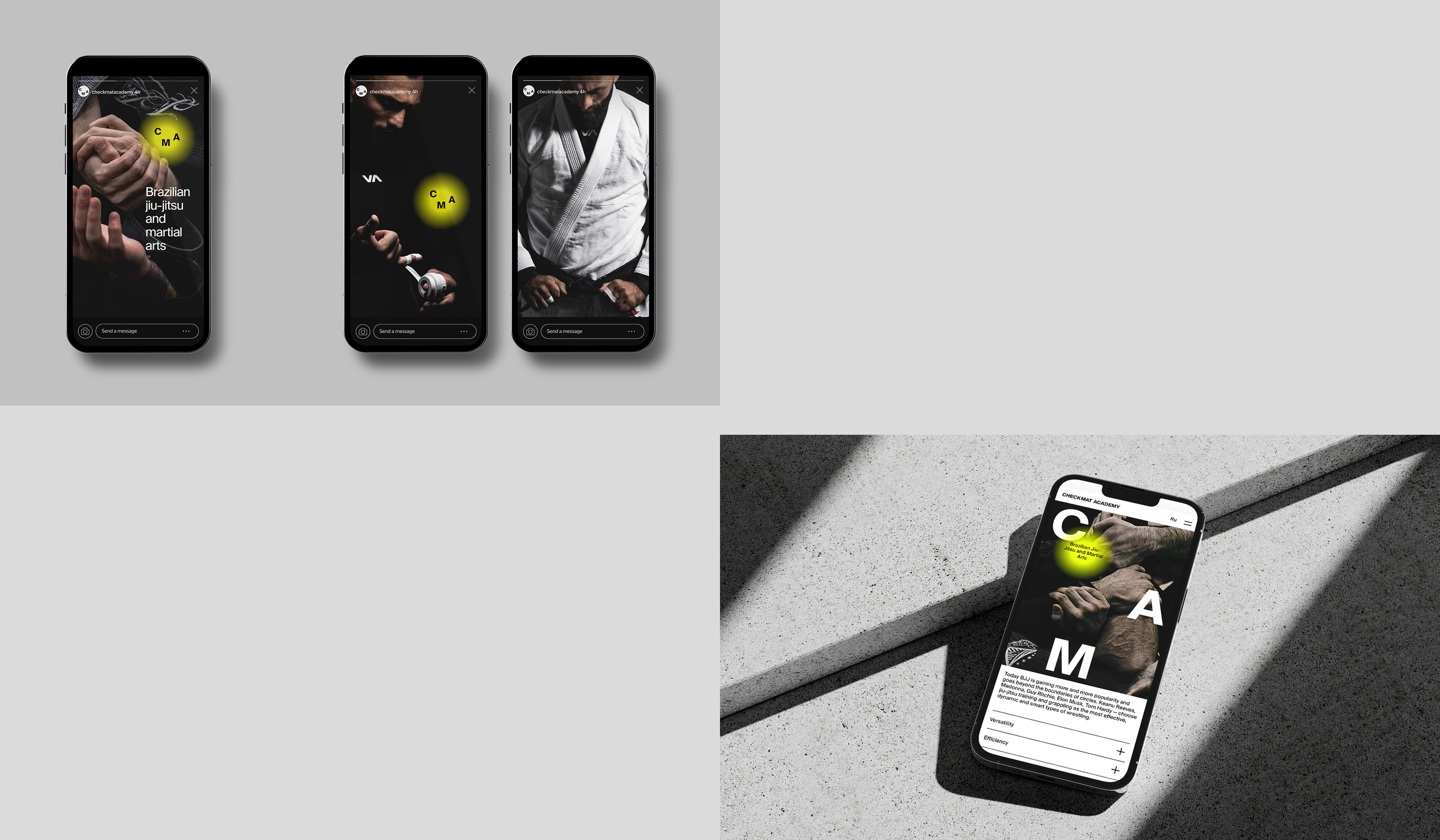
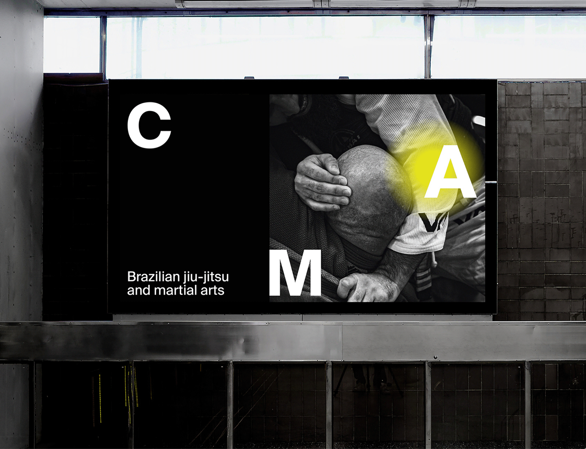
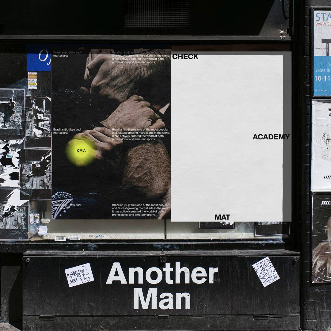
Green dot directs attention and highlights
the communication message or the photo itself.
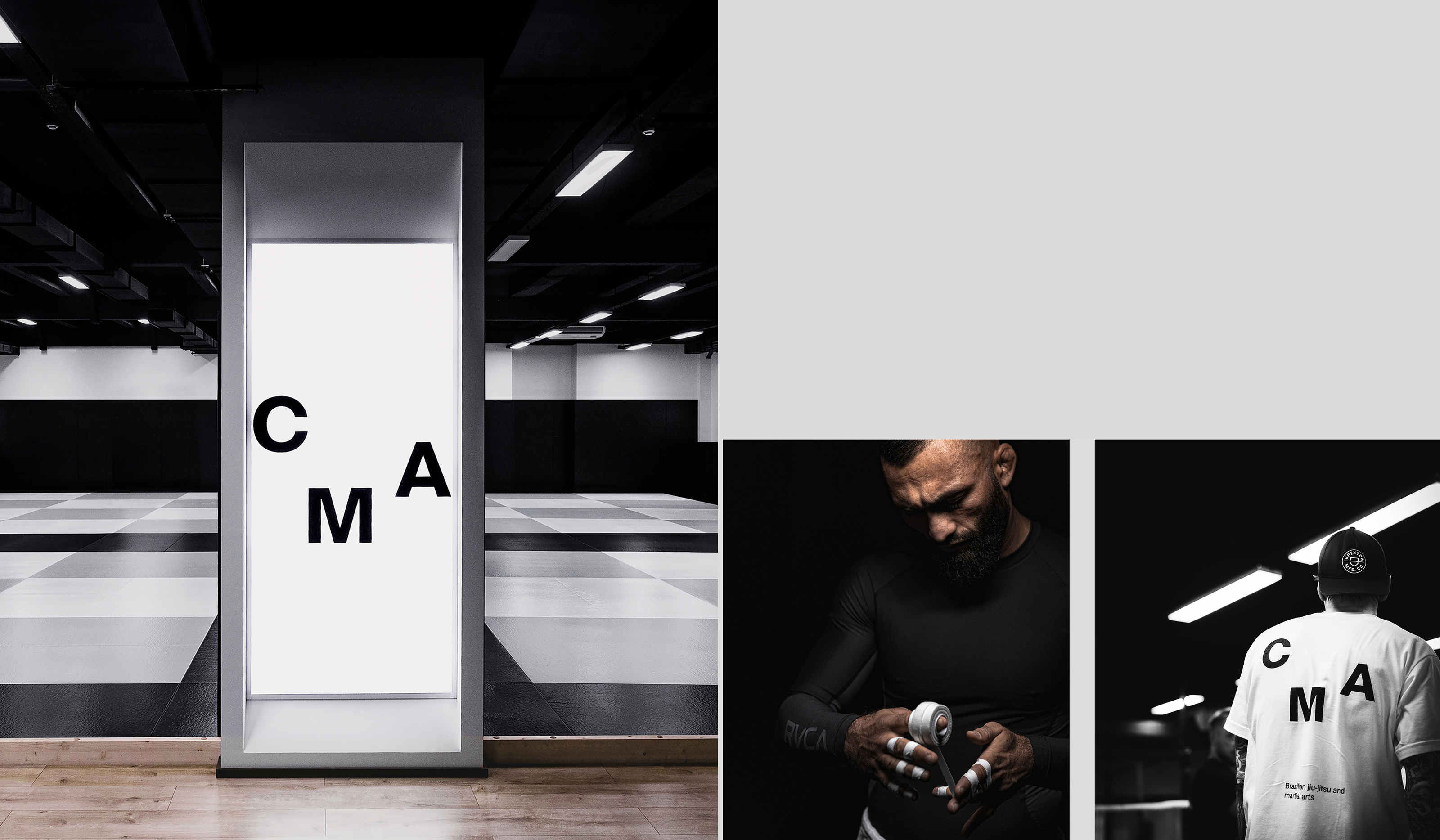
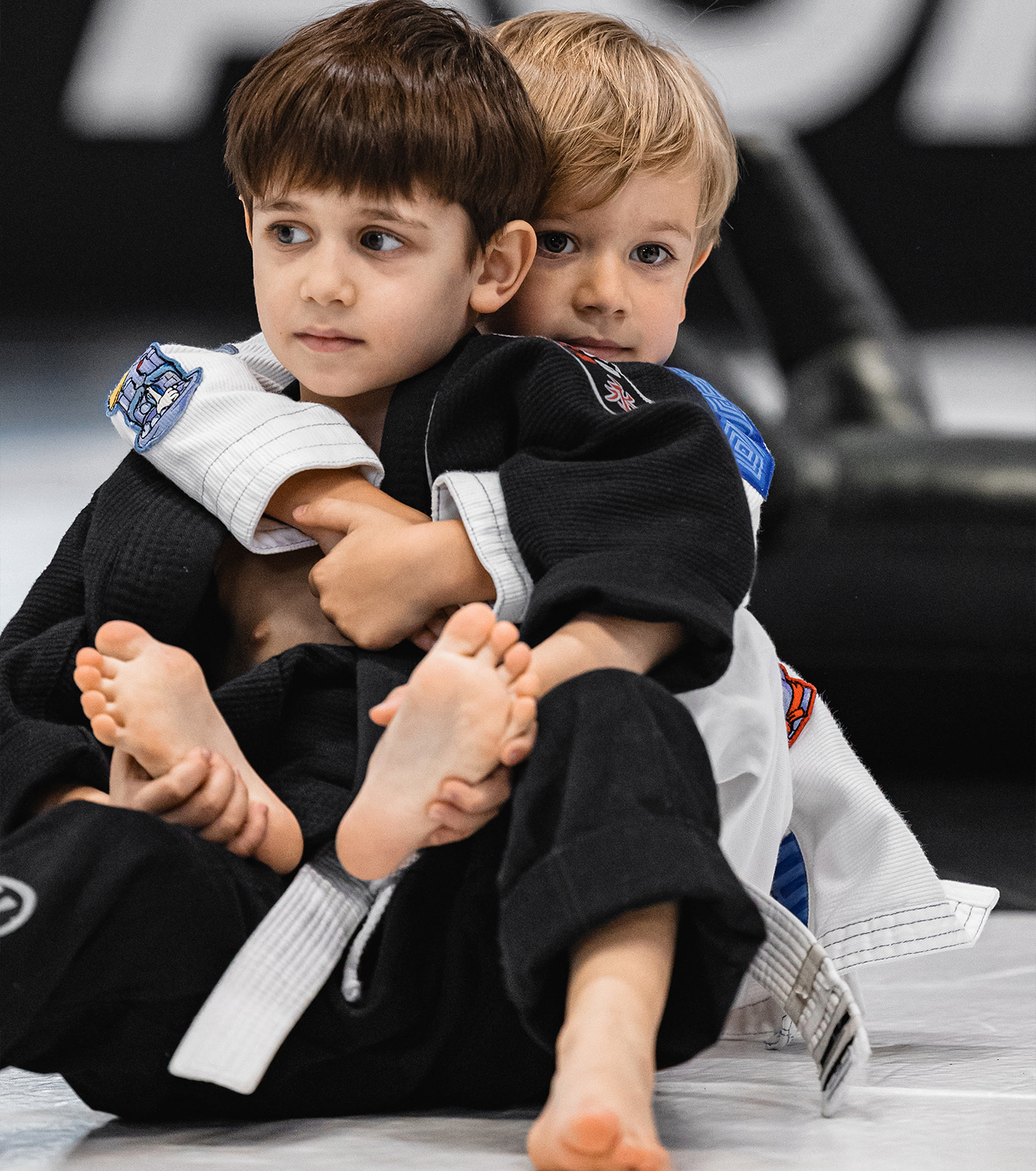
The photographic style takes after the artistic sports
photography of Victory Journal and SoccerBible — lest
we forget that sports are beautiful.

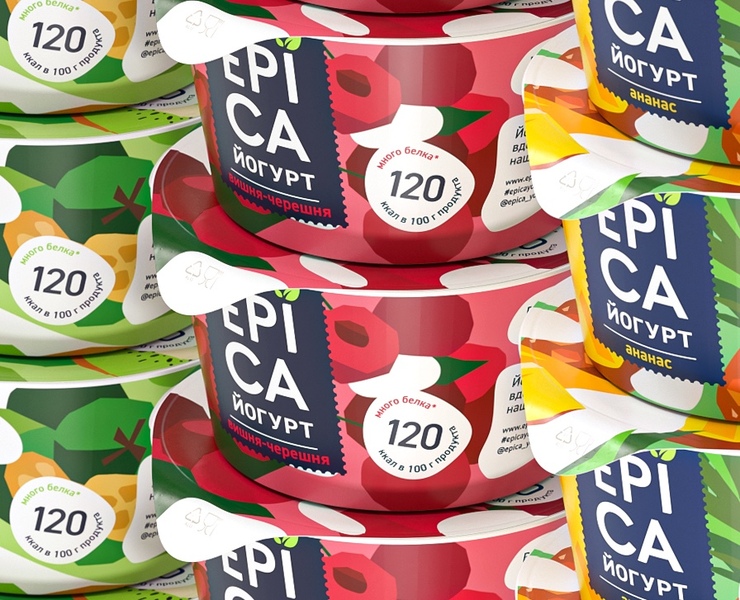
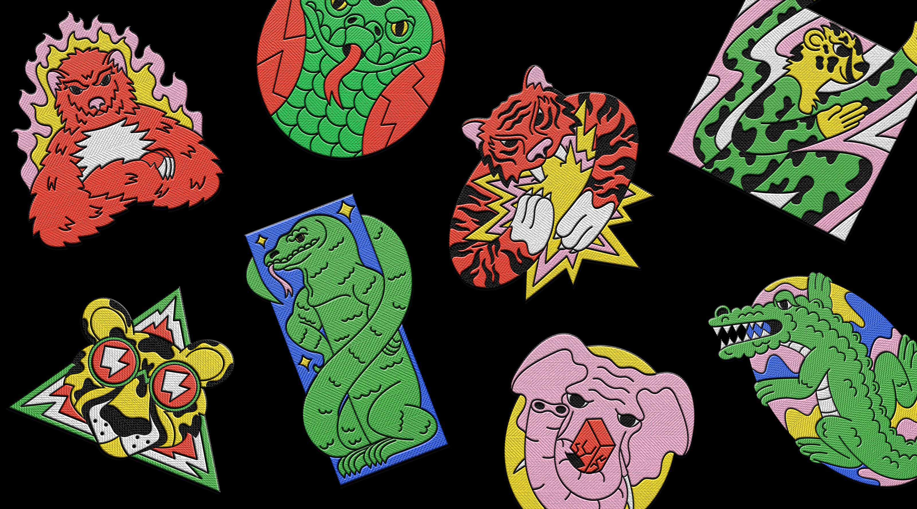
What we did: Illustration


Creative director → Alexander Zavatskiy
Managing partner → Alexander Zazvonov